This is something I’ve wanted to do for a while. Not to be confused with my previous project, with #AlbumCoversAsDataViz, this is more about how you can visualise the actual contents of an album – its words, its sounds and its structure.
I was reminded more recently about this by meeting Stefanie Posavec. When we spoke together at the Tableau User Group in London this January, I was excited to share the stage with one of my first dataviz heroes, and was looking through her back catalogue of projects. One project she’d undertaken a few years ago was to create a series of visualisations that depicted an album for OK Go!
You can check out her work here http://www.stefanieposavec.com/ok-go

Stefanie combined the words of OK Go!’s album with the words of the novel used for the album title. So which album could I use? I’ve visualised the Hitch-hiker’s guide to the Galaxy before, does that mean that Radiohead’s OK Computer would be a good candidate? Do I need to look for a different combination of album and book?
I’ve visualised music before, so I really just wanted to focus on words and songs, but the album/book connection didn’t seem relevant in most cases. Instead, I figured I’d be trying various things, so if I was going to have to manually code every word and every syllable of an album, it should be something I was already pretty familiar with. January this year also represented the 30th anniversary of one of my favourite albums, namely “Flood” by They Might be Giants. It has a few things going in its favour to visualise. First – there are a large number of songs, so we can expect variety. Second, the words are often, well, daft! A lot of wordplay and subject matters far from usual album fare mean that I’m hoping for some interesting visual results. After all, one song only has two words. And third, I still love it after thirty years. As my daughter always says … don’t judge me!
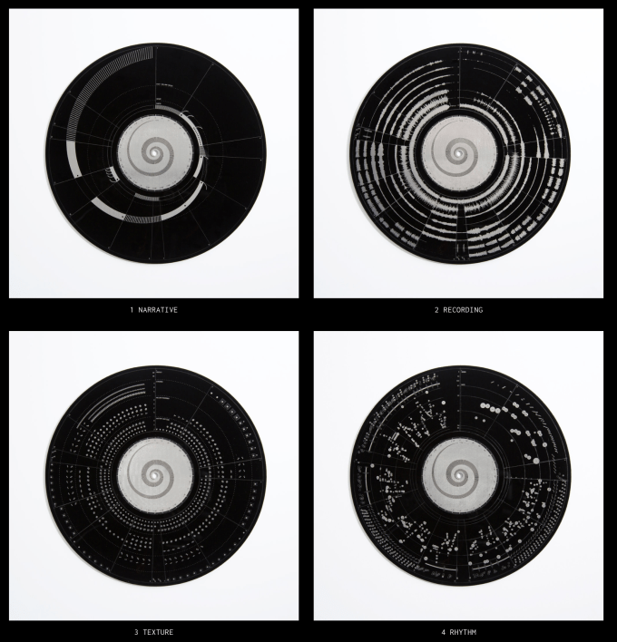
I have many other sources of inspiration. I’ve mentioned OddityViz before – from Valentina d’Efilippo and Miriam Quick, visualising just one song (Space Oddity) in visual and radial form, which was an inspiration for my Handel’s Water Music visualisation. But that focuses a lot on the music, not just the words. Check out oddityviz.com to see what I mean – the first four discs are shown below, with the whole collection on https://www.oddityviz.com/records

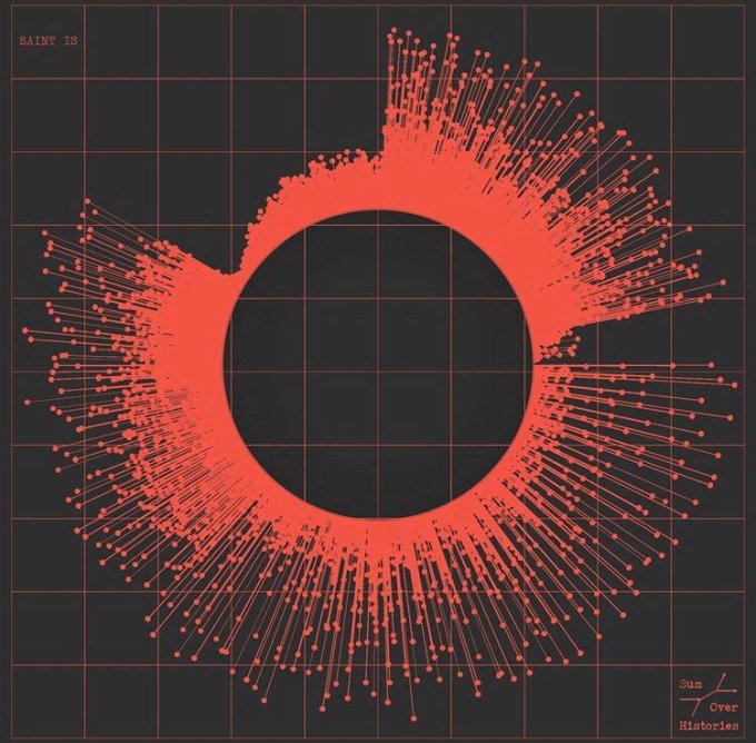
Tiziana Alocci recently visualised “Sum over Histories” for a graphic on their sleeve (also found on https://www.instagram.com/p/B4Kq6tMIK3T/?igshid=vieqe5o9odhc)

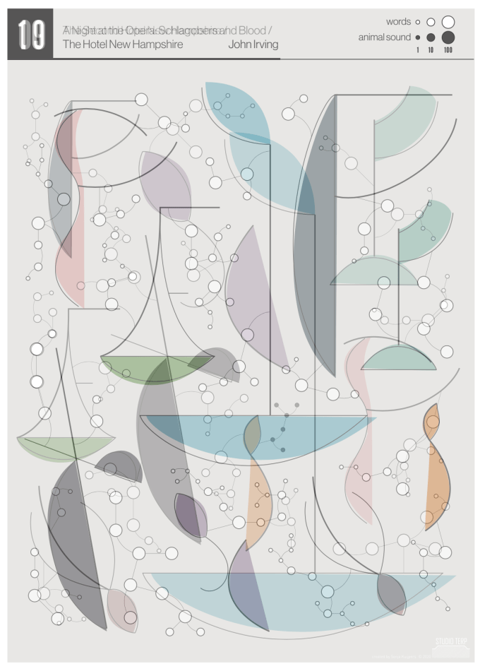
But the thing that has convinced me most to revisit this project is Sonja Kuipers’ recent project, visualising her favourite book, chapter by chapter. This has resulted in both a combined, small multiple visualisation and a viz for each chapter.


I’m never brave enough to go that abstract, but why not? I want a piece that stands out, and that demonstrates the differences between songs in the same way we can see the differences between chapters here. It might be more easily achieved with Illustrator, but it all depends to what level of granularity I want to take the data.
So what conclusions have I come up with?
I’m going to focus on words, lines, and syllables
Im not visualising anything musical this time
Radial visualisations, involving music and albums, are always good
Let’s also consider more abstract visualisations / small multiples for each song
This could lead to a lot of attempts.
The proposed solution? #31DaysOfFlood
To get me out of my lockdown slump, I’m going to visualise the TMBG Flood album in a different way each day for all 31 days of May. I should disclose, I have about 8-10 ways started already, so I have some pre-prepared, with others yet to be discovered. I’m hoping this will point me, eventually, to a solution I’m happy with. I’m also hoping that solution will look amazing! But most of all I’m going to have fun and enjoy trying 31 different things. There’s no obvious way and no correct way.
A prolific output of different, unconventional, sometimes witty and often short artistic outputs. Sounds just like the album!
Since it’s May 1st for a few more minutes (UK time), I’m going to start with my first attempt here.

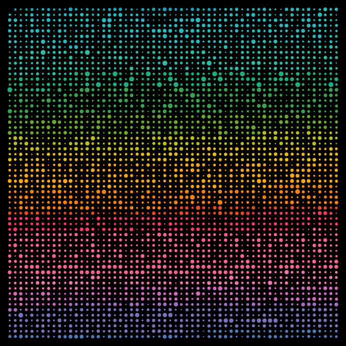
This represents every word in order, coloured by song, and sized by number of syllables each word. I love the way it looks, but acknowledge that the 19 different colours can’t be distinguished easily enough. 30 more attempts to come. All will be published and viewable online during the course of the month.
6 Comments