Kind of an obvious question for this post. Of course it’s important to have clean data. For me, I’ve been involved in the thankless task of producing clean data for the last twenty years, much longer than I’ve been involved in visualisation. This article was one I wrote last year which confirms that most people in data science (however you are defining that) spend a long time cleaning data, and don’t much enjoy doing it … http://swisspeaks.com/news/general-articles/data-science/
But sometimes you have to make a judgement. If you’re not focussing or reporting on certain elements of the data, or your story focuses on elements that sidestep the dodgiest data (for want of a more technical term), then that can be OK. It could even be a shrewd tactical move on behalf of the “visualiser” to design something that avoids areas of unclean data.
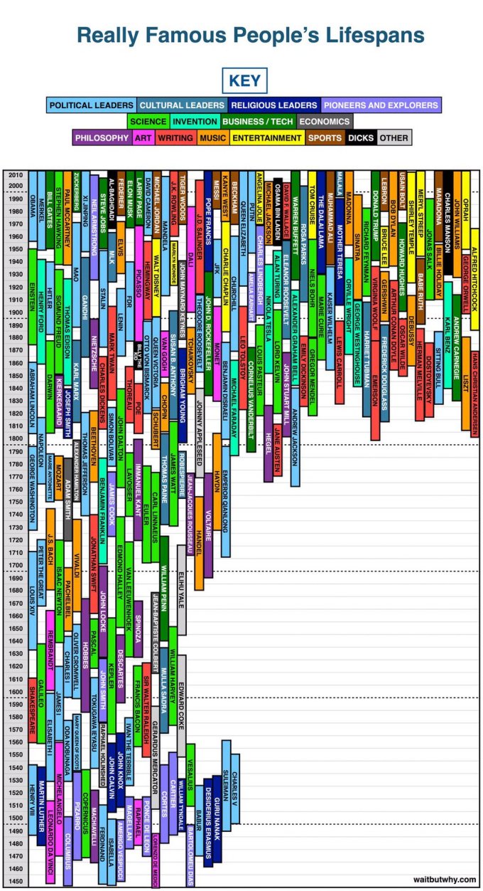
This week’s task for #MakeoverMonday, where we revisit and revisualise (spellcheck changes “revisualise” to “revitalise” which is quite appropriate) a visualisation. The original, from waitbutwhy.com, is shown below. Our dataset was huge, going back to biblical times, with the first “famous people” dating from 3500BC.

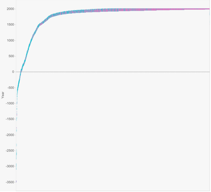
Now, there are many ways to pick up and run with this dataset – looking at gender division, focussing on countries, most recent centuries, different occupations etc. Perhaps foolishly, I wanted to visualise everyone on one screen. There were initially two issues with displaying every “celebrity” lifetime on one screen in chronological order. Firstly, the shape would look like the curve below. The vast majority of people are within the last couple of hundred years, but those from early history stretch the line into a parabolic form and leave a large amount of white space.

The second issue was more serious. If I wanted to show all 9360 people, then all 9360 people needed birth and death dates that looked sensible, otherwise there were some obvious gaps and very long lines, sometimes headed in the wrong direction.
As this was just an exercise for fun, ideally I would choose a different tack that didn’t show birth/death timelines, or I’d just run with the dirty data provided. But I’m stubborn and it’s a bank holiday, so I’ve spent far too long on this dataset than intended, making sure all records have valid dates. Several hundred records (I didn’t count, but would estimate between 500-1000) needed amending. A few people were listed as dead instead of alive (RIP Tiger Woods, George Michael, Charles Aznavour!), many hundreds were shown as alive instead of dead (biblical figures and historical rulers were alive and well aged over 5000), and there were many instances of AD instead of BC or vice versa being used for birth/death dates.
In addition there was confusion where the database had the name of one famous person whereas in reality there are two famous people from different eras with the same name. Francis Bacon and Jane Seymour were two who sprung to mind.
One thing we can’t do anything about is the subjectivity of the dataset. What on earth is X doing there? Why are there so many Americans? So few Africans? So many footballers? I can’t believe Y wasn’t included, etc. etc. That’s a point for discussion, but it’s not our job.
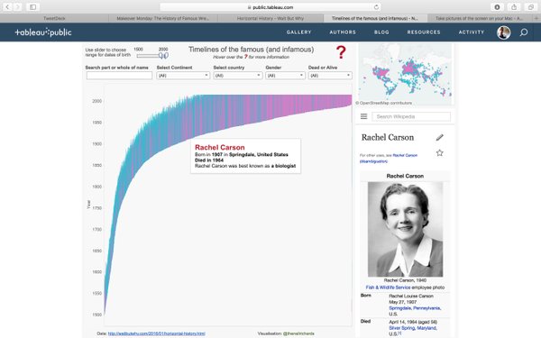
So in terms of the visualisation, once I’d stubbornly decided to clean the full dataset, my plans went full circle. Having initially rejected the idea of just one timeline on one screen, I then planned to consider different eras. Splitting the dashboard into a story with eight different tabs (BC, dark ages, mediaeval, industrial, Victorian, pre-war, post-war and millennials) was just looking too clunky though; I’d rather show the whole thing on one screen and give the user a slider and filters to explore. Add the wikipedia link and a linked map which ties in nicely, and the final viz was born. Click below for the interactive version:
I think there are better makeovers out there, but I’m happy that I achieved my design goal this time. I think it works, as once it was published I genuinely had fun exploring areas on the map and in the timeline.

1 Comment