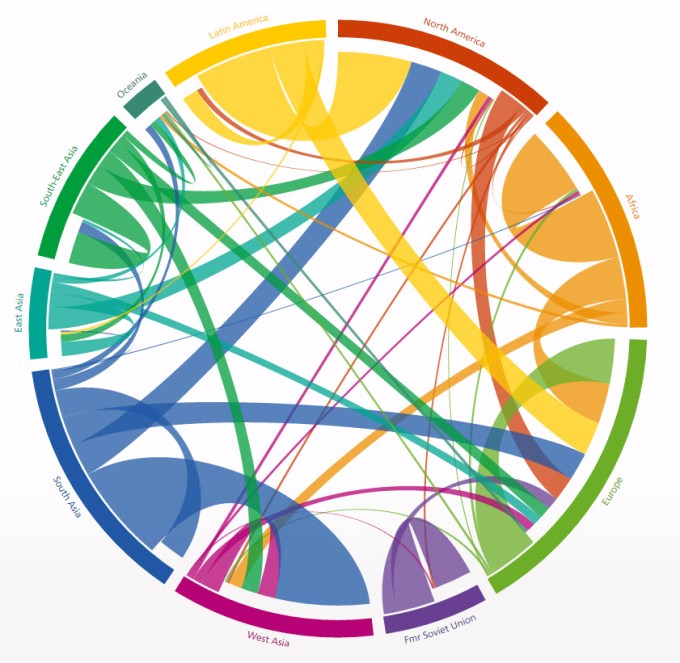
I have a number of dataviz questions I still want to cover, but this has usurped a few others and moved right to the top of my list for the moment. The debate focuses around this chart here, published at http://www.global-migration.info/
You can probably skip to the concluding statement of this post (which I haven’t yet written so genuinely don’t know what it’ll be) to predict that there’s going to be an element of “it depends” in the final conclusion. The question about chord charts themselves is a very specific example of a more general debate about simplicity versus complexity. The chord chart is certainly seen as a proxy for “complex” and this post is really a specific example of the continuing debate between simple and complex.
I’ve referred to Chris Love’s talk before here where he refers to the acronym “KISS” for “Keep it Simple, Stupid”. His talk eloquently and passionately shows the importance of keeping visualisations simple, while also acknowledging the time and pace for flair and complexity. There’s even an example of a ridiculously over-complicated Premier League visualisation in his talk from an up-and-coming visualiser who was really just using complexity to show off what he could do … but I digress. Chris has a love-hate relationship with the Sankey diagram. While his own work and the documentation of how he has achieved it has made this complex chart a lot more accessible to those who want to use it (in Tableau), he is increasingly frustrated by the proliferation and over-use of the Sankey, often by people using his own method.
We don’t agree on everything – I generally love a good Sankey chart, perhaps because I pompously think that I have a reasonable understanding on when it’s a valid chart type to be using to show insight, so I don’t shy away from using them, even professionally. Below is an example of one I have created and used (ironically, adapted from Chris’ original excellent code).

Please note I’ve deliberately cropped out labels and explanations here, and haven’t included a link to the interactive version. The reason for this is simple – this is a client project which I’d prefer to leave anonymised. The chart shows the change in rating scores for particular measures between the first sample point (left) and second point a few months later (right) But I have a version of this with explanations, filters and drop-downs allowing the user to choose all manner of options, hover and interact, and when briefed to users it works really nicely.
Simple versus complex continues to be debated. Last week, in an excellent webinar (hosted by Tableau, using the #datadebate hashtag), Andy Cotgreave of Tableau and Andy Kirk of visualisingdata.com debated briefly on the nature of simple versus complex visualisations. Andy C put a good case for the simple visualisation – it’s more important to be able to dive in and get to the numbers without having to work hard for them. But in a detailed reply, Andy Kirk explained that a good visualisation should be able to assist and coach viewers through even the most complex of visualisations, so that they in turn shouldn’t be shied away from. Two great soundbites emerged which gave great weight to the argument for “complex” over “simple:
- “Everything is new once”
- “Don’t simplify, clarify”
In other words, maybe it’s better not to lose function/complexity just for the sake of simplicity, when it can be left in if effort is made to coach or clarify?
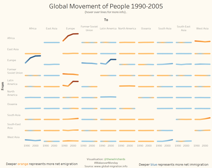
So, on to chord charts. Conversations rumbled on as a result of the simple/complex debate, with the upshot being that the chord diagram at the top of this post was selected for this week’s MakeoverMonday project. I’m sure I’ve mentioned Makeover Monday before, but I mention it in a lot more detail here. Can the community make over / improve an initial chart to produce something new and potentially better? I’ve never created a chord chart before, and to be honest I wouldn’t know where to start. But for a makeover, that doesn’t matter, and my attempt is below (click to access interactive version)
First, some context into what I was trying to do. When Andy Kriebel (are you keeping up with all the Andys?) posted the original chord diagram, a quick chat confirmed what I suspected – he doesn’t like chord diagrams! I could certainly see his point – they might look great, but how easily, if at all, can we get real insight from the chord? Is it not just showing a lot of people moving around and not much else? I could concede that it was one unnecessary step beyond a Sankey.
They require quite an investment of time and even then do not often show a great deal of insight. So my plan was to show something that didn’t need much explanation, which showed trends over the four data points 1990-2005, and which showed the nature and magnitude of net migration flow from region to region.
I think I’ve done OK (but, just “OK”). My small multiple charts do show trends in each pari of regions, and my use of blue/orange (another hot debating topic which I will avoid for now!) shows the asset I’ve tried to focus on most: net immigration / emigration for each paired region combination (though this needs explaining in the text). But in sticking to consistent axes throughout, almost all trends are “flatlining”, dwarfed by the large net flows from Africa and Latin America to Europe (which, to be fair, ultimately is the main analytical take-out from the visualisation). The blue/orange shades are otherwise indicating little more than a net positive/negative flow. And the image itself, though I’ve tried to make it neat and clean, is still quite crowded and not overly striking.
On reflection, I’d rather invest ten minutes in the original chord than one minute looking at mine. Granted, it’s not until looking at the chord for at least the fourth time in compiling this blog post, that I’ve even noticed the additional functionality to split regions into individual continents. A lovely addition which isn’t easy to spot if you tend to just dive into visualisations, but I see that as more of a fault of me as the viewer than one of the visualisation. Mine has no individual country breakdowns. So that’s a negative for the chord showing how much time you need to spend to realise all the potential insights, but a positive indicating how much information is involved once you’ve found it!
So at this point, I’m a fan of the original chord visualisation but the jury is still out for me. But the plot thickens for me in the publication of the makeovers from the project’s leaders: Andys Kriebel and Cotgreave. A fantastic element of the Makeover Monday project is that the two organisers will always post a short accompanying explanation to their thought processes behind their reworks. See below, in that order, and click here (for Andy Kriebel) and here (for Andy Cotgreave) to visit their accompanying blogs and explanations:
This is music to my ears! The two experts leading the visualisation community I owe so much to have differing views – and whether or not it encourages me to either take an opinion or a balanced view, it’s certainly great news for a novice who runs a blog based on debated opinions in dataviz. I don’t think I’d be involved if there was only one accepted wisdom, one way through the profession from beginner to intermediate through advanced to expert. If that were the case I’d make it to a certain point only, limited by skill, opportunity and technical ability.
It’s the dataviz equivalent of loving Kandinsky and hating Picasso, or admiring Bach and being indifferent to Radiohead. By glorious coincidence, I’m publishing this within seconds of being notified of the Turner Prize winner – a choice which always courts controversy over what is “good”, or even what is “art”, and visualisations can be just a divisive for similar reasons.
In summary: here are the contrasting things that both said in their blogs:
Andy Kriebel:
- Chart is way too busy
- Can’t see trends
- Some of the colours are too similar
- No order to the regions
- Difficult to compare different arcs
- Easier to present as heat map to show region pairs with highest movement
- Including countries over-complicates the visual
Andy Cotgreave:
- Designers have explained it well
- Initially looks a confusing mess, but comes to life/becomes clearer with interactivity
- Best way to show so much detail
- Andy C’s own makeover is a flat admission that original can’t be matched – simple approach to makeover doesn’t even try, and loses detail
- Investing time to read chart is not a reason in itself to avoid using
- Using width to show range of measures ensures outliers aren’t dwarfed
Enough about them – what do I think? While not disagreeing with any of the points above, I’m leaning towards the Cotgreave way of thinking in choosing an opinion which is pro the original chord diagram and not anti it, albeit just in this particular specific example. But let it be noted that this was the same man advocating simple over complex in an earlier debate! It might be that I’m fickle, most influenced by the most recent well-presented opinion I’ve encountered, and that another viz, opinion or well-reasoned article persuades me further in the opposite direction in the future, and I don’t mind that at all.
But I’m attracted to complexity, something striking, engaging and different. As Andy C mentioned in his blog, the original chord diagram was presented in the Graphical Web conference in 2014. It’s highly unlikely that any other visualisations on this page will be showcased at a conference! Now I do know that the definition of a good visualisation is absolutely not the same as a visualisation that gets displayed as a talking point at a conference. But it does coincide with the kind of visualisation I like to explore, discuss and blog about. It’s back to the cliches of art again – “I don’t know if it’s art, but I know what I like …” And if it inspires me to explore, with a little bit of help directing me how to do so, then I’m in my element. I can always back myself to understand and engage with a visualisation if it’s well-designed, well-documented or both. Ultimately these are the kinds of visualisations which have piqued my interest in the field in the first place.
Mind you, when it comes down to it, it depends really …


Great post and I agree that it really depends. I personally feel that flair and visual appeal have a big role to play in data viz, even if its only purpose is marketing (i.e. to pull someone in). In my own visualizations, I like to include sort of a starter tab that has the visually engaging stuff, drawing people in, then provide other more K.I.S.S.-like tabs that allow them to understand the data more simply.
LikeLiked by 1 person