If you’ve read previous blog posts, you’ll know that I’m a fan of different and unusual chart types. If the chart types are visually interesting and striking, but don’t necessarily follow visualisation best practices, then, for me, sometimes, so much the better! I’ve blogged about, and attempted, sunburst charts, radial bump charts, bump charts, spiral charts, chord charts, spark bar charts … you get the message.
But when I recently found out about the Marimekko chart a few months ago, even I wasn’t sure if I liked it. I couldn’t really think of a use of such a chart other than just for the sake of it, and though that doesn’t always stop me, I wanted to be sure I could make sense of a use case for it.
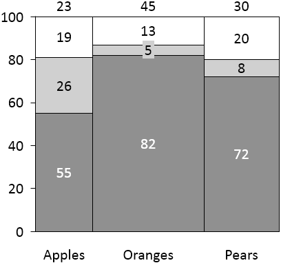
So what is a Marimekko chart? Below is a simple example from think-cell.com, the first example you might come across using a well-known search engine. Essentially, it is a stacked bar-chart which totals to a whole both horizontally and vertically. To this extent, each vertical bar has a different width proportional to the overall sub-sample.

But this week’s MakeoverMonday dataset got me thinking. The original chart requiring a makeover was the chart below, from the Guardian.

The chart aims to show the chance of each profession becoming automated within 15 years or so, along with the percentage each profession consists of in the workforce. The main issue, for me, with the original visualisation, was that showing two percentages on the same axis doesn’t really make sense. We’re being asked to compare two percentages which aren’t relevant to each other, so don’t belong on the same scale.
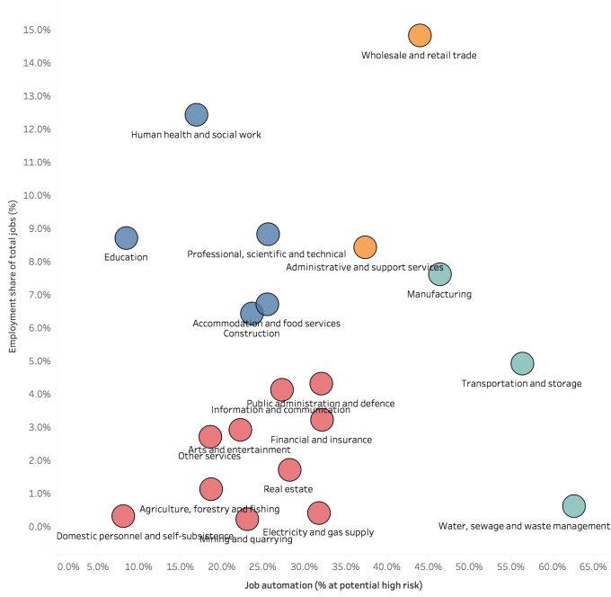
My first thought was a scatterplot – plotting percentage of workforce versus percentage at risk would allow us to cluster together professions, or identify traditional quadrants: which professions are both more likely to be automated and have a higher proportion of the overall UK workforce. Something like this (excuse formatting):

But I wanted a different way to combine likelihood of automation with the overall share of UK workforce for each profession. From a numerical point of view, multiplying the two together will give the overall percentage of the entire UK workforce. And from a visualisation point of view, this can be represented by multiplying height and width together to give area.
Enter the Marimekko chart. With x-axis ranging from 0% to 100% and y-axis also ranging from 0 to 100%, the entire chart area therefore represents 100% of the UK workforce. Realising this as I experimented with visualising the data was the lightbulb moment for me where the Merimekko was concerned. The total area of the bars therefore nicely sums up to the overall percentage of the population at risk, in this case a round figure of 30%.

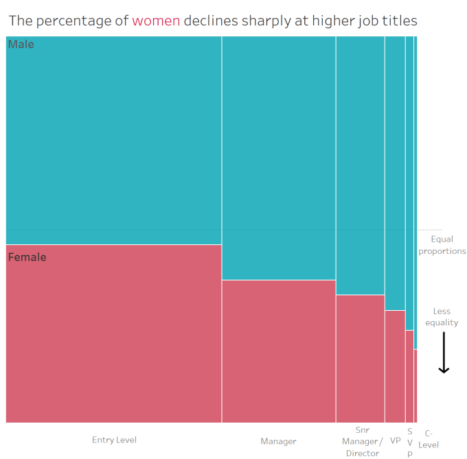
The influence for creating the chart was from Emma Whyte, who herself drew from the great work done by Jonathan Drummey. Emma blogged about this recently as a recent #WorkoutWednesday challenge in this blog post here. I’ve chosen to use the same technique as her, blending all the non-selected elements to the same shade of grey to look like background. The chart Emma (re-)created was this one below (not hard to see where I got the inspiration):

Thank you also to the suggestion of Steve Wexler – he has a simper version of the same process here, which will be familiar to any users of his excellent and instructive stacked bar charting method for Likert questions in survey data. Be sure to check it out for his thoughts on the Merimekko (initially sceptical and similar to mine). But where it really comes into its own is in visualising two interconnected percentages, both of which sum to 100%, so the total chart area can represent the sample whole.
4 Comments