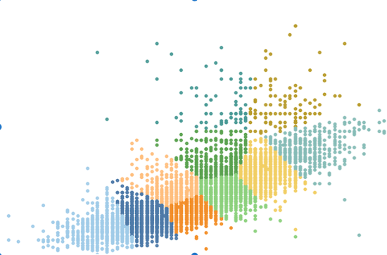
This latest blog post is somewhat overdue but I want to talk about clustering. Though I try and keep my blog posts fairly software-neutral it’s probably clear that most (though by no means all) of my experience and published visualisations are using Tableau. So this particular post focuses more than usual on the clustering feature […]
Author: Neil
How should you prepare a visualisation project?
Here’s a post about my latest significant visualisation – it’s Olympic-themed, centred around all the decathlon greats from 1984 to the present day. I’m genuinely quite happy, but not delighted, with it. Click on the image below to see the interactive version on Tableau Public. And please, if you like to explore this kind of […]
Speed or substance?
A quick(-ish) post to answer today’s question, about a very quick visualisation. Yesterday, in response to the appalling terrorist events in Nice, a visualisation was published in order put into perspective the fact that Muslim terrorist groups were such a small minority compared to the overall Muslim population. A great notion and worthy of a […]
What’s in a colour?
First answer – as a pedantic Englishman, the letter “U”, of course. As I keep saying in this blog, I’m not really in a position to give great expert advice on data visualisation principles. Many experts have written and spoken about colour, not least Matt Francis earlier this week, who gave a reprise of this […]
What makes a “viz of the day”?
First – an explanation. The majority of my visualisations are done using Tableau and published on Tableau Public (here). Available for all to see, it’s a great resource for experimenting and publishing work that you’re happy for all to see. Click on it today and you’ll see there are 190000+ authors, 25M+ views/month and over […]
Remain or Leave?
In a blog where I’m posing every post as a question, this was by far the biggest question of the week in the UK. In fact, probably the biggest political question of my lifetime. But this is a data visualisation blog, so there’s no way I’m answering that particular question. The main point though, is […]
Should we call out bad practices?
Yesterday, in my professional capacity, I attended a conference in Oxford related to data science in government. That makes me sound much grander than I am, but in reality it was a get-together for data scientists/analysts, researchers and policy makers to network and learn some of the data science work being done by government departments. […]
Are any visualisations off limits?
Data visualisations can cover just about any topic, from the sublime to the ridiculous; from the serious to the frivolous. I’ve seen no end of powerful visualisations on police brutality, casualties in war, mass shootings, the list goes on. Many more of these have surfaced, either new or updated, in the wake of the recent […]
Should the data drive the visualisation?
Obviously the answer to this is “yes”, at least inasmuch as it can’t be the other way round. I’ve learnt (well, I knew really – let’s say “confirmed”) today that you can’t just decide on a visualisation without thoroughly knowing your data and its suitability for the job. Take the excellent visualisation below, published in […]