Yesterday, in my professional capacity, I attended a conference in Oxford related to data science in government. That makes me sound much grander than I am, but in reality it was a get-together for data scientists/analysts, researchers and policy makers to network and learn some of the data science work being done by government departments.
The timetabling meant I had almost four hours to kill on trains and platforms, so I was glad to spend some of that time reading Alberto Cairo’s The Functional Art I’ve only dipped into it before, having started (out of synch) with his latest book The Truthful Art. It goes without saying, but I’ll say it anyway, that both books are an absolute must for anyone interested in the design and creation of data visualisations. One of the first principles which the book confirmed was the difficulty of judging differences in areas of circles. We can’t easily judge if circle B is twice the area of circle A – circles mask our ability to judge size. It’s one of the first things we learn, and something I will therefore always try and avoid if possible if comparing quantities is important.
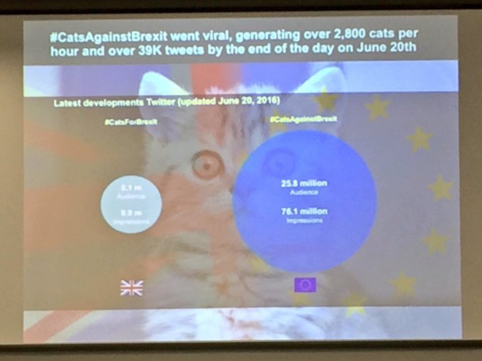
Fast forward a couple of hours and I was watching a presentation at the conference about some of the great work being done by the Oxford Internet Institute. Occupying the difficult last slot before lunch, the speaker grabbed our attention with some of the social media analysis being done. Funny, topical and up to the minute (the Referendum vote started less than twenty-four hours after his talk), he introduced us to the analysis done on hashtags for the #VoteLeave and #VoteRemain campaigns. And as light relief, he was even able to point to the impact of the Internet’s greatest influencers – cats. Yes, #CatsForBrexit and #CatsAgainstBrexit are even a “thing”. Which brings us to the visualisation slide (apologies for the quality – snapped and cropped off the projector screen using my phone)

At this point, my heckles were raised. Circles – no! How much bigger is the second circle than the first? The ratio of 25.8 to 8.1 million (roughly 3:1) is not even the same as the ration of 76.1 to 6.9 million (roughly 11:1). How can one circle represent both? This is breaking all the rules if we want to compare the two quantities! It doesn’t represent the magnitude of superiority of the pro-EU cats tweet versus the anti-EU cats tweet. But I was missing the point completely; absolutely wrong to be a snob about this.
We must always consider our audience in setting up a visualisation. If the visualisation is part of a slideshow or presentation, then we know exactly who the audience is, and we also know that we are in charge of proceedings. Our audience is in front of us, watching. We can talk/explain, we don’t need the audience to interact, and we can get our point across using our charisma and the context of the rest of the presentation.
Now, on its own, perhaps in a book or report, this might rightly be frowned upon. If I saw this on its own, out of context, on a website, I might be straight onto @wtfviz, or would quickly move on. But in the captive audience of researchers, policy makers and analysts, probably only one of whom (me) is most passionate about data visualisation, the point was made admirably. A light-hearted, engaging point made about the spread and reach of hashtags and our ability to monitor them, whether frivolous, political, or a mix of the two. The magnitude of tweet and impressions numbers wasn’t important at all, in fact the fact that #CatsAgainstBrexit “won” that particular hashtag battle was almost irrelevant, and I doubt anyone else in the room gave it a second thought (rightly so!)
I should have been interested in the findings and smiling at the cute cat. After a second or two, that’s exactly what I was doing, whilst chiding myself for thinking negatively about so-called rules. This wasn’t supposed to be quantifiably presenting a scientifically-researched fact or the exact findings of a representative survey. The message should have been simple and two-fold: hashtags can be monitored and compared, and in this example the Remain cats easily outperformed the Brexit cats! The numbers didn’t matter and the next slide was soon upon us. Overall, the talk engaged me, piqued my interest in social media analysis and was perfectly timed in advance of today’s referendum.
I haven’t answered the question yet – but it’s clear that the answer is “No, not always” – as I suspect will be the case in a lot of the questions I pose, we should always consider the context.