A quick(-ish) post to answer today’s question, about a very quick visualisation.
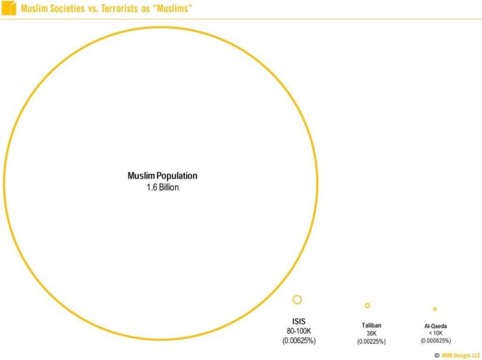
Yesterday, in response to the appalling terrorist events in Nice, a visualisation was published in order put into perspective the fact that Muslim terrorist groups were such a small minority compared to the overall Muslim population.
A great notion and worthy of a viz – a simple viz I really liked in principle (author is credited on the image), which I first saw retweeted by Tableau’s Andy Cotgreave, who pointed out that admirable though the original was, the scale was wrong – clearly the three small circles are sill too big.

I knew that I could use Tableau to represent this more accurately. I only had five minutes (well, I didn’t have any time really, as I was at work, but I had Tableau open for a work project, a strong black coffee and five minutes for some time out). 
My resulting visualisation is above. Straight out of the box – four numbers visualised as accurately-sized circles. You’ll need good eyesight to see the smaller ones (hint – top right), and I think the smallest of all isn’t even visible to the human eye!
No formatting, tidying, amending the legend, titles or changes of colour, just something that was able to join in the conversation very quickly and put the perspective into, I hope, even better perspective. Numbers aren’t shown for the smaller circles, though the interactive Tableau version has them in tooltips. But shown alongside the original, we know what the numbers of each of the population bubble is.
I don’t think it’s ever right to sacrifice speed for accuracy, but if all you want is a quick visual answer, then there’s no need for bells, whistles and formatting – a very quickly-produced visualisation is every bit as meaningful.
Nice work Neil!!
LikeLike