This latest blog post is somewhat overdue but I want to talk about clustering.
Though I try and keep my blog posts fairly software-neutral it’s probably clear that most (though by no means all) of my experience and published visualisations are using Tableau. So this particular post focuses more than usual on the clustering feature in Tableau. It’s a good thing for me to talk about for three reasons:
(1) Tableau v10 has been released in the last week, with, among its new features, the ability to include clustering, so the timing is very relevant
(2) While v10 was in beta, users were invited to submit visualisations using its new features for a #TableauTorch themed contest.
(3) Coming from a market research background, we’ve used clustering for a very long time (by “we” I mean statisticians and analysts I’ve worked in conjunction with, rather than myself) to understand buying/awareness patterns among different customer groups or types of people, so it’s particularly interesting for me to see how this feature can develop.
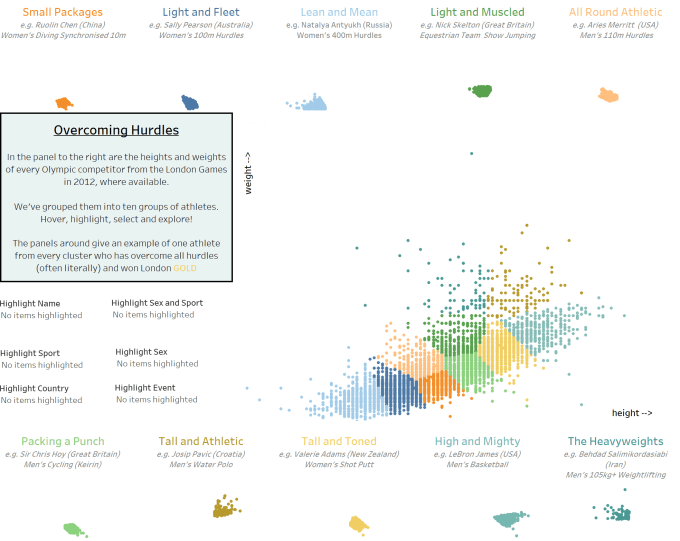
So, with (2) above in mind, we start with my cluster-centred, Olympic themed entry. I can at this stage sheepishly admit that it won. So this post comes with a great deal of thanks to Tableau Software for recognising my attempts to learn more about data visualisation all the time and for using their software as a tool to do just that. And with further thanks for the ticket to their conference in November this year, from where it’s pretty likely that I will blog about the experience and am looking forward to learning much more about the software than the small amount of knowledge and experience I have acquired up to now.
I digress – here’s my entry. As usual, please click to interact.
What I really wanted to do was not “just” show points in clusters, since that would be fairly meaningless, but to use the highlighting feature (also new in V10 – I wonder if the double-up feature helped me win the prize? I hope so – I like to think I have good ideas occasionally! …) to highlight the athletes in the data in a number of different ways – by gender, country, sport, event or individual athlete (if your eyesight is good enough).I do think it works really well, perhaps better than exclusively highlighting, as showing the whole population in the background really shows the difference in body types among these groups of people.
The features and (so far) limitations have let me to the following tips and suggestions using clustering.
– Tableau can automatically generate from 3 to 10 clusters automatically. Don’t necessarily accept the automatic number it generates, but have a play to see what stories it can tell with the automatically generated clusters. In my case, with such a large dataset, the full amount of ten clusters worked. Other, smaller or more diverse datasets might seem odd with too many clusters.
– Tableau will name the clusters “cluster 1” etc. This does’ mean anything – it makes sense to try and interpret these clusters. I’ve used some fairly trite categories such as “Lean and Mean” or “High and Mighty” but have attempted to give them a more meaningful name at least. If it’s not possible to name your clusters in this way, then your clusters don’t really mean anything.
– Clusters won’t really work in datasets with lots of outliers, since the internal calculations attempt to minimise square distance from cluster mean values for *all* data records. So if you’ve got one, or several, outliers, it can make the clusters quite unpredictable. In particular, it can make for clusters with just one record in, which someone defeats the object of a “cluster.”
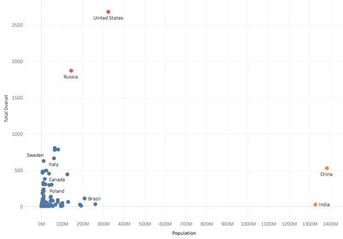
Another clustering example I considered was to look at total number of medals by population for each country. The aim for this is to “level the playing field” to see which countries are “punching above their weight” (apologies for sporting cliches – no pun intended either time). The problem here is that the larger countries can really skew the clustering, because of their populations being so much different to other countries.
Below, top, is the default attempt at clustering, showing just three clusters with two countries in each of two clusters, and the remaining 100+ medal winning countries in the third cluster. Can we fix it by increasing the number of countries? Below bottom shows what happens if we increase to five clusters. Even worse – four clusters of one country each and one of every other country. The data is just not uniform enough for clusters.
3 clusters:

5 clusters:

– This final observation for now is a tip: Maps are great to show clusters, but clusters don’t work on geographical variables. Want to make them work? Convert back to latitude and longitude, then cluster just as if they were ordinary number variables. Get your clusters, convert back, bingo! Geographical clustering is good and easy to understand. “Cluster 1” might be meaningless, “High and Mighty” might be a bit trite, but “South West England” or “Scotland” is a far easier cluster to understand and engage with. One small caveat – the automatic nature means it may not respect state or country borders. The below is almost perfect, except that Josie Peason’s post box in Hay-on-Wye (the red circle straddling the Welsh border) is actually fractionally inside Wales, but has been clustered with English boxes. Can’t blame Tableau for that while clustering is still completely automatic!

If you want to know more about cluster analysis – https://en.wikipedia.org/wiki/Cluster_analysis is as good as anywhere to go, with a good top level explanation of the K-means system used by Tableau.
In the meantime I’m looking forward to thinking of more (better) examples where we can use clustering in a data visualisation setting. Any comments or suggestions welcome below!

Excellent piece. Thanks for putting this out there for people to consume and consider. One thing that can be done with the outliers scenario is to create a transformation of the measures. It can help to reel in the outliers, and bring them closer to the rest of the dataset. Perhaps a SQUARE() or LOG() calc.
LikeLike
Thanks Bill. In fact, I did try using a logarithmic scale in this example (for the country population) and it still didn’t change the clusters. I came to the conclusion that it wouldn’t make a difference to the clustering process but, to be fair, perhaps that could have been tested somewhat more thoroughly!
LikeLike
You can create a calculated field that is e.g. LOG(Total Overall) and use that as input to clustering. Axis settings affect the visual but not the calculations themselves (including operations like clustering).
LikeLike
Hi Bora – thanks for the tip, I can see that makes good sense. I read your own definitive blog post thoroughly before attempting clustering in Tableau and I’d recommend anyone else does the same 🙂
LikeLike