This post is a review of Jer Thorp’s “Living in Data”. It’s one of the hardest books I’ve had to review, in part because of the nature of the book and in part because of my own circumstances and the nature of how I read this book. But if you want a spoiler (a tl:dr; as the phrase goes), I absolutely loved this book. The hard bit is describing how, why and what it’s about! The front sleeve summary describes how Thorp asks the crucial question “How do we stop passively inhabiting data, and instead become active citizens of it?” – hence the title of this post (I’m a sucker for a discussion phrased as a question!)
I stopped my review series this year quite abruptly, when I decided that I needed to put all my efforts into writing my own Questions in Dataviz book. At that stage I had read almost exactly half of Living in Data, and I was hooked. The second half was finished today, several months later. And while I’m excited that I have got my book review mojo back, the most telling thing is that when I considered what I wanted to read next (and because I am behind in my target for this year, there are many more books), the answer was clear. The pile of new and unreviewed books can wait, and eventually become the second, third, fourth books and beyond on my new revitalised list. But I wanted to re-read this book. To immerse myself in Jer’s series of beautifully-written stories. At times you didn’t realise that you were reading a data book – the “techy” parts are included where necessary, but this was as much biography, travel journal and encyclopaedia as it was anything else.
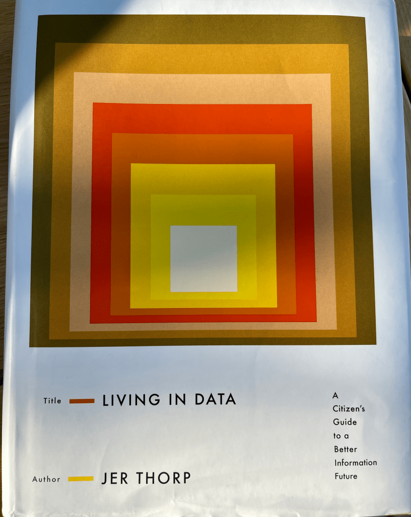
Ironically (I think this a valid use of the word?) I was drawn to the book and bought it almost entirely on the basis of its front cover, which was so reminiscent of Josef Albers that it seemed like the natural progression. However it has almost no relevance to the book but I’ll include it here so you know what to look out for!

Reading the book in two sections almost didn’t matter too much. The first half left me wanting more, but essentially made me think “Wow, Jer Thorp has had so many amazing travel experiences in his work with data”. The second half, months later, made me think “Wow, Jer Thorp has had so many amazing travel experiences in his work with data … when you add that to the first half that’s even more awesome.” The book’s prologue explains that it will “by necessity, meander […], double back and reverse course.” And it concludes, where it starts, on the banks of the Mississippi.
I want to include two quotes from the book: Firstly this quote which probably resonates most with me as a data visualisation practitioner. In fairness, it’s not overly representative of the book, but it’s still a sentiment that I would echo loudly:
Data viz is not, as much as some may try and make it so, a neat process. There are no correct instructions to follow, no best practices. Some readers might bristle at this suggestion […] they’ll point to fifty years of graphics semiology, take their copy of The Visual Display of Quantitative Information off the shelf, gesture wildly at an entire sub discipline of cognitive science. They’ll send me a link to a blog post by Stephen Few. “Rigor“, they’ll say, a little more loudly than they’d meant to.
Living in Data – Jer Thorp
The second quote comes right at the very end of the book and leaves a lasting impression, acknowledging the unseen (and often ignored) work of data research and activism.
Every word on every page of this book rests on top of the work done by decades of researchers and scholars and artists and activists – largely women of color – who saw the mess we were making with data, and to whom we mostly didn’t listen. If there’s going to be any kind of decent life in data for any of us, we need to start listening and keep listening. So thank you at last to all who, in the face of closed doors and all-male panels and all-white tenure committees, didn’t give up.
Chapter stories range from the unique preservation of Maori data and genealogy in New Zealand, fascinating data installations involving deliveries of rice on an industrial scale in Birmingham (UK), collection of biological data in Cameroon and Angola, and glacial data from the Canadian Rockies, all entwined in chapters with titles such as “Drunk on Zima”, “Paradox Walnuts” and “A Lossy Kind of Alchemy”. And the book rightly features the work that the author is best known for as Data Artist in residence at the New York Times and founder of the Office of Creative Research – work that was new to me but is rightly featured, without taking away from the wider theme of the book. In particular, he talks about the process behind the co-creation of the visualisation exhibited at the 9/11 Memorial in New York City, where he and Jake Barton displayed the names of all those killed in the terrorist attacks, visualising the interconnectedness and relationships of all the victims via an algorithm he designed. I wasn’t aware of this work before and I’m thankful to the book for introducing me to it.

The overall effect of the book on me (other than to feel inadequate in my own achievements in data) was gratitude to work in a small way in such an all-encompassing field, and to acknowledge that there is so much more that we have the power to do which can affect people’s (and other creatures’) lives. Pretty good for a book about data with a cool colourful cover!
2 Comments