This is a review of the seminal book “Interaction of Color” by Josef Albers – in particular the 50th Anniversary Edition (below). Right from the start, it’s important to state that it is full of high quality colour plates, every one illustrating an important experiment, illusion or lesson around colour theory. This experience already is enough to recommend it as an excellent book to own, it’s a pleasure to explore and learn from every page.

From my own perspective, as a data visualisation exponent, this is new theory to me, and a little outside of my comfort zone. I know colour rules where accessibility and standard best practice are concerned, but I’m no artist or designer – I wondered what I might learn from this book that I could apply to my work. However, the upside of that approach is that everything I encountered in the book was new and fascinating!
Essentially though, I think to wonder what I might specifically learn is to overthink it. Better to me was to read the book in full and immerse myself in the examples, to understand the importance of colours, saturations, hues, positioning, colour combinations, illusions and more, and just enjoy it. And perhaps understand that if ever there is a reason where it feels like I’m using one specific colour but it doesn’t stand out in the way I’d hoped, or it seems to “show differently” then there’s probably good reason.
The first section of the book consists of the text of Albers’ lessons, in somewhat broken English. But the book can be summarised by the following phrases from his introduction:
In order to use color effectively it is necessary to recognise that color deceives continually.
To this end, the beginning is not a study of color systems.
I was drawn to the book since learning about and being influenced by the Bauhaus movement since starting my journey in data visualisation. I do know that Bauhaus was revolutionary in its time, and in the same way that the movement in itself was not universally accepted, nor were Albers’ teachings as described in this book. My knowledge of Bauhaus is still very scant, but I’ve loved the colours and geometry I’ve encountered in Bauhaus art and noted many such artworks as a potential influence for data art and data visualisation. In fact, the image below, snapped as potential dataviz inspiration from a pre-pandemic visit to the Art Institute of Chicago, came from an exhibition of Bauhaus weaving, and is by Anni Albers, Josef’s wife.

So I’ll illustrate the value of the book with two examples (with the caveat that these are, intentionally, low quality phone copies from the book). Albers illustrates the potential colour illusions when crossing dark colours with light (clearly this was designed long before computers and RGB codes). The three yellow strips are identical colours, but when they cross the darker colours they are assigned mixed colours that are dark, medium and lighter mixes respectively.
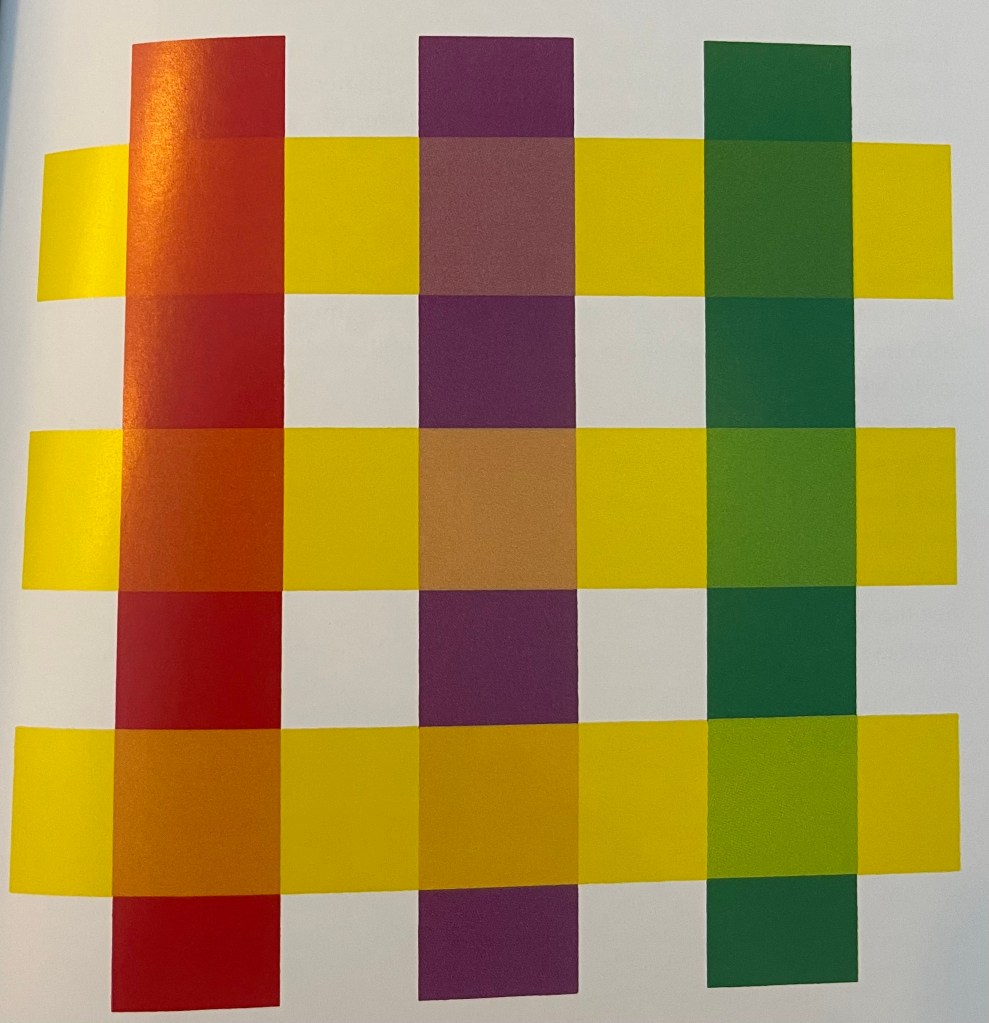
Albers is able to demonstrate that the conscious choice of the colour composition of these mixes can give the illusion of the yellow band passing under or over each strip.
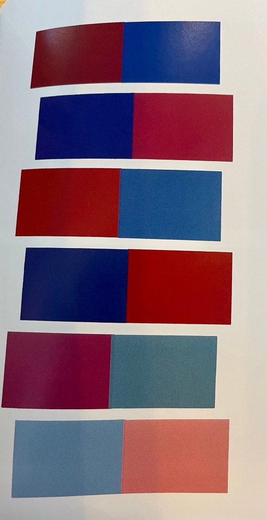
The second example that caught my eye was below: Albers challenges the association of red and blue with “warm” and “cold” by alternating red/blue left/right and right/left pairs below. He asserts that both colours can look high as well as low in temperature with the accompanying explanation that “A reading of all the left halves warmer than the paired right halves is not unreasonable”. You might contest this but it’s certainly an interesting assertion that it’s worth spending time investigating, since it challenges cultural assumptions around colour (in this case warm/cold) which we still hold today.
In all, the book is a pleasure to own, with interesting colour plates to consume, many of which challenge conventional colour theory and others which complement it. I’m no artist or art theorist but I feel my understanding and willingness to question colours can only have improved as a result.

3 Comments