A few weeks ago I was preparing some simple bar charts for a presentation. I was presenting demographic results for three separate cities, so I’d decided to give them each their own colour. But I just sought clarification on the best way to group the data. What I decided to do was something I should do a lot more often, which was to sketch out the possibilities.

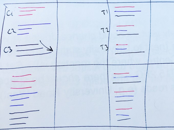
So I came up with two ideas. Assume each colour is a city, and each option is one of three age groups. Do I show the age groups within each city (colour), as has been shown in C1/C2/C3? Or do I split up the colours and show the cities within each age group, as shown in T1/T2/T3?
I thought about my dataviz principles and was pretty clear the former option would be best. But I sought confirmation from my colleague, Guy, next to me. He agreed, keeping the age bands within each city (the first option) was best, and would allow easier distinction of age profiles (hence drawing the arrow). And then, as I turned away to fire up Tableau, he said something along the lines of – “Yes, that’s consistent with Gestalt theory”
Now I’ve churned out a few visualisations and read a fair few books, but had never heard of Gestalt theory. A quick google confirmed them as a school of German psychiatrists in Germany in the 1920s. Immediately this interested me – the multi-disciplinary nature of data visualisation is one of the things that fascinates me. When I gave a presentation at Sheffield University earlier this year, few of my audience had traditional data science or analysis routes into data visualisation. Many came into the field from traditional or digital art backgrounds, some were statisticians, some were students/theoreticians, and some came from altogether different backgrounds. So, is there a link to psychology?
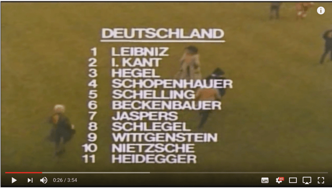
My first look into German psychology was a common mistake – I ended up here. Are principles of data visualisation driven by the great German intellectuals through history? Kant, Schopenhauer, Beckenbauer(!). Nietsche et al?
Wrong – it’s German psychologists I need, not German philosophers.
Gestalt, in German, refers to the principle of perceiving something (or, in our case, visualising something) by considering its individual parts as having different characteristics to the whole. The word itself most closely means “organised whole”.So, you might describe a tree by describing its trunk, its branches, its leaves, its blossom, its inhabitants. But if you were to step back and look at a tree, you would do just that and consider it as a whole, not necessarily the different parts we just mentioned.
Today, knowing I was going to write this blog post soon, I came across this post by fellow data visualiser and friend Eva Murray, who writes about her route into data visualisation via psychology here:
As a direct example of linking an interest in psychology with an entry data visualisation, I’d have put this higher up in the blog. But, she also specifically mentions Gestalt theory, so I’ve now come across this idea twice now in relation to data visualisation. So, perhaps we’re on to something here! Somewhat dauntingly, she mentions that her father studied it at quite some length for three years, so it doesn’t really feel right for me to go into any great detail here, being only a data nerd with access to google. So, while I will go into it a little bit, I strongly encourage you to read, explore or study further if anything whets your appetite.
But given that Gestalt refers to visual perception, it must have parallels in data visualisation. And it seems it does. Six principles are listed below:
- Proximity / Contiguity: – this is the principle shown in the handwritten example above. Things that are closer together will be seen as being grouped together
- Similarity: – things with the same characteristics tend to be seen as being grouped together. Colour is a good example of this – also shown in the example above
- Common Fate: – Things that move together are seen as being grouped together. The most common example of this seems to be a flock of birds: from a dataviz perspective this could refer to animations but also elements which seem to be tending in a similar direction
- Good Continuation: – We can perceive groups such as points in lines even if they are intersected – if two lines intersect in an X form, we see the groupings as two lines crossing rather than four separate identities meeting
- Closure: – we perceive closed shapes as a grouping, or near-closed shapes which we perceive in a group shaped as the whole shape.
- Area/Symmetry: – included for completion, this seems to refer to completely overlapping groups, where the uppermost group is seen as a whole, and the “underneath” group as background.
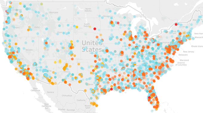
I haven’t backed this up above with any images, as that would just mean copying someone else’s post. But I think it’s important to look at a visual example to understand the principles a bit further. So instead I’ve just knocked up a five minute incomplete viz on a dataset I’m working on, to see if I can see or recognise any of the principles above. Below is a map of police killings in the US from 2013-15. Each circle represents where the killing took place, and each colour represents the victim’s ethnicity.

And straight away, I think I get it. We don’t want or expect people to look at this and see a map of the USA. We see individual states. We see areas rife with crime and we see areas where the victim count is sparse. We see clusters of red and orange packed together in a Florida-shaped wedge, and a light blue mass around about the Carolinas (excuse my geography if I’m a little bit out). We see the proximity of circles forming the shape of California but with less consistency of coloured circles. We see a couple of orange clusters on the Mexican border.
The areas rife with crime – dots packed together – are principle 1 (proximity/contiguity). The colour distribution, whether close together or otherwise, are principle 2 (similarity). Perhaps the mass of red along the east coast of Florida is an example of 4 (good continuation) – a proliferation of black victims (red dots) which we can see despite interspersal of orange (Hispanic) and light blue (white). Principle 5 (closure) – the states of California and Florida are pretty recognisable even though there are small victim-free gaps.
In recognising Gestalt principles at work, it enables us as designers to notice and work on stories in the data. So, I think we can learn a lot from German psychiatry. (Not German philosophers – after all, as any Python fan knows, they lost 1-0 to Greece).

3 Comments