Win a book! I think excitedly of clever words and count numbered different letters carefully. One by one segments form, mostly in Pilish … wait for the upcoming joy of victory!
A few weeks ago, I was excited to read about a new book by Sarah Hart. The book: Once Upon a Prime was to be a book celebrating mathematical connections with literature. This sounded right up my street – as a mathematics graduate I’ve always been a nerdy lover of numbers. And I’ve even been known to write a bit, if you count this blog you’re reading now and this book you may have heard mention of. So the phrase above was conjured up as my entry into a Guardian competition to win the aforementioned book.

The phrase itself might look odd and cumbersome at first, and there will be some context to that in a couple of paragraphs. And, sure enough, if you click on the link, you’ll see I didn’t win the book. But I did get my entry immortalised as worthy of a permanent mention on the Guardian website, which was nice! And, truth be told, I didn’t expect to win. By this point though, my interest had been piqued and I’d already ordered the book.
My posts on this blog have been either posts questioning data visualisation principles, ideas or practices, which you are probably used to by now; or, more recently, posts in the forms of questions posed by a number of data and visualisation books I have read and reviewed in the last couple of years. But recently they have dried up. Since the release of my book, of which I have been immensely proud, my published output has almost stopped. I am visualising less, and those projects I am undertaking, and questions being posed, don’t seem quite so new, so are not making it to the public arena (including this blog). I am reading less, though I do have a number of books I focus on and return to for my newer professional role promoting data fluency. I’ve been frustrated at my slowdown, and lack of creativity, but I’ve learned to enjoy it for just that – the slow down. To celebrate the publication of my book, and to continue enjoying and celebrating the visualisation output of others, which continues to inspire me (even if the quantity and quality of my output says otherwise).
I don’t want this to be a post about how to get out of a creative slowdown, or how to deal with it mentally and tell yourself that it’s totally OK, because it comes to all of us. But inevitably this post is a little bit like that … and, alright then, it’s OK! You can love the field and be immersed in it, whether you are actively participating or not. That’s my takeaway and I hope it’s yours too.
Back to the book, and the competition. I knew already that anything that combined creative ideas with mathematical/number-y concepts would be an inspiration to me (slump or no slump). And I was right! The competition was to create a poem in “Pilish” – one of the many mathematical connections with poetry and literature that Sarah would feature in her book.
Pilish is a word describing text whose word lengths accurately mirror the successive digits of π. We all know π is the famous number 3.14 … (some of us may know it in more details than others). So that means that a Pilish poem or piece of text needs to have three letters in its first word, then one, then four … and so on … and can of course be as long as you want seeing as the number itself is infinite.
But in order to work out my (nearly) winning entry, I actually visualised it. If you write in a Courier New font where all letters are the same width, you are essentially looking at a bar chart of word lengths. If your word is too long or too short for the relevant bar, your Pilish isn’t accurate. But if it perfectly overlays the dataviz, then bingo! Here’s my Pilish entry visualised:

The book is full of examples connecting maths and numbers with the written word – firstly of structures of words, lines and syllables within poetry and literature. We think of a haiku which fits the syllable structure 5-7-5. The rhythm of iambic pentameters, or the rhyming structures of limericks, villanelles, sonnets and more. And of course, to keep on topic with a visualisation with a visualisation blog, any structure with regular rules can be symbolised and visualised. We can visualise such structures with colours, or blocks, or letters to replicate rhyming patterns for example: a sonnet has 14 lines with rhyming structure ababcdcdefefgg.
In addition to word, syllable and line structure, the book then introduces a number of constrained writing styles. I loved the idea of lipograms – entire literary works written to deliberately avoid certain letters, the most famous of which was Ernest Wright’s Gadsby published in 1939 – a 50000 word novel without using the letter “e”. As an analyst and visual person, I am taken immediately in the direction of a histogram analysis: imagine the difference in a histogram of letters used in Gadsby to a histogram of letters used in any other works of literature. Or, better still, don’t imagine – visualise!
I won’t cover everything that the book covered (you should buy it!), but suffice it to say that every introduction of counting, structure, scale, geometry and all things mathematical sparked a different idea or curiosity in me. Particular mention goes to the Oulipo movement of France started in 1960 – a group of mathematicians, authors and philosophers who essentially saw Gadsby as child’s play, and went further into constrained literature. They wrote in palindromes, they wrote lipograms in French (La Disparition, by Georges Perec, is a similar lipogram to Gadsby, but is longer, considered superior, and more difficult to write given that e,è,é,ê between them occur even more often in French than e does in in English), and they wrote with more and more complex constraints leading to a whole repertoire of constrained literature works.
As a further nod to the mathematical wit within Oulipo and constrained writing, their logo is in fact an ambigram. Try turning your phone/laptop upside-down (or standing on your head …)

And, if you are of a certain vintage like me, you will love the throwback to the Choose your Own Adventure books. The author mentions “The Warlock of Firetop Mountain” – a wonderful flashback for me because I received exactly the same book at pretty much the same age in the same year 1982 (apologies, Sarah Hart, if that is revealing your age, nobody wants to be thought of as approximately the same age as I am!).
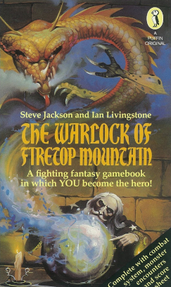
As I continued to read and remind myself of these books, I began to wonder if the topology of these books, with every possible direction readers could take and outcomes they could encounter, would be an inspirational data source for a visualisation, before remembering that Mike Cisneros, a few years ago, had done exactly that. See his phenomenal visualisation here (and click through for the Tableau Public version). Note that this excerpt is only a fraction of Mike’s full visualisation!

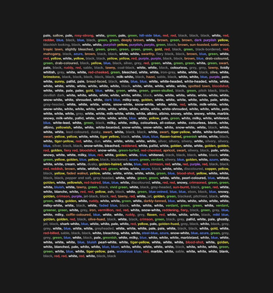
I should also mention Moby Dick, by Herman Melville. The author mentions that inspiration for her book came from the realisation that Melville wrote in precise mathematical terms, specifically including the description of a cycloid. As I looked more into Moby Dick, a novel I was aware of, but ashamed today that I knew only two facts about: (1. It’s about a whale. 2. It begins “Call me Ishmael”), my first action was to buy the book to read, so Once Upon a Prime has already begun to inspire me both to visualise data and to read classic fiction. But the other thing that became apparent was the brilliant minimalistic work from Peter Gorman. I had seen the visualisation below of all the colours from Moby Dick and was inspired to look further into his work:
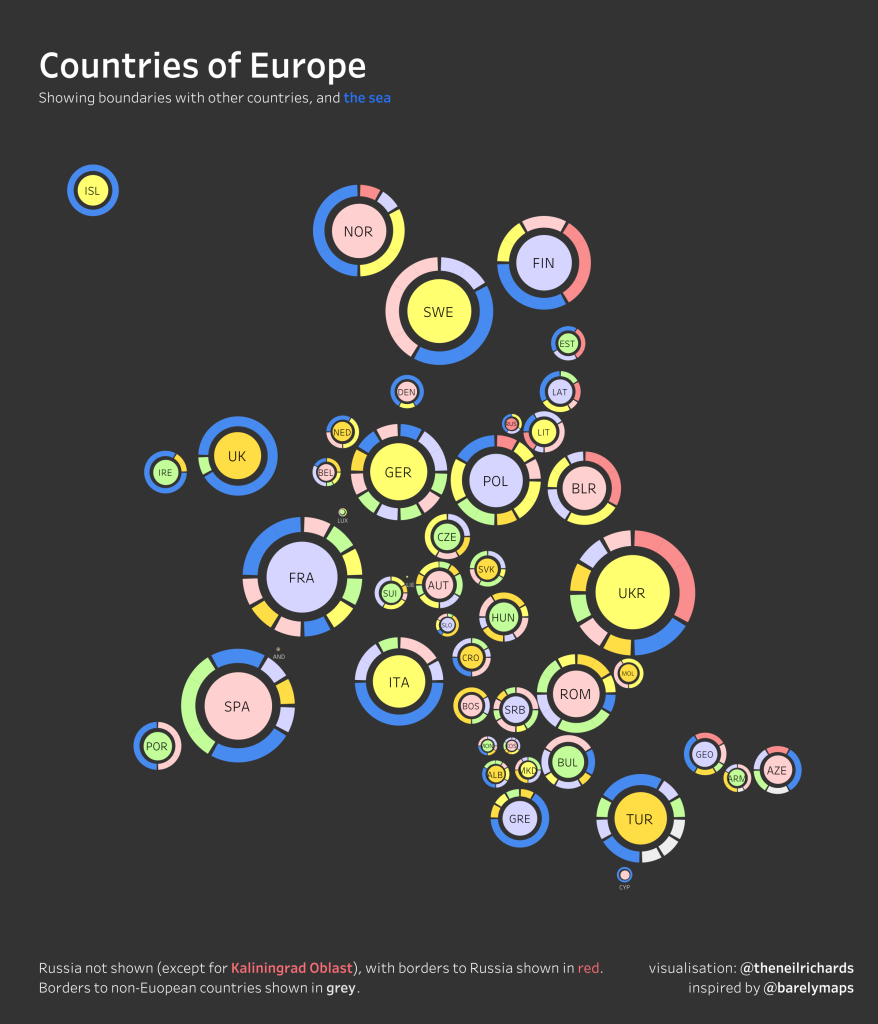
I also knew of Peter Gorman from his minimalist maps collection – as @barelymaps he posts a variety of wonderful simple map ideas. In fact, forgive me the tangent, one of these maps has inspired me recently to create my own new geometrical map style (which readers of this blog will know is something I always love to return to for new ideas). In this case, looking purely at countries and their borders with neighbours, I created the below visualisation, awarded Tableau’s Viz of the Day (my first in over three years!)
Back to Peter Gorman, he has created a collection called Kaleidoscope Brain, of 100 images, all inspired by Moby Dick in some shape or form, all in his inimitable minimalist style. Everything about Once Upon a Prime, and about Peter Gorman’s Moby Dick inspiration, has been pointing me in recent weeks to the fantastic source and inspiration that literature provides for data visualisation projects.
However, I’m not sure I had realised how much, despite this inspiration, that I have already been doing this throughout my non-professional work. I already knew that words, phrases and letters were wonderful data sources and have been using them accordingly, perhaps more than I had realised.
Firstly, before my own examples, I have to nod to Jeff Shaffer. At the recent Tableau Conference in May 2023, while co-presenting with Andy Cotgreave and Steve Wexler, Jeff reached the “Forward Looking Statement” from Salesforce, required to be displayed on screen by all presenters at conference. A wordy, legal slide, there is no chance of reading everything contained, and no assumption that anyone would be interested in it even if they wanted to, but it’s a legal requirement to ensure that everyone knows not to take action based on anything contained in the upcoming talk or speculate on anything revealed for the financial gain of them or anyone else. At least I think it’s something along those lines – I’ve never had time to read it, nor tried to do so. But it’s legal common sense.
Jeff took this text and had fun with it! He visualised it, looked at word and letter frequencies, pulling out the longest words and those with the highest scrabble scores. A great ice-breaker for a data literate audience which bypassed the awkwardness of knowing the screenful of words otherwise had to be shown up there for reasons that didn’t concern the audience. You can check out Jeff’s slides here along with all the other previous videos from previous Chart Chat sections.
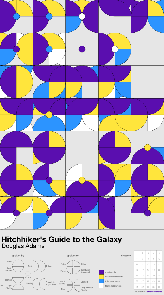
And I realised – this is the kind of thing I’ve always loved to do too. Not so long ago, I created 31 charts here, looking at letters, words, phrases and sentences (even scrabble scores!) from 18 songs on one album. I’ve visualised word counts and story arcs from my favourite work of literature, as well as using (totally unnecessary) conversation counts from the same book as input for a data art piece (below)
And words, when taken out of context as highly disaggregated elements of a larger whole (such as a novel) can also make excellent pseudo-random seeds, which is what I have done when generating Truchet Tiles
So I wanted to use this overall excitement about maths, structure, words, letters and literature, to present a new work to accompany this post. Immediately I thought of Colours of Shakespeare – a work I created a little more recently. Channelling my inner Peter Gorman (though I didn’t realise it at the time), I visualised every colour in Shakespeare’s plays, showing it not as a disaggregated list, but in Marimekko form. But I hadn’t realised that I published this already! Sonja Kuijpers, a long-time friend and inspiration, also suggests using books and literature as your data source, in her Domestika course. My visualisation came from that inspiration – you will probably be able to see other amazing literature-inspired work by her and her students if you follow the link through to that course.
I was particularly pleased both by that work
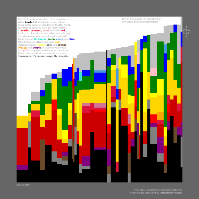
… and by the accompanying sonnet – probably the only sonnet on record to use the word Marimekko in its final rhyming couplet, and perhaps with good reason, which I can justify including here due to its strict mathematical rhythm and rhyming structure!
The Bard’s most oft-scribed colour shade is white,
While black doth also feature close behind
While black doth also feature close behind.
From Merry Wives of Windsor to Twelfth Night,
Extremes of light and dark are what we find.
In scarlet, crimson, coral and plain red,
A vibrant colour theme in shades breaks through.
But what of nature’s verdant shades instead?
There’s less of turquoise, green, azure and blue.
Metallic hues of silver tones and gold
Outshine prosaic yellow, grey and brown.
Orange and purple in rhyme are ne’er told,
And pink completes the colours written down.
These colours with shapes now we must echo …
Shakespeare’s colour usage Marimekko.
OK, it might be self-indulgent to include here, but why not attempt poetry and literature to accompany a visualisation, when it’s the very subject that has inspired your visualisation in the first place?
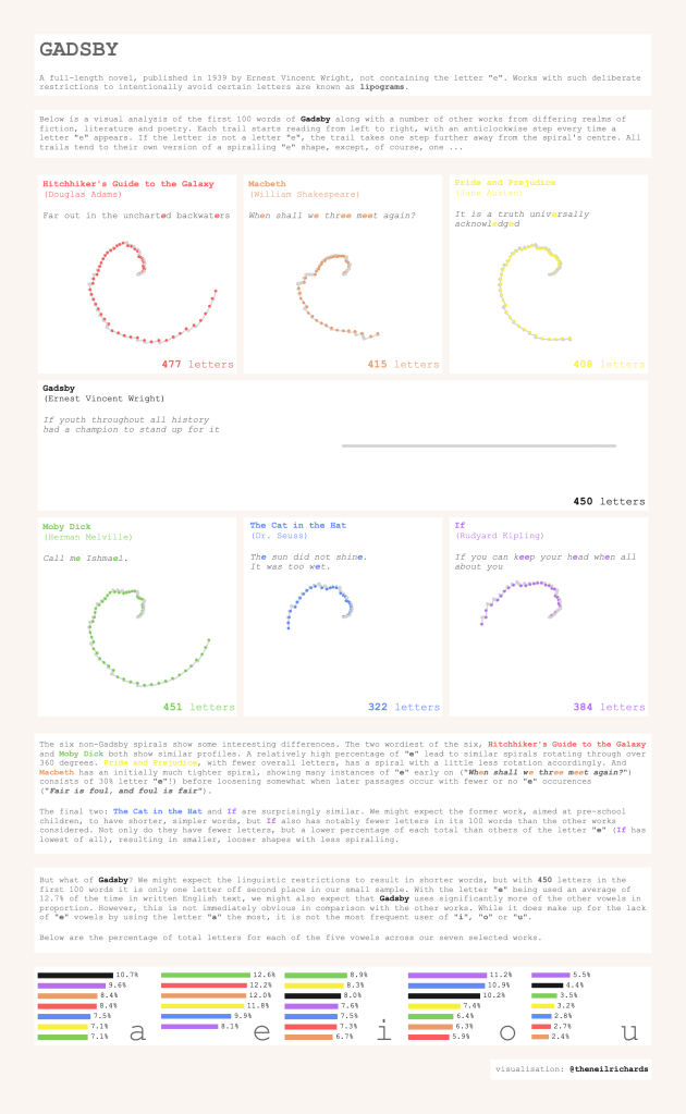
With all this behind me, I still wanted to use the inspiration from Once Upon a Prime to break out of my creative slump and create something brand new, so I turned back to Gadsby. The sheer rebelliousness (or should that be ridiculousness?) of refusing the English language’s most used letter will be shown most clearly when comparing it with other works from poetry and literature. Even within the first 100 words, the frequency differences should be pronounced. So I compiled data (i.e. words) from six other works, looking at frequency of using of E, along with the other vowels. I’m not sure that it showed any insight that we wouldn’t have expected, but using the letter “E” to drive rules for spiralling curves allowed for some creative shapes to emerge that were very different from the flatline of the “E”-less Gadsby.
As with so many of my questions and posts, the route to the answer usually meanders through a long journey of tangents. In this particular case, I learned so much in the process, enjoyed visiting so many new ideas and revisiting previous visualisations, and even downloaded classic fiction on the way. The whole “discussion” (which mostly took place as part of my creative process) didn’t really need to have a conclusion, only an enhanced appreciation of words, numbers, patterns and literature, and the myriad ways they can inspire unconventional data visualisation projects.