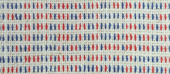
I first wanted to call this post “What is steganography?”. I chose against it, because this post acts as a review of “Record, Map & Culture in Textile Art” by Jordan Cunliffe, a book I have had the pleasure of reading and taking inspiration from. And I didn’t want the subject of this review to […]
Recent Posts
What makes for an engaging encyclopaedia?
The first draft of this post initially had a simpler question: “What is an encyclopaedia?” This first question might seem like a strange question – those of you who are around about my age will know well (albeit those of you from across the pond may debate the spelling). But there are genuinely people, more […]
How do we inspire action through data stories?
This is my review of “Present Beyond Measure”, subtitled “Design, Visualize and Deliver Data Stories that Inspire Action” published last month in Nightingale, the Data Visualisation Society’s online publication, you can find the original review here: https://nightingaledvs.com/present-beyond-measure-book-review/ I first became aware of Lea Pica from a Data Storytelling webinar facilitated by the data training platform DataCamp in […]
How do great visualisation designers think?
Over the course of the last several years of this blog, you’ve got a good level of insight into how I think. But this post isn’t about me – how do great visualisation designers think? This (with the exception of me anglicising the spelling and emphasising the word “great”) is the subtitle and premise of […]
Is it a good idea to enter dataviz competitions?
Once again, this is a post a few months in the making. It’s a topic that often comes up, and a question that can have a number of answers, depending on the type of competition, your own career and circumstances, and other such considerations. Or, like most of my questions, it could have one valid […]
How can you find the creative spark for dataviz?
This post is an impressive piece of procrastination even for me, being over fourteen months in the making, starting from a podcast interview I gave with Alli Torban in November 2022, but I’ve been able to resurrect, rewrite and complete it with the launch of Alli’s new book: Chart Spark. Coinciding almost exactly with the […]
What makes a truly terrible map?
So before you think I’m ending my longish absence on this site by making a grand re-entrance swooping back in with some controversial opinions on maps, this post is my review of Terrible Maps by Michael Howe. I feel like I should address my recent absence on the site, but on reflection I don’t think […]
How can we take dataviz inspiration from literature?
Win a book! I think excitedly of clever words and count numbered different letters carefully. One by one segments form, mostly in Pilish … wait for the upcoming joy of victory! A few weeks ago, I was excited to read about a new book by Sarah Hart. The book: Once Upon a Prime was to […]
How can I be more wise in my use of colour?
This is a repost of my review in the Data Visualisation Society’s Nightingale publication of Colorwise by Kate Strachnyi – you can find the original review here: I was looking forward to reviewing ColorWise by Kate Strachnyi for two reasons. Firstly, Kate is a huge presence in the online data community. In particular, she has grown a strong […]