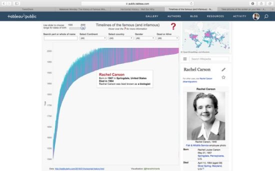
In my last post I led up to a first draft of a timeline chart featuring the lifespans of US presidents. Without further ado, here’s the final version: There were quite a few changes from the previous version, mostly with the addition of bars to indicate number of future and ex- presidents alive at any […]
Tag: timeline
How much labelling should you include in a visualisation?
The inspiration for this post, and for the visualisation(s) accompanying it, comes from two places. One, from my last post, where I considered the importance of white space – when considering every text element, does it really need to be there? The other inspiration was from the latest work from Nicholas Rougeux below: The original […]
How important is clean data?
Kind of an obvious question for this post. Of course it’s important to have clean data. For me, I’ve been involved in the thankless task of producing clean data for the last twenty years, much longer than I’ve been involved in visualisation. This article was one I wrote last year which confirms that most people […]