This is a repost of my review in the Data Visualisation Society’s Nightingale publication of Colorwise by Kate Strachnyi – you can find the original review here: I was looking forward to reviewing ColorWise by Kate Strachnyi for two reasons. Firstly, Kate is a huge presence in the online data community. In particular, she has grown a strong […]
Recent Posts
How do you explain data through story?
I’m always nervous about framing any discussion or blog post around data storytelling. After all, my book has a whole chapter on telling stories in data visualisation, based on previous posts in this blog such as Should every visualisation tell a story? and Should data visualisations always tell a story? (such an interesting subject I […]
What is my greatest influence in writing a book? (or – what are Grandsire Doubles?)
I’ve always wanted to write a book, at least I think I’ve always wanted to. There are lots of reasons: the new challenge, the satisfaction and “legacy” of a physical publication, and, specifically, a productive use of my time during a difficult year or two as I enter the second half of my first decade […]
What is Modular Information Design?
I could have entitled this “How do we visualise complexity?”. But that might have been confusing for two reasons. This post is a review of Visualising Complexity by Nicole Lachenmeier and Darjan Hil of Superdot Studio – a captivating book which is subtitled “Modular Information Design Handbook”. The book systematically and graphically details their bespoke […]
How can I become a numbers person?
This post is an interview with Selena Fisk, author of “I’m not a numbers person” – previously published in Data Visualisation Society’s online Nightingale publication When I came across I’m not a numbers person and learned about Dr. Selena Fisk, I knew that I would be interested in reading the book to help increase my grounding in data […]
What are functional aesthetics?
I mention aesthetics quite a lot in this blog (and in my upcoming book) but not with any great appreciation for what the term might mean, especially when applied to data visualisation. My own definition probably just covers something that looks visually pleasing. But this post reviews Functional Aesthetics for Data Visualisation by Vidya Setlur […]
How do you create a dataviz themed logo and book cover?
In case you missed the news (where have you been?!) – Questions in Dataviz is to become a book, released later this year. If you are wondering, the current status is that the book is written, the manuscript has been reviewed and submitted, and is currently going through copy editing and production. Rest assured, you’ll […]
How do we change how we see the world?
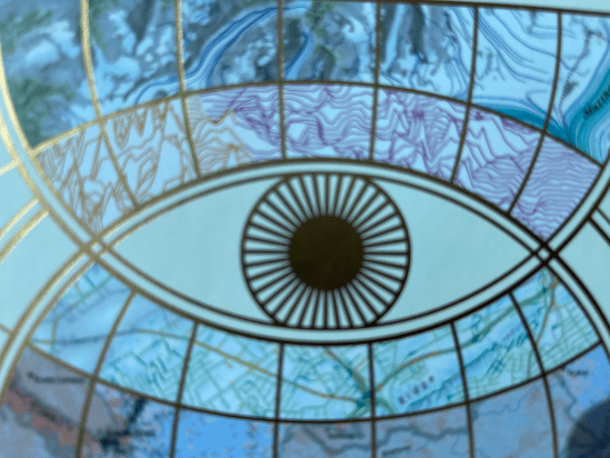
This post is a review of “Atlas of the Invisible” by James Cheshire and Oliver Uberti. Subtitled “Maps & Graphics that will change how you see the world” it’s basically just that. Whether it changes how you see the world, well that’s up to you – but the book is packed full of maps and […]
How can we use comics to tell data stories?
This is a repost of an article in Medium, the online journal of the Data Visualization Society, which you can find here: https://nightingaledvs.com/how-can-we-use-comics-to-tell-data-stories/ This post is a review of From Data to Stories, a book from Richie Lionell and Ramya Mylavarapu of Gramener, described on its front page as, “an end to end guide to Storytelling with […]


