This post is a review of “Atlas of the Invisible” by James Cheshire and Oliver Uberti. Subtitled “Maps & Graphics that will change how you see the world” it’s basically just that. Whether it changes how you see the world, well that’s up to you – but the book is packed full of maps and graphics.
That’s the main joy of this book – it might sound obvious but it’s absolutely packed with maps and graphics. For every traditional or near-traditional map visualisation, there’s a chart that’s either a much less traditional stylised map view, or a chart that’s nothing to do with a map. But what every image does have in common (and there are a lot of images), is that they country or region related information in an eye-catching manner. Because of that it’s a book I love to pick up and browse through. It’s a joy to own, read and take inspiration from, while being very difficult to pin down to a specific genre or description to base a review around. In other words, every time I pick the book up to review it, I browse through, find something different, and get thoroughly immersed in it again, without writing a word!
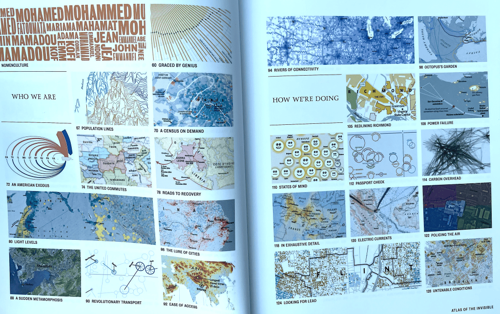
Like a few other books I’ve reviewed, the book has a visual display of contents – like every other book that’s included one of these, I love it! It covers several pages, but below is one of these pages, which does a good job of showing the variety of graphics on option, from those instantly recognisable as maps to those which are alternative methods of displaying geographical information (this is less than half of the overall contents).

There’s a danger when reviewing a book like this that I review it purely from a data visualisation fan’s perspective. And that’s still mostly what I will do, and mostly why I have (and love) the book. But it’s important to appreciate the content and intent of each of the visualisations. The topics covered are wide-ranging, but every chart or infographic aims to uncover information about the earth and the people that live there. The authors don’t just focus on the visuals, but also the importance of the data and stories behind them, bringing them to the attention of their readers – with the heartfelt implication that we, as consumers, not just understand some of the issues, but do something about it. They do this by including enough annotation and explanation with every chart to aid with our understanding. Every graphic might take centre stage but not without the time taken to frame it (literally) within words of explanation.
I probably have about twelve new creative viz and map ideas as a result of this book. But not before stopping to think about the content of many more than twelve of the charts and learning more about the world, its geography, its politics and many important issues. Both of these outcomes are a very good thing!