In case you missed the news (where have you been?!) – Questions in Dataviz is to become a book, released later this year. If you are wondering, the current status is that the book is written, the manuscript has been reviewed and submitted, and is currently going through copy editing and production. Rest assured, you’ll know when the book is released!
But that’s not the topic of this post, which is all about designing a logo and a book cover. In my case, I knew that I had two options – either to accept the book cover that the publisher will create, or to provide my own. The latter idea, to provide my own, was too good an opportunity to turn down. I’m sufficiently excited about the Questions in Dataviz book that I want to give the overall look of the book a unique personal feel. But having made this decision, I faced two major problems:
Firstly, I can’t draw or design. I’ve mentioned this lots of times – I just can’t. No false modesty here, it’s just not a skill I’ve ever owned or nurtured – something I’ve freely admitted many times on this blog. I basically need data, and someone else’s idea. And the second problem is that I really didn’t know what I wanted. It needs have elements of data visualisation, and it needs to be very much “me”, in my style. But what does that actually mean?
So now comes the answer to the question, and it’s a simple one. You get an expert to do it for you. In my case, that meant one person only, I wanted to work with Alli Torban. Alli seemed the perfect choice to me – she represents the perfect crossover between data visualisation and design, having worked as a freelance across both areas. I know how much she likes to represent patterns and tessellations, so her style should be a great match with my own. Here’s an example of an awesome tessellation style visualisation she created for a recent Viz For Social Good project, described as “Tessellated Panoramic Eschertype”!
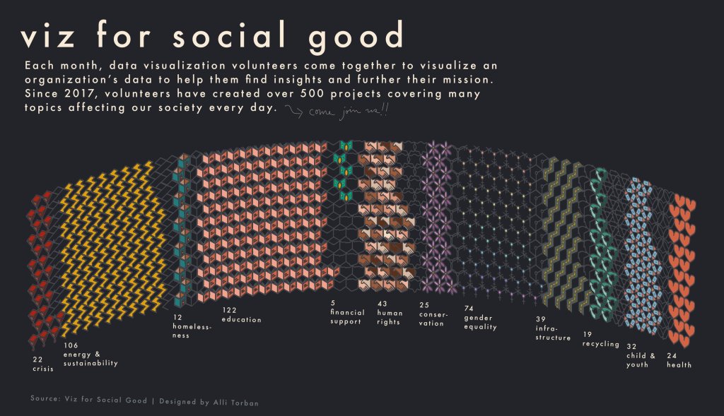
Alli’s brief was not a simple one – it was essentially “Design me a book cover for Questions in Dataviz”. In trusting her with complete creative freedom, I was not giving any assistance as to what ideas or themes I wanted to include. So we worked together to find out the kind of concepts I like. I used Pinterest for the very first time to identify images and patterns that I liked, and Alli used a combination of these images and some of my own data visualisations to find a host of ideas that represented me and my style. I certainly commented at the time that she was able to work with me to narrow down my tastes and visual style to the point that she knew them better than I did!
I admit, Pinterest was took a bit of getting used to, but I soon came up with some ideas. This was my Pinterest board ….
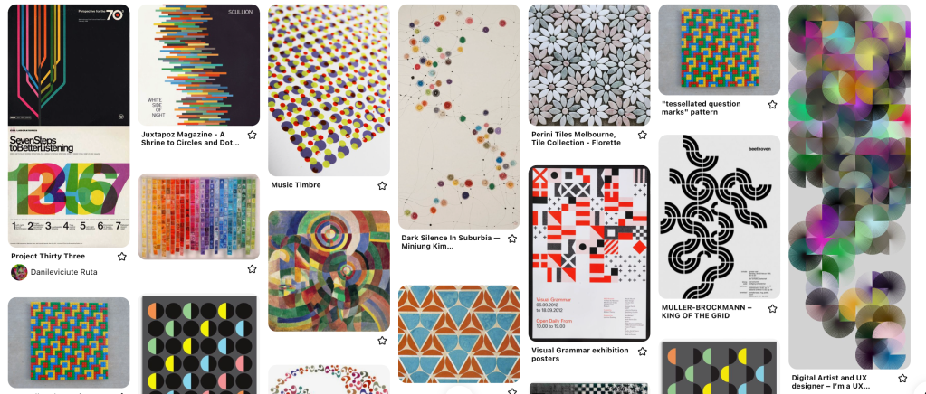
Our next call discussed things that I wound’t even have considered, but really made me appreciate the process further. What drew me to each image? Who is the intended audience of my book? What do you want them to feel when they see the design? No surprise that there are just as many questions in branding and design as there are in dataviz! The overall combination of the images chosen and the thoughts and influences behind the choices were captured in what became my mood board (below). In addition to this, Alli combined ideas from some of my own visualisations, to create mood board ideas and a potential colour palette.
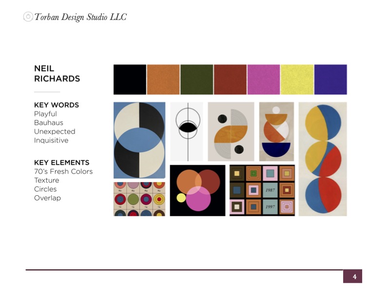
These calls, conversations and exercises had really helped identify what I was looking for, along with examples. These concepts didn’t come as a surprise to me, but the exercise did such a good job of identifying these themes in order for Alli to create her design. I liked bright colours (perhaps in seventies or eighties themed palettes); geometric overlapping shapes; themes emerging from negative space; designs influenced by Bauhaus and vintage 60/70s style (with Helvetica font), and a sense of exploration and fun. And, the unwritten or harder to describe quality, a design that looked like a “Neil” design!
So what’s the creative process? How did Alli get from my conscious stream of vague ideas to a striking geometrical logo that I love, and that is just to my taste? As well as the final design (it’s coming!), Alli produced this fun video to show the design steps from mood board to first draft of the final product – see how the design develops below:
I’m going to go straight to the final design now – this mockup blew me away, and I loved it instantly. It’s an emotional experience to have someone design something for you that represents you and your style, and present it in physical form! The emerging question mark from overlapping circles was such a clean and striking image which will represent the book and the brand. And the blocks of stripes for the spine and back of the book which give it such a unique look on the bookshelf … well they might look like stripes to the untrained eye, but I love the fact that they are constituents of a large stacked bar chart representing proportion of each colour in the logo.
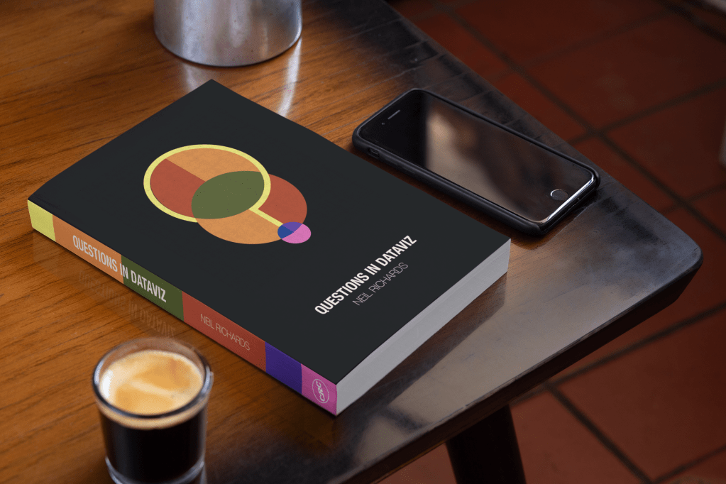
From there we looked at different iterations just to see if tweaks in colour and form would lead to something even better. I was never going to veer far from Alli’s original, since I knew from my own visceral reaction to it that it was the one to choose. But I can’t describe in this blog the delight from seeing the image above for the first time! Looking at three alternatives which considered slightly different colour arrangements and backgrounds, I debated polling my twitter follower what their favourite design was. But rather than that, I asked my wife and two close friends, whose judgement I trust moth, which of three designs they preferred.

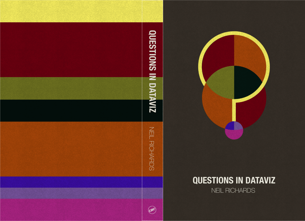
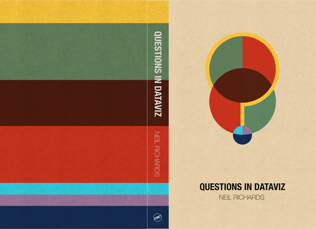
Bad idea … I probably should have seen this coming – I got three different answers! I flip-flopped several times between a favourite once I had everyone’s feedback, but ultimately the combined feedback told me one thing. All three of them are good combinations that work well, I just needed to choose one, and stick to it.
With final design chosen (I preferred the middle logo and background), we had not only a book cover design, but a brand logo and a complementary stripe colour scheme which works perfect for social media backgrounds. Having a clear design allied to a concept of something I can now visualise (no pun intended) as a physical object has made me all the more excited for the launch of the book this year. Watch this space!
2 Comments