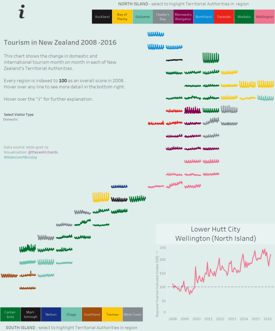
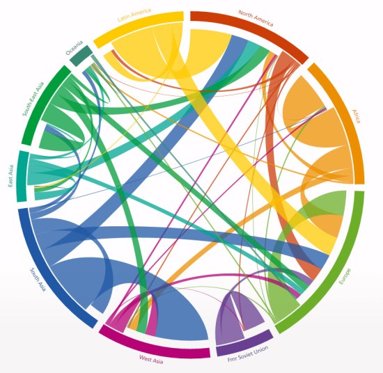
At the start of the year were a lot of tweets, messages and blog posts covering predictions in data visualisation for the year ahead and people’s own resolutions for what they might do in a new and different way this year to develop their skills, experience and exposure. Personally, I ducked out of that approach, […]
Category: Uncategorized
How did I create the spiral chart?
Jump, Darn Dolt! My latest visualisation is the spiralling chart below this paragraph, showing all the tweets of a certain dolt in anagram form who I don’t want to give any more publicity than he already craves, part of the Makeover Monday project. I’ve been toying with a spiral chart for a while (for example, I […]
Exploratory or Explanatory?
Today’s question is all about how much explanation should be included with a visualisation. In terms of your overall look, should you clarify, or simplify? It’s a topic that often comes up in visualisations, and I think it’s one I don’t always get right. Earlier this week I revisited an idea I had following the […]
What were my data visualisation highlights of 2016?
I’ll be honest – I don’t for a minute believe I have the standing, expertise, or width of knowledge and experience to comment on data visualisation generally in 2016 (or, similarly, to make predictions on future developments for 2017). But 2016 was an eventful year in my progression into the field of data visualisation. So […]
What does data visualisation have in common with psychology?
A few weeks ago I was preparing some simple bar charts for a presentation. I was presenting demographic results for three separate cities, so I’d decided to give them each their own colour. But I just sought clarification on the best way to group the data. What I decided to do was something I should […]
Is there a place for chord charts in data visualisation?
I have a number of dataviz questions I still want to cover, but this has usurped a few others and moved right to the top of my list for the moment. The debate focuses around this chart here, published at http://www.global-migration.info/ You can probably skip to the concluding statement of this post (which I haven’t […]
What did I learn from Tableau Conference 2016? (part 2)
Part 1 was posted a few days ago here, featuring numbers 1-8. We’ll jump in at number 9. 9. Tableau is moving into data preparation. With the announcement of a three-year roadmap followed by the developers on stage, Tableau announced a raft of new features large and small. These are all well documented now in […]
Why don’t people tell the truth?
I don’t want to make this too emotive – I’ve already toned down the title from “Why do people lie?” But, why indeed? There are probably a thousand psychological reasons but I’m asking in just one specific context: opinion polls. I’ve often said that it’s impossible to be interested in data visualisation without taking an […]
What did I learn from Tableau Conference 2016? (part 1)
Last week, I had the great fortune to attend Tableau’s yearly conference, in Austin, Texas. In the interests of disclosure, I should say that my entry was paid for by Tableau, as winner of an entry competition. With so many sessions to attend, things to learn, speeches to hear and people to meet, I’ve tried to […]