It’s probably not ironic that I’ve changed and rewritten the overall title of this blog post probably a dozen or more times. It’s true that the theme for this blog is that each title poses a question, so that’s a very specific (and probably unnecessary) restriction. But I’ve had many other stabs at this title, […]
Author: Neil
So, what’s the point?
Another blog post – another question. But this one might suggest that I’m losing my love of data visualisation. Losing the momentum that drives me to produce lots of work. An introspective question it might be, but don’t worry, it’s not an exasperated cry for help. Let me explain. Earlier this year, not for the first […]
Where is the joy?
I haven’t gone all contemplative on you for this post, nor am I channelling my inner Black-Eyed Pea, but instead this is a post about the recent phenomenon of the Joy Plot. And it’s fair to say it’s resulted in a bit of a division of opinion. Those who know the derivation of the Joy […]
What is the best choice of background colour?
This week I began work on a Wimbledon-themed viz. I’m sure when I started this blog I had a stubborn determination not to use the word “viz”, rather to use the full term “visualisation” wherever possible. But I have a feeling it didn’t pan out that way, and given my propensity to veer off-topic, anything […]
So, what were the chances of that?!
This weekend (I’m writing this on a Tuesday evening) there’s the deadline for entering the second feeder contest for Iron Viz. Iron Viz is one of the highlights of every Tableau Conference, where three winners of the feeder contests perform on stage in front of 12000 or so people to produce an amazing viz in […]
Why do we visualise using circles?
I should clarify – if the books of Tufte and Few are your visualisation bibles then you may not enjoy this post. Rightly so, the two authors I’ve just mentioned are seen as the foremost proponents of the field of creating professional, analytical dashboard visualisations. But for those who enjoy data visualisation as data art, […]
Do we publish visualisations just for the attention?
A week or so ago I wrote three-quarters of a blog post about this, inspired by the attention that my Africa tile map viz was getting. I ran out of time and “parked it”, heading off to the Tableau Conference in London To summarise my first (unpublished) post: I compared a data visualiser publishing her […]
Which shapes work well with tile maps?
Last year I posted about tile maps and the fun I had devising one for Africa in particular. My approach up to that point was simple – just devising a square grid, basically based on graph paper and an atlas. Or at least the slightly more up to date version of rows/columns in Excel and an […]
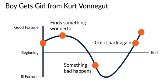
Should data visualisations always tell a story?
I feel a bit of a fraud asking this question. It’s been asked, debated, blogged and further debated many times before. You can get opinions on the subject from people with much more experience in data visualisation than me. For example: Cole Nussbaumer Knaflic, Alberto Cairo, Jon Schwabish, Georgia Lupi, Chad Skelton, Sophie Sparkes, Robert Kosara […]


