Anyone who becomes involved in data visualisation will become interested in colour palettes. We know the importance of colour from a best principles perspective and from a cultural perspective – it’s something I wrote about right at the start of this blog (was it really nine years ago?!), which formed a crucial chapter of my book and the subject of many of my talks. And by extension, colour palettes become a key consideration.
In fact, my most popular visualisation ever in terms of Tableau Public views is not one of the many creative, rule-bending visualisations that I have enjoyed making and featuring over the years, but a simple visualisation featuring 100 colour palettes derived from 100 photographs with their hex codes for easy import into Tableau (the work deriving the colours themselves was all done in the original article on the Canva website). The only trademark nod to my style is the 10×10 grid – I still managed to make a small multiple grid visualisation out of a practical viz about colour palettes!
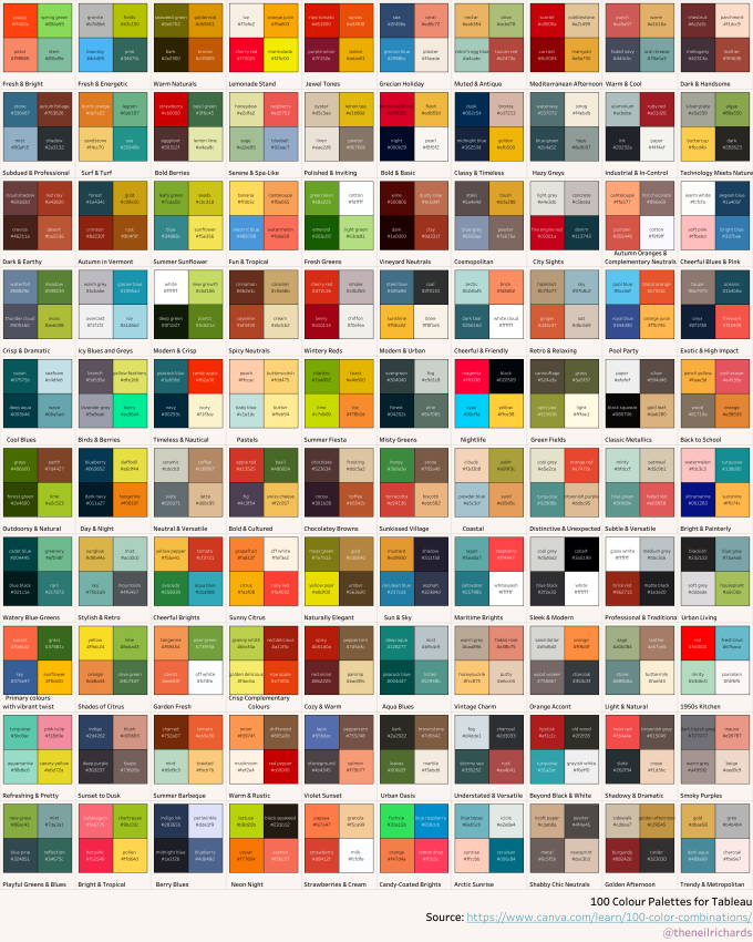
Indeed there are many ways via many websites to derive inspiration from colour palettes, such as https://www.canva.com/colors/color-palette-generator/, https://color.adobe.com, https://coolors.co to name but a few. These all come highly recommended by me. But that’s not what has inspired this article.
It was while browsing online for inspiration recently that I came across a collection of colour palettes that really caught my eye. Unlike my 2×2 squares, these colour palettes were 10×10 grids of 100 squares. You could consider them as colour palettes and waffle charts combined, but not waffle charts in the traditional sense as we know them (by which I mean the squares are not sequentially filled from 1-100 top left to bottom right as would usually be the case in a data visualisation). These palettes were all created by Emily Noyes Vanderpoel, published in 1901. This was a lot of exciting new information to investigate!

The image above shows 18 of these colour palettes. Further investigation shows they were all published in a book called Color Problems, featuring no fewer than 117 coloured plates. Naturally I couldn’t resist, and now have the book for inspiration (a modern reissue from 2018). Note that if you’re interested in the book yourself, as well as the usual online retailers, the book, given its age, is freely available in PDF form at the Internet Archive here:

It’s a book that most data visualisation students or practitioners are unlikely to own, so I won’t expand this post into a full book review, other than to emphasise that the book is a joy to own and read, knowing that a lesser known female watercolour artist was responsible for such an eye-catching book on colour theory which pre-dated the Bauhaus movement and the likes of Josef Albers
Vanderpoel writes elegantly, immediately equating colour to the “music of light”, and keen to make her work accessible to all. As seen in the preface below, she wants to avoid books that are “too theoretical to be easily understood”, appealing to the likes of lithographers, florists, dressmakers and more.

Introducing topics we take for granted in our colour understanding today, such as colour blindness, and explaining the concepts of hues, tints, saturations as an integral part of colour theory in determining contrasting and complementary colours, it would not be out of place in 2025.
But back to those striking colour palettes. Of the plates included in the book, there are over fifty standalone colour palettes such as those shown above. Here’s one such plate in full – all featuring 100 mosaic squares (often somewhat jittered) in different shapes and arrangements, with the percentage breakdowns of each colour (i.e. the number of squares) totalled underneath to add to 100. Shown is a colour breakdown from a brightly coloured panel of the Alhambra, but many of the colour breakdowns are from more prosaic objects such as Egyptian mummy cloths or an antique Persian rug. She explored historical artefacts from many global cultures in order to create the collection of colour analysis plates.

By this point I knew what I wanted. I wanted to create a something that looked like a Vanderpoel colour palette. There were two ways I could do this – either find a way of breaking down colours from images or objects and visualising their proportions, in the same way that Vanderpoel did, or use these palettes as inspiration for visualisation output, while populating the visualisation with data from anything that takes my fancy that best fits these kind of colour breakdowns. This would be back to my favourite theme of Design Driven Data!
Sometimes you have to acknowledge that your first ideas have already been done – and to a better standard than you could possibly have done yourself. If I wanted to break down colour proportions from an image or object, how might I convert an image into a Vanderpoel-style palette? Fortunately this has already been done – Liza Daly has created the wonderful Vanderbot, which can be found at https://colorproblems.art via her personal page https://lizadaly.com – a portfolio with many other fascinating images and articles inspired by art, text and fiction.

The above output from the Vanderbot is an analysis of my Questions in Dataviz book cover – broken down into its six main constituent colours, beautifully aged, jittered, and styled as if it were a plate in the book. It does a great job on any photo or artwork of creating similar plates.
The last stage of the journey was to create my own Vanderpoel style waffle chart and choose some data to include. I wanted six to eight colours, with fairly irregular breakdowns that can be compared from palette to palette (waffle to waffle). I first considered cricket scores (as I so often do), as I was fortunate enough to attend the India vs Women T20 cricket international in Nottingham that day. But these waffles by definition show percentages – figures that need to add up to a 100% whole. Cricket doesn’t lend itself to percentages, but absolute figures. And there are eleven players on a team … it doesn’t bode well, so I’ll have to visualise Smriti Mandhana’s magnificent winning century another way, another day. My first attempt looked at possession stats from Switzerland vs Norway women’s football, but I eventually settled on Wimbledon tennis matches, visualising breakdowns of points won.
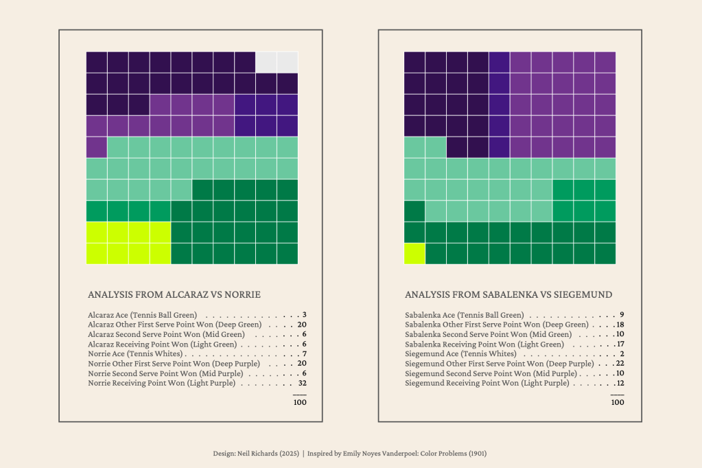
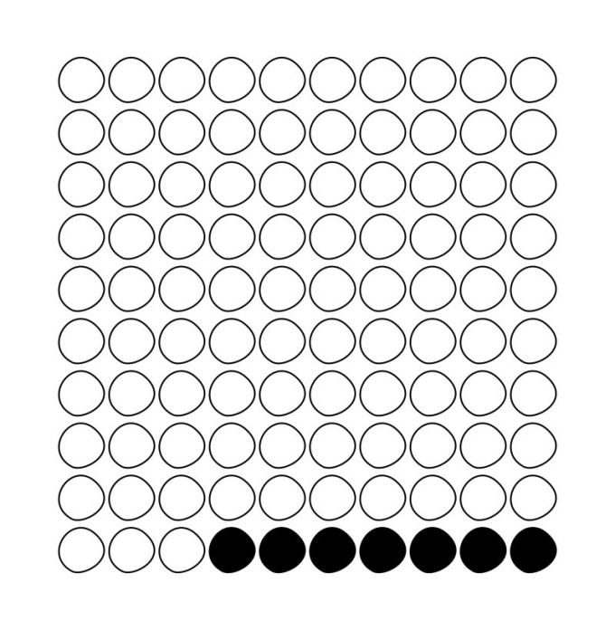
It was only as I finalised these visualisations that I came across a Linkedin post from Hannah Kunde, a freelance data visualisation trainer from Germany, on the effectiveness of visual arrays in representing proportions, particularly percentages. Citing an article by Gaelic et al. from 2009, she asks “What does 7% look like?” which can be hard to grasp especially if considering how many out of 1000 that would represent. Visual arrays are helpful and appealing ways of displaying percentages in particular, and were shown in the study to be a significant help to understand risk levels when reporting medical risk. Seeing, for example, seven elements coloured/highlighted in a grid of 100 “makes the proportion instantly visible, with no calculation needed.”
And so, regardless of my own level of numeracy and data literacy, I think that’s why these Vanderpoel palettes appealed to me so much. It also agrees with Nadieh Bremer’s ethos, detailed in Chart Chat, of the appeal of something slightly out of the ordinary in order to be more memorable and eye-catching – if we contrast the two palette-inspired tennis charts to a pair of stacked bars, or pie charts, for example.
If you’ve got this far, you’ll realise that it wasn’t the colours of palettes in a traditional sense that has inspired these questions and my latest design driven data inspired creations per se. It’s the actual design layouts of the palettes themselves. Ten years into this blog, and ten years into a journey of finding new inspirations, new ideas, and new questions, continue to present themselves all the time to me.
