This question might be a pretty broad subject, and a pretty ambitious one to answer. But in fact, the answer is simple – you read “Better Data Visualizations” by Jonathan Schwabish. This post is a review of that book – recently released with the subtitle: “A Guide for Scholars, Researchers and Wonks”, continuing my series […]
Tag: line chart
Is white space always your friend?
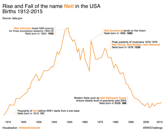
Today’s blog post focuses around a visualisation challenge set by Cole Knaflic, author of the seminal work Storytelling with Data. This year she is setting a monthly challenge, with the first challenge set out here The challenge is simple. Using any data you care to source, create (and share) an annotated line graph. As is […]
What were my favourite visualisations of 2017?
As promised, part two of my review of 2017 focuses on my favourite six visualisations I created in 2017. I’m not overly comfortable about self-promotion and am having second thoughts about showing these, but I think it’s inevitable that blogs should be a combination of learning, sharing and self-promotion so as to get the maximum […]


