This weekend (I’m writing this on a Tuesday evening) there’s the deadline for entering the second feeder contest for Iron Viz. Iron Viz is one of the highlights of every Tableau Conference, where three winners of the feeder contests perform on stage in front of 12000 or so people to produce an amazing viz in […]
Category: Uncategorized
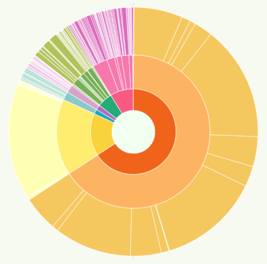
Why do we visualise using circles?
I should clarify – if the books of Tufte and Few are your visualisation bibles then you may not enjoy this post. Rightly so, the two authors I’ve just mentioned are seen as the foremost proponents of the field of creating professional, analytical dashboard visualisations. But for those who enjoy data visualisation as data art, […]

Do we publish visualisations just for the attention?
A week or so ago I wrote three-quarters of a blog post about this, inspired by the attention that my Africa tile map viz was getting. I ran out of time and “parked it”, heading off to the Tableau Conference in London To summarise my first (unpublished) post: I compared a data visualiser publishing her […]
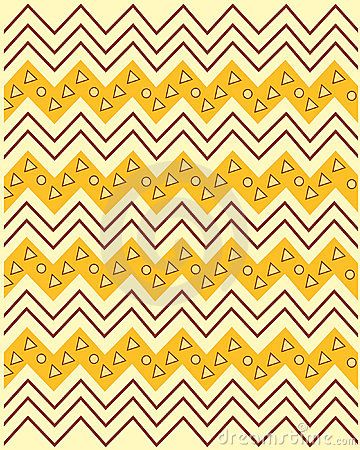
Which shapes work well with tile maps?
Last year I posted about tile maps and the fun I had devising one for Africa in particular. My approach up to that point was simple – just devising a square grid, basically based on graph paper and an atlas. Or at least the slightly more up to date version of rows/columns in Excel and an […]
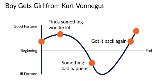
Should data visualisations always tell a story?
I feel a bit of a fraud asking this question. It’s been asked, debated, blogged and further debated many times before. You can get opinions on the subject from people with much more experience in data visualisation than me. For example: Cole Nussbaumer Knaflic, Alberto Cairo, Jon Schwabish, Georgia Lupi, Chad Skelton, Sophie Sparkes, Robert Kosara […]
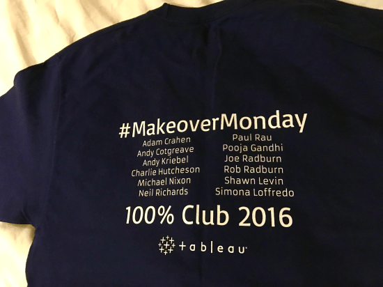
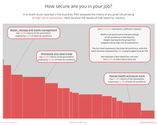
Why have I stopped contributing to Makeover Monday?
It’s difficult to be a regular contributor of Tableau data visualisations online via Tableau Public without knowing about the excellent Makeover Monday initiative. For those who aren’t aware of it, I penned an ode to it last year. As last year continued, I posted a contribution every week, from the simple to the complex, learning […]
What is a Marimekko chart (and when should you use one?!)
If you’ve read previous blog posts, you’ll know that I’m a fan of different and unusual chart types. If the chart types are visually interesting and striking, but don’t necessarily follow visualisation best practices, then, for me, sometimes, so much the better! I’ve blogged about, and attempted, sunburst charts, radial bump charts, bump charts, spiral […]

How do you visualise chess games?
There are lots of ways you can interpret this question. As someone who asks and answers lots of data visualisation related questions, and themes an entire blog around it, I’ll touch on a few of them. Sorry about that … First of all, chess is a battle game between two armies. So you could say […]
Who are my data visualisation inspirations?
I wanted to write a post about my inspirations in data visualisation. First of all, I feel a little bit uncomfortable citing inspirations, not because I feel uncomfortable expressing praise to others, but because I feel that as someone so inexperienced in the field, you might think that I am eliciting comparison. Please don’t think […]
