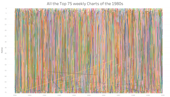
It’s difficult to be a regular contributor of Tableau data visualisations online via Tableau Public without knowing about the excellent Makeover Monday initiative. For those who aren’t aware of it, I penned an ode to it last year. As last year continued, I posted a contribution every week, from the simple to the complex, learning […]
Author: Neil
What is a Marimekko chart (and when should you use one?!)
If you’ve read previous blog posts, you’ll know that I’m a fan of different and unusual chart types. If the chart types are visually interesting and striking, but don’t necessarily follow visualisation best practices, then, for me, sometimes, so much the better! I’ve blogged about, and attempted, sunburst charts, radial bump charts, bump charts, spiral […]
How do you visualise chess games?
There are lots of ways you can interpret this question. As someone who asks and answers lots of data visualisation related questions, and themes an entire blog around it, I’ll touch on a few of them. Sorry about that … First of all, chess is a battle game between two armies. So you could say […]
Who are my data visualisation inspirations?
I wanted to write a post about my inspirations in data visualisation. First of all, I feel a little bit uncomfortable citing inspirations, not because I feel uncomfortable expressing praise to others, but because I feel that as someone so inexperienced in the field, you might think that I am eliciting comparison. Please don’t think […]
What can be achieved by collaboration?
At the start of the year were a lot of tweets, messages and blog posts covering predictions in data visualisation for the year ahead and people’s own resolutions for what they might do in a new and different way this year to develop their skills, experience and exposure. Personally, I ducked out of that approach, […]
How did I create the spiral chart?
Jump, Darn Dolt! My latest visualisation is the spiralling chart below this paragraph, showing all the tweets of a certain dolt in anagram form who I don’t want to give any more publicity than he already craves, part of the Makeover Monday project. I’ve been toying with a spiral chart for a while (for example, I […]
Exploratory or Explanatory?
Today’s question is all about how much explanation should be included with a visualisation. In terms of your overall look, should you clarify, or simplify? It’s a topic that often comes up in visualisations, and I think it’s one I don’t always get right. Earlier this week I revisited an idea I had following the […]
What were my data visualisation highlights of 2016?
I’ll be honest – I don’t for a minute believe I have the standing, expertise, or width of knowledge and experience to comment on data visualisation generally in 2016 (or, similarly, to make predictions on future developments for 2017). But 2016 was an eventful year in my progression into the field of data visualisation. So […]
What does data visualisation have in common with psychology?
A few weeks ago I was preparing some simple bar charts for a presentation. I was presenting demographic results for three separate cities, so I’d decided to give them each their own colour. But I just sought clarification on the best way to group the data. What I decided to do was something I should […]