The title for this question comes from the subtitle of the next book in my series of reviews. In fact, the full text reads “How to use data visualization (sic) to make better decisions – faster“. The spelling is a clue that this is a book from a leading US expert, and indeed this is a review of Steve Wexler’s book, The Big Picture, released last year in 2021.
Right from the start, Steve makes it clear that this book is different. The first page of the introduction states that “The Big Picture is for the 99 percent of business professionals who don’t create data visualisations, but who need to be able to decipher, understand, and see the value of charts and dashboards if they are to survive, let alone thrive, during the never-ending data deluge.” In other words, the book is aimed at chart readers, not chart creators. Steve himself describes himself as a professional “chart looker-atter”. So my first plan was to ensure that my review was with the intended audience in mind.
But I struggled with that, because it’s not the reason I bought the book last year. I bought the book to improve my own chart-creating skill and to learn valuable lessons from the author. And it’s not just me, I know of many other people who have bought the book, either people at work, or in my wider professional network. In every one of those cases, we are talking about chart creators, not chart looker-atters. And if you’re a reader or follower of this blog, the chances are that best describes you as well. In other words, I am firmly within the “bubble” of the 1%, not the 99%. So I hope Steve will forgive me for pandering to my fellow 1%-ers instead, and that there are 99 other equally thoughtful reviews to counterbalance this from the point of view of the intended audience.
Moving away from who should be reading and benefitting from the book most, the book itself is a delight to read. Each chapter is packed full of example which explain many different chart and dashboard types, showing simple examples of each chart done well, as well as examples of charts done not so well. Indeed, readers of a previous book co-authored by Steve Wexler: the Big Book of Dashboards, will be familiar with the “scaredy-cat” – a red flag indicating chart types or practices to avoid.
Throughout, it became clear to me that there is great value to be learned from every chapter from the point of view of a chart creator, with the focus always being on how you can create better charts and visualisations in order for you readers to understand your output, and hence “make better decisions – faster”.
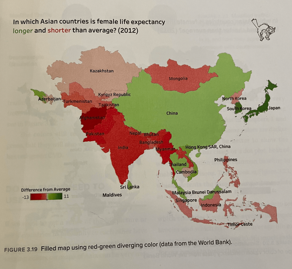
The introductory chapter contains instructive examples on exactly why we visualise data, followed by chapters advising on the importance of choosing proper chart types for best understanding, using colour wisely (see above), and the biggest chapter of all, focusing on chart types you should know (and love, or loathe). As a spoiler, my own upcoming Questions in Dataviz book makes use of one such example from the introductory question where I consider the advantages and disadvantages of different shapes. I’ll include the example below, an updated version of the results included in the book:

The upshot is that, even as a business dashboard designer, you are not constrained to bar charts, but have. a wide range of chart types available if done simply, well, and with adequate explanation, offer a wide portfolio of visual examples to better help your readers see their data. The book therefore acts as a great reference full of simple instructive examples.
And that’s where I make no apology for the framing of the review – whereas chapters may start with the focus on the (chart-) reader understanding the chart, in order to improve their own data literacy (or graphicacy), in reality it works equally well as a primer for chart designers. Understanding starts with the designer – design your charts well, and with understanding, and your readers will have the best chance of understanding your chart, improving their own data literacy, and making great decisions based on your graphics. A lover of food will enjoy a great meal – but if that meal has been expertly prepared by a great chef, they will love and appreciate it even more. Without wishing to stretch the analogy, I see this book as more of a cookbook than a menu – it may not go into great detail of every recipe (so it doesn’t tell you technically how to make every chart), it does at least give you all the tips needed to make a great meal, and the reasons behind every one of those expert tips. And it shows you that not every meal has to be a cheese sandwich! (OK I’m done with the analogy now).
Fittingly, the final chapter is full of charts that have been curated that are known to have made a difference – to help their clients make great data-driven decisions. This chapter serves as great validation (as if it were needed) – our charts make a difference and they cause a reaction in our readers, allowing them to make data-driven decisions.
Finally, in trying to describe the content and its suitability for visualisation practitioners as well as consumers, one thing I haven’t focused on is just how easy and pleasurable it is to read. I should add that I know Steve and attend any talks he gives or courses he delivers at any opportunity. This is in part through his expertise and in part through his easy-going, friendly manner and the wit with which he delivers his knowledge. And this shines through in every chapter – reading this book is like attending a presentation, or like sharing a joke and a conversation with him. That’s a good enough reason for anyone to enjoy this book, whether you’re a creator, a looker-atter, or both. But if you need another reason, remember I said “I bought the book to improve my own chart-creating skill and to learn valuable lessons from the author.” – if you bought the book with that specific intent too, you won’t be disappointed.
