There’s certainly nothing cryptic about this post’s title – it’s a review of Visualizing with Text, by Richard Brath. As explained on the back cover, the book “uncovers the rich palette of text elements usable in visualizations from simple labels through to documents.” One of its claims is “Eight new approaches to data visualization leveraging text.” And I was excited to buy this book, knowing it would be a great reference for, well … visualizing with text.
I’ve had this book since early last year and moved this book a little further down my “to do” list of books to review and generally found it quite hard to review for one main reason. And that’s the fact that it contains absolutely anything you could possibly think of to do with text and visualisations. A fact that makes it very hard to define in two or three categories and to structure a concise book review around, but, equally, a fact that makes this a brilliant book and an exhaustive resource on all things text and dataviz.
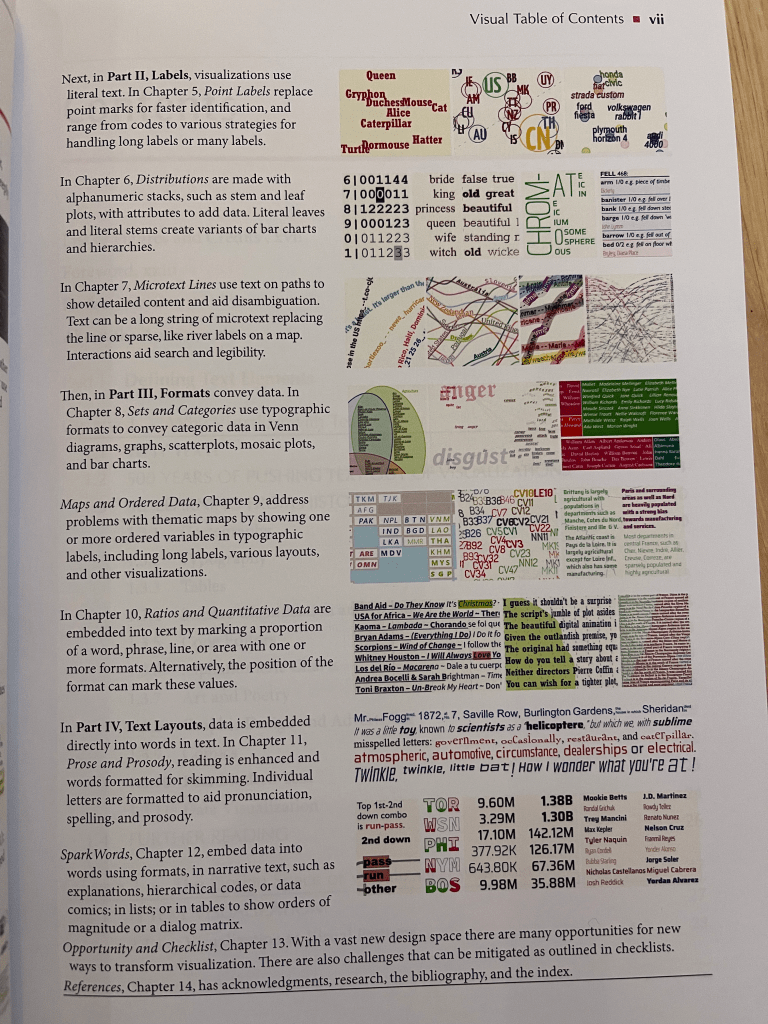
Possibly one of my favourite pages was a visual display of contents. I love this idea – one I first saw (and commented on with delight) when reviewing Manuel Lima’s The Book of Circles. Here you can see part of this page of contents, and this in itself should be enough to hint at the wide range of content.

The book starts with a historical section, followed by a sufficiently detailed background in typography and layout, considering the main ways that text might be incorporated within visualisations: literal data, typographic qualities, visual attributes, alternative layouts, and interactions. But once again it’s hard to pin this book down to “just” certain elements of working with text, as it swiftly moves into the myriad opportunities for visualising with text.
Our contents image above then kicks in. Text as labels is an example-packed chapter of just that (where our text is doing the job of the main point label) and in looking at the Distributions chapter, this time our text replaces the function of the actual bar or shape mark that’s encoding our metric. In other words, we’ve got text that looks like scatterplots, tile maps or bubble charts, followed by text that looks like bar charts or area charts. And the book is never short of examples, often showing several individual separate examples where a lesser book would just use one. Next, microtext lines are a fun chart type – here we’re using text as the line in a line chart.
We move onto text formatting as a type of encoding, followed by more examples of text encoding to represent geographical areas (maps!). And as we move through using text to display ratios and different layouts, we then come across “spark words” – including any number of the above methodologies where text is manipulated to facilitate the understanding of that text (for example using font weight as an encoding for city size).
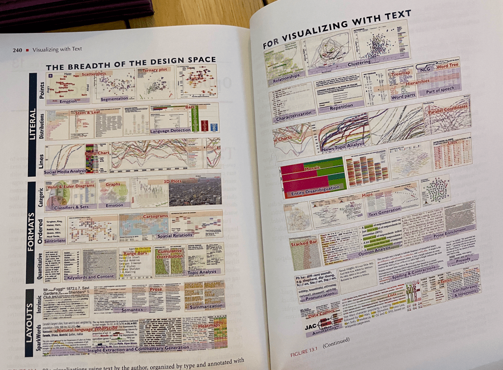
I feel I haven’t done a great job of reviewing this book other than to convey the breadth and depth of text-related information in the book and my own pleasure at browsing through and having this great reference to hand for all things text and visualisation. But though my thoughts are disjointed, the book does a better job than I do at bringing everything together with a detailed taxonomy of all discussed uses of text in visualisation. I show it here, knowing that it’s not clear, but as an illustration of its variety and its completeness.

If you need or want a clearer version and full detail of all the innovative ideas with visual examples (and, who doesn’t?!) then I highly recommend this book.