Last week, I had the great fortune to attend Tableau’s yearly conference, in Austin, Texas. In the interests of disclosure, I should say that my entry was paid for by Tableau, as winner of an entry competition. With so many sessions to attend, things to learn, speeches to hear and people to meet, I’ve tried to narrow down to a few key points. I failed, there are lots. Here are the first few of a two-parter, in no particular order:
1. Write the book you want to read / Write what you want like
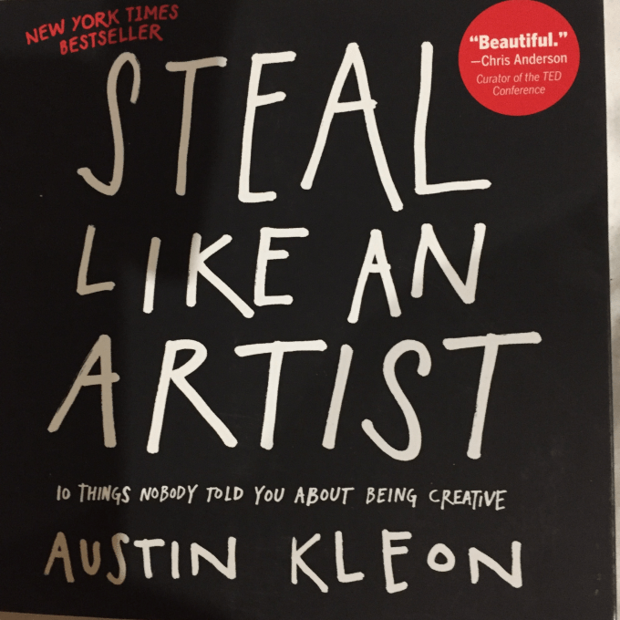
This learning is the only one that is in a particular order, because it came from the plane journey. A couple of weeks ago, I recommended the concept of “Steal like an artist” – in doing so I obliquely referenced Austin Kleon’s book of the same name. It felt right that I should go one step further and actually read the book, so I purchase the book to read on the plane. I can thoroughly recommend the book for anyone who wants to think creatively in making data visualisations. The author is a creative person, an artist, who, by coincidence, lives in Austin, Texas, so reading the short book from cover to cover really gave me the mindset for the conference and upped my excitement level from day zero.
The quote I’ve chosen is simple – in looking to make an interesting and creative visualisation, think of yourself as the audience. The advice “Write what you like” is in direct contradiction to the usual mantra of “Write what you know” which is crossed out in the book. As an example, in traditional writing, you will write something much more creative and interesting if you write what you *like* (even if it’s science fiction, wizards and dragons) rather than what you *know* (your job, family and what you had for lunch …). That’s the mentality for creative visualisations.
2. Complexity is seductive
This comes from Chris Love’s excellent talk on the subject of simplicity. Keeping the mantra “Keep it simple, stupid”, i.e. KISS, he skilfully led us through the arguments for simplicity in visualisations. Complex is OK – if you’re trying to be noticed, win a competition or make your portfolio more visually attractive. But it’s rarely the best option analytically. In deconstructing a beautiful full multiple Sankey chart (below, original devised by Pablo Saenz de Tejada)

he showed us how insight could be better shown with simple histograms. I felt this was done with good taste and balance, since I’m a huge fan of the visual appeal and complexity of the original. A well-told story, not just for exalting the advantages of simplicity (which is an easy sell) but in acknowledging the balance.
3. Complexity is continuous, not discrete
Of the eleven breakout sessions I went to at the conference, when people asked me my favourite, I usually answered that it was Matt Francis’ talk: Bunking Data visualisation Myths. I would follow it up with the admission that it was probably the only talk where I didn’t learn anything new as such, but confirmed many of my thoughts on standard data visualisation arguments (are pie charts bad? should you never use red and green? etc etc). It was my favourite for pure entertainment – I’ve met Matt before and know he’s a nice charismatic guy (as comes across in his Tableau Wannabe podcasts). But I didn’t know quite how entertaining the talk would be – an hour of bad jokes and laughs at just the right point in the conference, great fun. I would thoroughly recommend a chance to watch Matt talk in the future, or at the very least listen to or catch up on any podcasts.
But on re-reading my notes from the talk I notice this gem that I wrote down – that complexity is continuous, not discrete. It follows on nicely from the point above and I like that a lot – there is no more an obligation to go for the flashiest possible an option than there is to keep the simplest possible option. The answer can lie anywhere on the scale from simple to continuous, depending on data, circumstances and so much more. In Tableau terms, it’s a green pill, not a blue one!
4. Positioning is important in how the user reads the dashboard
One of the most captivating talks was from Bridget Cogley – her expertise and philosophy is further demonstrated on her tableaufit.com website. In fact the full presentation she gave can be seen here: Bridget explained her background in ASL (American Sign Language) and linguistics as a background to her experience in designing dashboards. The results are always beautiful, but the importance of every consideration in a dashboard is every bit as important as grammar in the linguistics of a language. From a sound basis in correct grammar, the most beautiful and creative prose and poetry can be generated (not to mention the most technical and prosaic tomes too!). And from this background, Bridget made no apologies for showing us tweaks on the same dashboard dozens of time. From such an engaging and enthusiastic presenter (with the best trousers in dataviz) there was no apology needed.
Just one specific take-out was the importance of positioning and the consideration of Z-reading (shown below)

Our “default” way to read a dashboard follows the way we read text, and therefore we read in a “Z” fashion, unless of course we are reading in non-Western languages such as Arabic. It’s possible to position things in such a way as to draw our vision in a different fashion (perhaps the self-explanatory “N-reading”) but always consider Z-reading as the natural default.
I could have put lots of elements of Bridget’s talk as a headline, but possibly the key takeout message for me (let’s call it 4a) was
4.a. In interpreting, if your message isn’t understood, you’ve failed. Exactly the same goes for dashboards.
5. The “Crying” emoji was the most popular Twitter emoji in April 2015

Why is the “Crying” emoji the most popular in April? It turns out because a lot of people are very unhappy about doing their tax returns. How do I know that? Because Twitter use Tableau in many ways, both internally to monitor the progress of their analysts and the tickets they work on, and to record (sometimes fun) analytics about how people are using twitter. How do I remember that? Because I attended a session on how twitter use Tableau. In fact, this was the only customer session I attended, with all others being specific to features in Tableau or principles of data visualisation. But the real reason that answers the question “how do I remember that?” is the enthusiasm and passion of the speaker (Chloe Tseng). Quiet and polite away from the microphone, her enthusiasm, passion and humour shone through, whether in her daily work or the causes she believes in. It was a key example to me of the many ways in which data visualisation people (Tableau people in particular) are passionate about what they do and in sharing their experiences. It made me want to be as enthusiastic and charismatic as Chloe (and Chris, Matt, Bridget mentioned above) and talk at more gatherings and conferences, from the fun to the serious and technical.
Here we see Chloe talking about her work at twitter, possibly to do with emojis, but equally likely to do with the Lean Startup philosophy of designing dashboards internally where they try and minimise the number of administrative/iterative progress points in the design and creation process. The emojis and enthusiasm draw you in to the drier business message which in turn denotes a promising ethos for the future.


6. The US Election is a tricky time to hold a conference
“Avoid politics” was the general mantra – so many great visualisations had been done on the US election in the run-up to the week, but they were avoided so close to the event. I suspect that the US election date wasn’t considered when the conference was organised, with the result that election day fell right in the middle of the conference on Tuesday. Rightly, all US citizens had been encouraged to vote in advance before attending the event, but still the event passed with barely a word. But as votes were counted in the evening (and I watched in fascination in the evening on my phone in the bar in company of bemused and incredulous US delegates I now consider my friends) it became obvious that something very big and unexpected was happening. When you’re in the business of data, research and visualisation, it’s impossible to ignore the implications of the vote (I’ll devote a full post to it and will link to it very soon here once it’s written). But aside from that, speakers and delegates had to deal with a world-changing situation in mid-conference. Generally this was done with great dignity. The keynote speech the next morning was given by popular US radio scientific personality Shankar Vedantam and although the psychology of decisions based on fear seemed particularly apposite, he kept respectfully on-meaage. The election and results were largely unmentioned except in good-humoured asides.
Outside, the streets of Austin were disrupted with protests which were small and good-natured. Political discussions were kept out of the limelight and life went on. Only the final keynote (from Bill Nye, Science Guy) went political. There was a little discomfort in his anti-Trump/conservative/evangelical views, but Bill’s pleading for future generations to use data to save the world were purely science and truth-based, and though not to everyone’s taste I don’t have a problem with that.
7. Tableau is moving forward with diversity, slowly!
I’m a white, English-speaking, male data nerd and was expecting to be in the company of an overwhelming majority of people like me. Now I don’t know what the figures are, but I was encouraged throughout to see the prominence of women. The pre-conference began with a Data+ Women meetup and when the keynote speech featuring five of the brightest young developers took place, four of the five were young women including Ethiopian-born Makari who seemed a brilliant star for the future. The line-up of Zen masters (the most talented Tableau users who do most for the community and users) remains largely male although the most recent intake has addressed this slightly, with three of the most recent ten Zens being female. Overall though, the line-up is largely white and male

Now this can’t change overnight and it would be unfair to “un-recognise” the great work and talent of the men involved, but the brilliant women I met suggest that the talent is out there. But the one place we really need to do something about it is in the UK. Our five UK-based Zens are all white, male, and similar in age. Let’s see some talented British women or non-white men there next year, Tableau!
8. Diagonal reference lines, starburst charts, mobile formatting charts …
This blog is getting long now – let’s end on a high, and a “more to follow”. I learnt so many new technical tips that there’s not enough room to include them all. I missed Andy Kriebel and Jeff Shaffer’s “50 tips in 50 seconds” talk which is now top of my list to watch on-demand. But despite that, Robert Kosara taught me how to use diagonal reference lines. Adam McCann taught me how to do a starburst chart. Dash Davidson gave a great “Jedi” tip on how to create mobile dashboards, Michele Tesseri showed us how to visualise median measures … the list goes on. These kind of tips are the nuggets that we all went to pick up to do our job better. The list is long, and the conference just kept on giving.
Part 2 will follow

HI Neil,
Great post. Two things:
One: you call on Tableau to increase the diversity of the Zens. We can do what we can, but we call on the COMMUNITY to make this change. We choose from a pool of the best candidates. If that pool is 80% white males, we’ll continue with the same profile next year. Tableau seeks to encourage others in the community, but the community itself also needs to help encourage more.
Two: the z-reading pattern is not understood to be how people read dashboards. Our early results from using the eye-trackers show us that there are many things which can override the z-pattern. I think it’s a good starting point, but we think it’s not a hard-and-fast rule.
LikeLike
Thanks for the comment, Andy.
Appreciate the clarification on the Zens. I probably should have made that clearer – my takeout point is that Tableau *is* moving in the direction of more diversity, both in Zen selection and throughout the business as well as in conference attendees. My point about the UK Zens is based on a very small dataset indeed and is a call to action to the UK community more than to Tableau – let’s do this! (I think this is one week in particular, given worldwide events, where I’m ashamed to be a middle-aged, white male. But that’s a whole different point …)
The Z-reading point is really interesting. Before the Teknion talk, I hadn’t really considered positioning in dashboards. This whole element was the takeout for me from this talk, and the specific element of Z-reading was something I’d never even heard of, hence was in my notes for this blog write-up. Later that day I saw your own talk on visual elements of great design, and I noted and wrote down your point that actually it’s been shown that we don’t necessarily read dashboards that way, and as of yet we don’t know why, particularly given what I’d learnt only one session previously! So it’s probably wrong of me to state the principle in such black-and-white terms.
What I really wanted to do as a result was then to book into the Tableau Lab and learn a bit more about this at first hand, but with all my sessions and keynotes booked out, I never found the time, which is a shame. Bridget herself mentioned that Z-reading is thought to be the natural starting point to the way we read dashboards, but that positioning of elements can change this, so perhaps that’s the situation in many of the dashboards where it’s been measured that we read them differently – the specific elements are causing us to override natural behaviour?
In any case it’s a fascinating subject that one week ago I was unaware of and now I’m delighted to be discussing with experts in the field. This is just one of many elements where the conference has taught me and left me wanting to learn more …
LikeLike