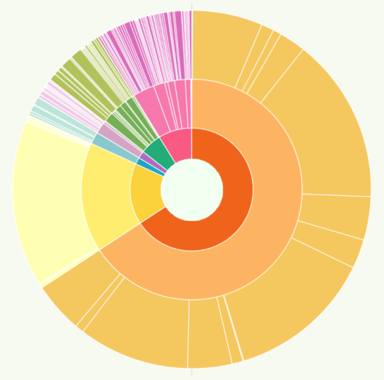
Let’s start by explaining what “the NYT spiral graph” is, since that’s not a very specific explanation for one particular chart. But the fact is, if you’re part of the data visualisation community, unless you’ve been hiding under a rock for the last few days, you’ll almost certainly have seen this chart more than once. […]
Tag: spiral
What (else) are Data Portraits?
I came across another different use of the term Data Portraits after I completed my online badges and blog posts for the Data Portraits and presented on them last month. On searching for the term I came across the work of W.E.B. Du Bois at the turn of the century. Du Bois composed a series […]
Why do we visualise using circles?
I should clarify – if the books of Tufte and Few are your visualisation bibles then you may not enjoy this post. Rightly so, the two authors I’ve just mentioned are seen as the foremost proponents of the field of creating professional, analytical dashboard visualisations. But for those who enjoy data visualisation as data art, […]
Why have I stopped contributing to Makeover Monday?
It’s difficult to be a regular contributor of Tableau data visualisations online via Tableau Public without knowing about the excellent Makeover Monday initiative. For those who aren’t aware of it, I penned an ode to it last year. As last year continued, I posted a contribution every week, from the simple to the complex, learning […]
How did I create the spiral chart?
Jump, Darn Dolt! My latest visualisation is the spiralling chart below this paragraph, showing all the tweets of a certain dolt in anagram form who I don’t want to give any more publicity than he already craves, part of the Makeover Monday project. I’ve been toying with a spiral chart for a while (for example, I […]