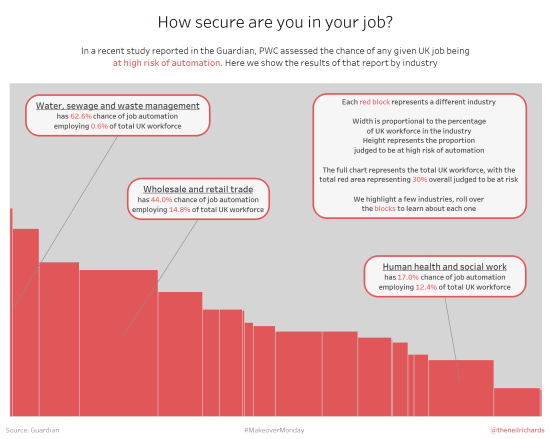
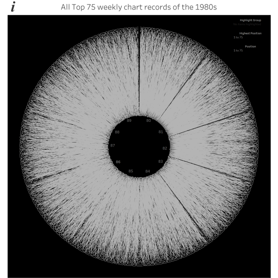
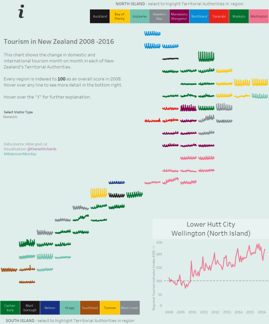
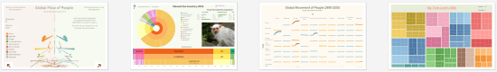
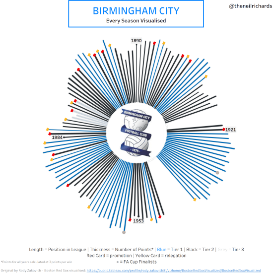
If you’ve read previous blog posts, you’ll know that I’m a fan of different and unusual chart types. If the chart types are visually interesting and striking, but don’t necessarily follow visualisation best practices, then, for me, sometimes, so much the better! I’ve blogged about, and attempted, sunburst charts, radial bump charts, bump charts, spiral […]
Category: visualisations
How do you visualise chess games?
There are lots of ways you can interpret this question. As someone who asks and answers lots of data visualisation related questions, and themes an entire blog around it, I’ll touch on a few of them. Sorry about that … First of all, chess is a battle game between two armies. So you could say […]
Who are my data visualisation inspirations?
I wanted to write a post about my inspirations in data visualisation. First of all, I feel a little bit uncomfortable citing inspirations, not because I feel uncomfortable expressing praise to others, but because I feel that as someone so inexperienced in the field, you might think that I am eliciting comparison. Please don’t think […]
What can be achieved by collaboration?
At the start of the year were a lot of tweets, messages and blog posts covering predictions in data visualisation for the year ahead and people’s own resolutions for what they might do in a new and different way this year to develop their skills, experience and exposure. Personally, I ducked out of that approach, […]
How did I create the spiral chart?
Jump, Darn Dolt! My latest visualisation is the spiralling chart below this paragraph, showing all the tweets of a certain dolt in anagram form who I don’t want to give any more publicity than he already craves, part of the Makeover Monday project. I’ve been toying with a spiral chart for a while (for example, I […]
What were my data visualisation highlights of 2016?
I’ll be honest – I don’t for a minute believe I have the standing, expertise, or width of knowledge and experience to comment on data visualisation generally in 2016 (or, similarly, to make predictions on future developments for 2017). But 2016 was an eventful year in my progression into the field of data visualisation. So […]
Is it OK to steal?
So, is it OK to steal? Of course not. In the data visualisation context, that would be passing someone else’s work off as your own. Anyone would agree that would be the wrong thing to do. But that would make a very short and uninteresting post. At the very least, I’m shooting for quite long […]
When is a visualisation a call to action?
This question and therefore this post has come about as a result of a conference talk I am giving tomorrow. The overall conference theme is the Culture and Politics of Data Visualisation and I’m excited to have been asked to talk at an event for the first time. Specifically, my talk focusses around my professional […]
How important is creativity in a data visualisation?
Because the gimmick of this blog seems to be to pose and answer a question in every post, I wasn’t sure whether to ask “How important is creativity …?” or “What is creativity …?” but either way creativity in data visualisations is what I want to talk about in this post. A little while ago […]