I’ve always loved the idea of visualising data on postcards, ever since learning of the seminal Dear Data project. For those who don’t know the project, it consisted of Giorgia Lupi (in US) and Stefanie Posavec (in UK) sending each other one postcard a week, always with self-collected personal data, visualised by hand on a postcard, and sent to each other by post. The collection of 52 now resides on display in MoMA in New York, and you can read much more about it in the Dear Data book and website.

Here’s just one example of their weekly postcard. It’s almost no exaggeration to suggest this project was my “entry drug” into data visualisation. It certainly opened my eyes to personal, disaggregated data and creative data visualisation on a human scale, where the only restriction is your imagination.

The key physical feature of postcards is that postcards are small – the restrictions of size mean you can get significantly fewer line strokes and dots across the width of a card than you can display pixels across a laptop screen. Even at the detail at which Stefanie and Giorgia went to, it most likely limits you to one chart, or one disaggregated data point per postcard. I’ve always thought that restrictions are great for creativity. It might seem counterintuitive – at first maybe you’d think that having no restrictions allows you do whatever you want! That might be true, but it’s the restrictions that often force you to think of the new, the different or the unconventional. The times where the regulation options aren’t available to you.
And there’s something more about postcards – they are a physical object that you hold in your hand, and make a conscious decision about. Postcards are personal. Whom do I want to share this data and visualisation with – which one person? We always consider our audience when visualising data – there is no more pertinent example than when we address a postcard and send it to just one person, our intended reader.
The double-sided nature of postcards means (as Giorgia and Stefanie regularly did), that the clear side can be 100% visual in nature, with no legends, keys, or instructions needed. Any “how to read” instructions and colour legends can be written out on the back – the traditional writing area of a postcard.
I’m currently taking part in the excellent Binoculars to Binomials course. It covers the three areas of data visualisation, coding (in p5.js) and birding, and is a delightful mix of areas which are all fascinating to me, and in the case of p5.js and birding, almost completely new. Assignment one, after just one week, consisted of visiting an area to go birding, connecting to bird sighting data via eBird, creating a viz using p5.js (a brand new tech to me), and creating the final visualisation as a postcard.
A huge shout-out to this course, not just because of the delightful mix of new skills and their associated learning curves, but also simply to the fun element. Jer Thorp has a real delight in his experiences as a birder (gleaned relatively recently since lockdown) and the combined joy of using them as a subject of data and coding. But what resonates with me is the sheer fun element. He believes there should be art, humour, and fun in data visualisation, and we shouldn’t have to all these stuffy dataviz rules. A man after my own heart! If you’re wondering where you’ve heard his name before – he authors the book Living in Data. You can read my review via the link, or skip the review entirely and take it as a hard recommend from me.
As well as enjoying all the new experiences, the final stage of creating a postcard put me in the same situation – who is my one intended viewer? Who, wherever they are in the world, would appreciate the physical visualisation in their hands, in the place where they live? What would be a fun way to visualise the data (within the constraints of my less than one week’s coding experience!) that would be appreciated?!
My visualisation took two forms. First version – the simple digital viz, created with code:

And the second version – the analogue equivalent (postcard and felt tips!).

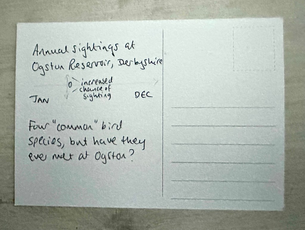
And finally – the reverse, with simple reading instructions. My idea was linked to the fact that my chosen area of birding was full of migrating birds, following their migrations at opposing times of the year. Some lived there only in winter months, and some in summer months. I chose four “common” birds from the database, all regularly sighted at Ogston Reservoir. But the sightings data suggested you would rarely if ever see them all at the same time. All four birds only “common” at different times of year. A minimalist viz was enough to show this in a reasonably aesthetic way.
I decided also on the recipient of the postcard – my father would appreciate this, as a fan of data and birds. A fun way (I hope) to engage with a new thing that his son is getting interested in and involved with, and a surprise thing to drop through the letterbox from the distance of the country away.
No sooner had I completed this (and having bought a stash of blank postcards) than I was introduced to an intriguing creative challenge. With Earth Day on April 22nd, the challenge was to read one book a day over twenty days from the Penguin Green Ideas range, and come up with a creative way of summarising each book, finishing the day before Earth Day. I heard of the challenge from Valentina DeFilippo (regularly mentioned in this blog as a huge creative influence for me), and it was instigated by Jeremy Connell-Waite. I decided to take the plunge with my own take on it – I would make a data postcard each day from the day’s book. From my first data postcard, to twenty more in the course of twenty more days!
The Green Ideas series features twenty books of 80-100 pages long, mostly essays and articles from a particular author, or extracts from longer books. Ever since my Environmental Studies degree days I had wanted to read and engage more with environmental writing and this was the perfect opportunity to do this and more, while going further into data postcarding. With 20 books from influential authors from Greta Thunberg and George Monbiot to Rachel Carson and Aldo Leonard, I decided to take the plunge.
It didn’t take many days to realise that finding data points in entirely text-based chapters and essays would not be easy. However, the postcard solution meant that I just had to find one small thing to elaborate on visually using data. I felt exposed – as creative people from all sorts of backgrounds came up with their own reviews, artistic interpretations and typesettings, I was an un-artistic grown men with just felt tip pens, postcards and a terrible knack of drawing freehand straight lines or circles. But I don’t like to duck a challenge.
I should say, before showing the data visualisation element of this, that despite the challenges (mainly the time commitment), I really enjoyed the reading element. It’s been a long time since I immersed myself in environmental books, and the diverse range of writing from all round the world left me energised and inspired to take more responsible action and think in what ways I can make a difference. As one of the earliest and most influential books in the series, Rachel Carson’s excerpt from Silent Spring gave me optimism from the knowledge that rational, scientific argument, well written, really can make a difference, because we know that her warnings worked, when it came to DDT use and production – I recommend reading the full book. It’s one of the reasons we visualise data (outside of fun, personal projects) – we hope to tell stories and facilitate calls to action, in the hope that actions really can make a difference.
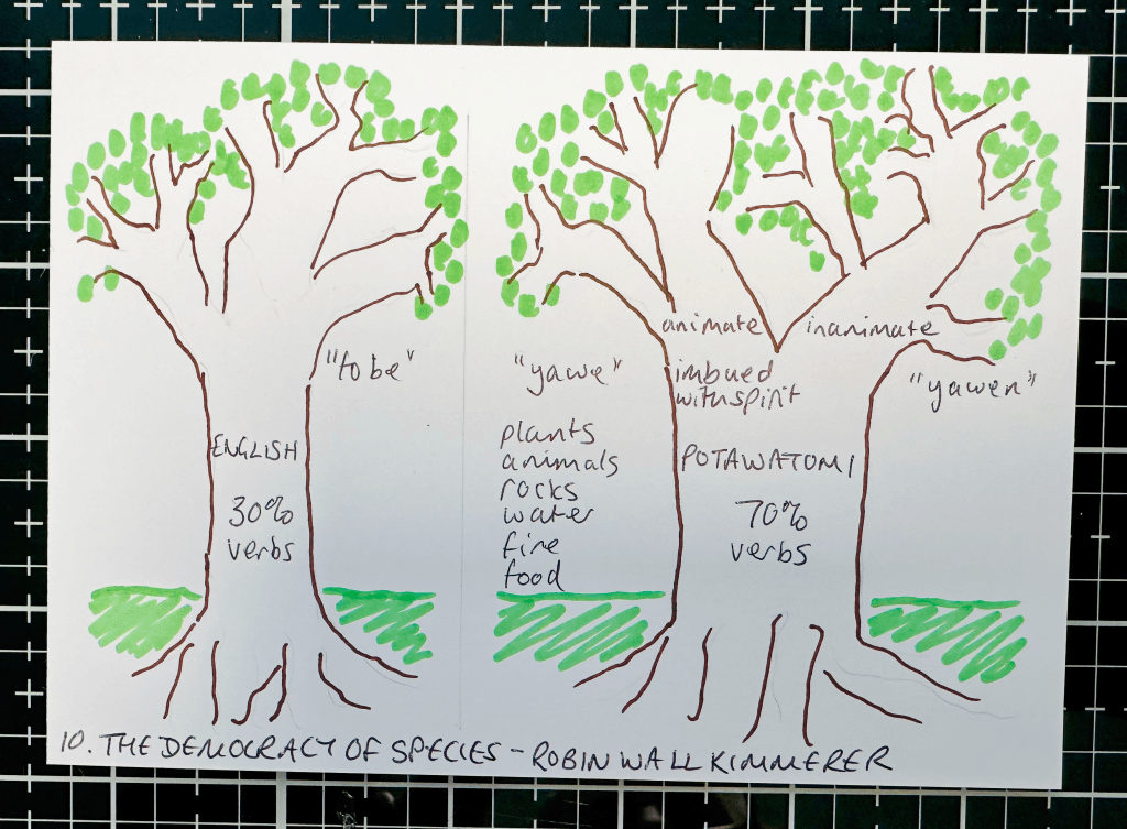
I won’t show all twenty postcards, that’s for a different time (perhaps a follow-up post). But a few examples follow of my attempts:


The restriction of finding one aspect to focus on wasn’t so much of a constraint (often finding even one was so hard!) but the commitment to visualising on a postcard and then sharing each one publicly kept me going through the challenge. How would they be understood, appreciated and received? Although all were made public on my LinkedIn page, it’s likely that a lot of the readership and engagement was among fellow participants. But I do hope more traditional dataviz practitioners were able to come across and appreciate some of the output – not for its artistic quality (clearly) but for the nuances of visualising on postcards and the different considerations required.
In conclusion, data postcards are fun, they are personal (their intended audience can be as low as one person), and their makeup allows for creativity. There is a lot of creative freedom and joy in going entirely analogue, and there is an undeniable challenge of leaving your comfort zone for anyone like me who creates almost entirely in digital mode. For those looking for a different outlook on doing something digital with your data, I recommend it!

So good. Inspired. Be well…
LikeLike