Yes you can, I’ve done it – at least I’ve done it for the lower 48 states.
The better questions to consider are “Should you …?”, or maybe “What are the pros and cons of such a map type”. Or perhaps “How on earth did you do it?” and the related “Why?”
First of all, this is a double-delayed post – the work to create and publish my county level US map was done earlier last year, but I never got round to creating a blog post about the process. I was convinced I had! So this is that blog post I never wrote, and started writing in November 2020 instead, with additional content to account for the fact that I’ve now created two such maps.
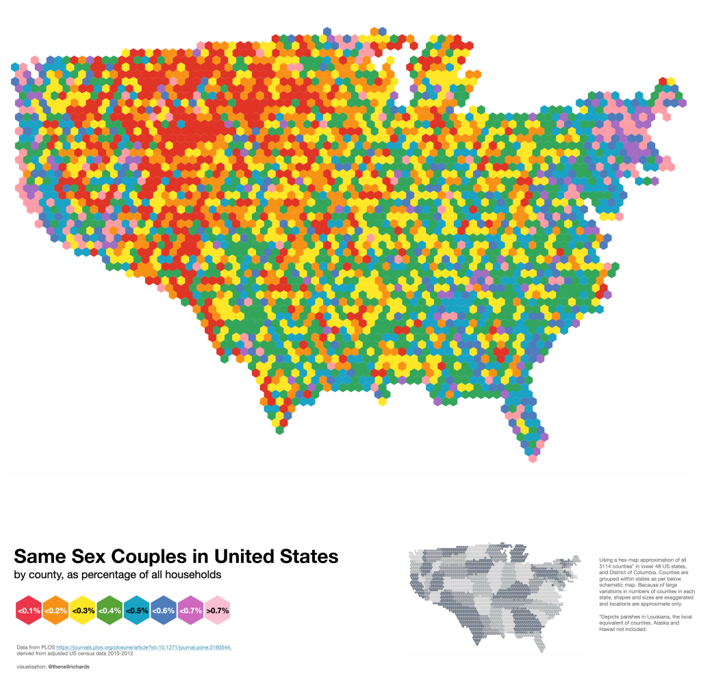
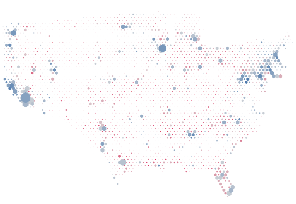
The map above shows the number of same sex couples in the US at county level. There are some notable trends in terms of colours – the reds and oranges (representing fewer same sex couples by percentage) are concentrated around the midwest areas, with pinks and purples (higher percentage same sex couples) showing closer to the coasts and major urban areas.
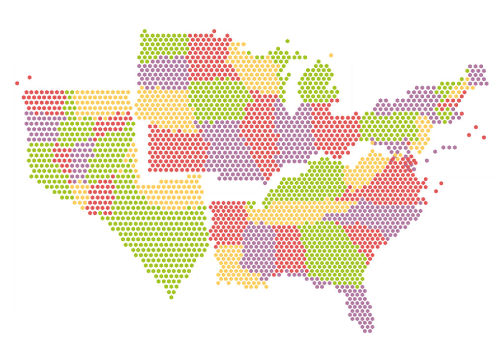
But the key map is the small grey map colouring counties by state – it’s this that shows the distortion. In general, easternmost states are more likely to have more counties – states such as Georgia and Illinois are exaggerated in size, with the likes of Nevada and California shrunk to a shadow of their usual selves. My representation does at least keep all of the states just about in the correct positions in relation to their adjacent states, while keeping the US in a recognisable shape. The downside of this is some artistic license required in the shape of some states, in particular Texas which is distorted almost unrecognisably.
The whole process of creating a tile map is always one of compromise. Choosing a hexagon tile map allows for six neighbours for every non-coastal county, whereas square tiles allow for four neighbours with four touching just at the corner. Aesthetically I prefer hexagons, but not only do they allow for six neighbours, they allow for exactly six neighbours, no more, no less. Of course this won’t always be the case.
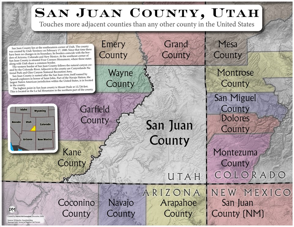
The most extreme example of this is San Juan County, Utah (below) with 14 neighbouring counties (three touching at corners and 11 with borders) in four states. This is as close to unmappable as it gets in tile map terms, so we can never see these as entirely accurate. I’m not sure exactly where in my tile map San Juan County, Utah ended up, but we can be sure that no more than six of its actual neighbours adjoined it in the map, with at least eight left stranded more than a county away (though in this case, the State integrity has been maintained as much as possible)
Here’s the more recent tile map I’ve created, showing results from the recent US presidential election by county.
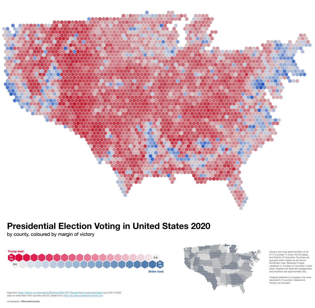
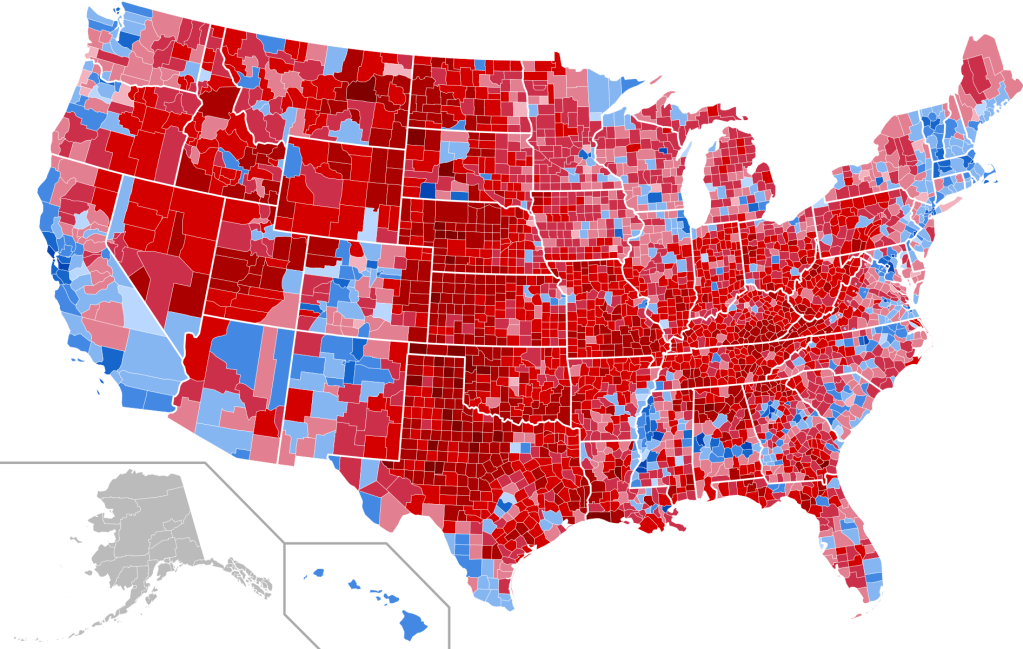
Famously, we know that in a geographically representative map, voting patterns will tend to show a sea of red in the US, almost regardless of which party is voting higher. Midwestern and rural areas, traditionally republican (red), will swamp the map.
In 2016 the map was similar, and it took this animated version from Karim Douieb to dispel some of the myths of majority Republican (red) voting.
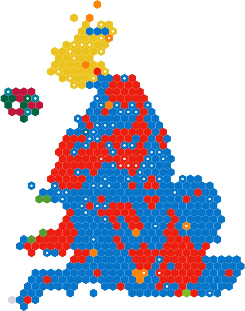
I did wonder if using a county tile map would help to alleviate this discrepancy. Perhaps the counties are more similar in terms of county populations? In the UK, each voting constituency has approximately similar populations, so a hex map based on voting constituencies generally works well, these are in fairly prominent use already. Here’s a breakdown of the 2019 UK General Election results, which does a much better job of accurately showing the urban labour vote (red) versus the rural conservative vote (red) as well as reduced population density in Scotland (the mostly yellow area reduced in size).
In the case of the USA, the counties are not just very diverse in terms of area, but also in terms of population. Los Angeles County, California has a population of over 9 million, and Cook County, Illinois, has over 5 million, with the top ten counties all having populations in excess of 2.4 million. However the bottom ten counties in terms of population have populations of 623 or under (although one is in Hawaii and one Alaska, leaving 8 of these counties in the hex map). Here’s my hex tile map with hexagons sized by number of votes. Note that almost all of the larger hexagons are different shades of blue!
So I would certainly recommend only using the US level county map (equally-sized hexagons) with caution. It can show geographic trends and could be an interesting talking point, but it’s unlikely to tell the true story of US distribution (whether in same sex relationship tolerance, 2020 voting trends, or anything else).
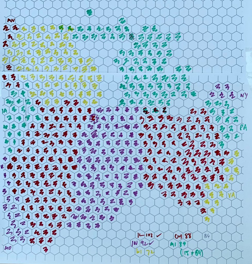
Some words on creating the hex map – this was a monumental task – frustrating and fun in equal measures. An individual state or collection of one or two of them is not too tricky, but the challenge of knitting them together is very tricky. I used a combination of manual position with graph paper and felt tips, and Graham McDonald’s hex map utility, first used when I created my Africa tile map a few years ago. The latter method struggled with more than a few states at time, with edge states being thrown off-course, but did a great job of keeping overall shape. But I soon realised I couldn’t get everything stitched together. Texas was the biggest problem – with so many counties in Texas coming at just the point in the US where there are more counties per square mile to the right than to the left, keeping the true shape and size just wasn’t possible (you can already see the effect it’s having on North Texas and the Oklahoma panhandle!). You can also see that in trying to keep an overall shape in the Northern States,
So the manual method was the only method I had – particularly for the irregular shapes of Wisconsin and Michigan round the Great Lakes which had confused the algorithm into putting counties the wrong sides of Lake Superior, and for lining up along state boundaries through the centre. Here was one of may works in progress …
Other things to look out for – there was at least one South Dakota county that had changed names in the intervening six months, and many counties that are spelt differently in different states (DeKalb, Dekalb, De Kalb anyone, not to mention any of the states starting with St, St., Saint …). I’d only recommend it for people who love hexagonal grids, geography, learning about countries in minute detail, and colouring in. For all people like that (like me!), I hope you have fun and success creating county level hex maps. For all others – you’re welcome to check out my own examples and borrow them, be sure to do so with the huge caveats of accuracy and suitability of use.
I’ll just leave you with this – they look pretty good though!

1 Comment