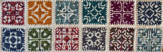
Yes – It’s time for me to embrace the Granny Life. Not a sentence I was expecting to write any time soon. And also nothing to do with the recent realisation that my personal Meldrew Point is fast approaching next month (no, “I don’t believe it” either), but more to do with the possibility of […]
Author: Neil
What is a Hitomezashi Snowflake?
As questions go, this is definitely one I couldn’t have anticipated being an immediately obvious candidate when I started my data visualisation career. It’s certainly “niche”. But has all followed from the paths I continue to be fascinated by. I often return for inspiration to my ideas of fabric inspired visualisations and steganography taking inspiration […]
How do we take inspiration from colour palettes?
Anyone who becomes involved in data visualisation will become interested in colour palettes. We know the importance of colour from a best principles perspective and from a cultural perspective – it’s something I wrote about right at the start of this blog (was it really nine years ago?!), which formed a crucial chapter of my […]
When does a Chart become Art?
ChART is Nadieh Bremer’s second book, following on from Data Sketches, co-authored with Shirley Wu and released in 2021. The simple title is explained by the subtitle: Designing Creative Data Visualizations from Charts to Art and looks at the scale of Nadieh Bremer’s work along a spectrum from charts to full on data art. I’ve […]
Why visualise data on postcards?
I’ve always loved the idea of visualising data on postcards, ever since learning of the seminal Dear Data project. For those who don’t know the project, it consisted of Giorgia Lupi (in US) and Stefanie Posavec (in UK) sending each other one postcard a week, always with self-collected personal data, visualised by hand on a […]
Can GPT help create data visualisations?
AI is pretty much everywhere these days. As I type, AI is trying to help me create this blog post. I’m writing this post from the point of view of someone inquisitive with AI – I don’t consider myself a pioneer or an expert user, but I’m happy to dip my toe in the world […]
Can you use a digital tool to create manual visualisations?
The question might be a strange one – here’s the thinking behind it. Many of my blog posts (and indeed, my book), have been based on the premise that I am both unskilled and unconfident at producing anything creative using traditional manual means. Pens, paper, crafts, physical creations, anything like that, have filled me with […]
How do you invent a new chart type?
This post culminates with my latest visualisation, a combination of a coxcomb and beeswarm chart. I’ll tease you, readers, and reveal it at the end of the post. But what got me thinking and posing questions was the nature of a chart with elements of two existing chart types. My output these days is much […]
How do we bring joy to data visualisations?
“The designer who wants to be more than a mere decorator must apply his thinking to the proper ‘tone of voice’ for presenting statistics. […] A bar chart is nothing but the skeleton of a story until the designer decides that it’s a message that should be shouted or whispered, or giggled, or just admitted.” […]