The question might be a strange one – here’s the thinking behind it. Many of my blog posts (and indeed, my book), have been based on the premise that I am both unskilled and unconfident at producing anything creative using traditional manual means. Pens, paper, crafts, physical creations, anything like that, have filled me with trepidation for more years than I care to admit. So, for me, Tableau has enabled me to use data as my creative media and static or dynamic onscreen creations as my “artistic” output. I leave “artistic” in quotation marks as, well, that’s for readers and consumers of the output to decide!
I love other forms of data visualisation though, and always have. Recently I read and reviewed Jordan Cunliffe’s book “Record, Map and Capture” – it reminded me of my love for physical and manual visualisations, both in their own right, and as an inspiration for static digital data visualisations, through the use of disaggregated data and manually curated data collected with care often through personal recording and observation. If you follow that link, take inspiration from her work and book for your own future personal projects, and get no further through this blog post, that would be an excellent result!
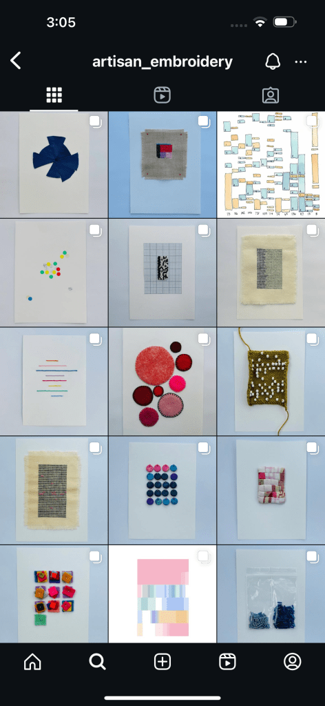
But for those of you that have come back and are still here, thank you for staying with me! You can imagine by now why I was very interested when I learned of Jordan’s December Advent Calendar posted on Instagram, and especially why I was delighted to be a guest contributor for 2024. Each day, Jordan will manually create a daily visualisation, usually via stitching and embroidery, which embraces the daily theme. Below you can see the finished products for days 1-15. A beautiful and intriguing small multiple array of themed visuals which is building up daily!
December 16th was my assigned day, and I chose the theme of colour. I had a number of colour-themed ideas, but many of them seemed a little predictable. For example: what were the predominant colours every hour for a particular day in my life? Green when I mowed the lawn, white and yellow when I ate a cheese sandwich, red white and black when I watched Arsenal and Newcastle on TV? I didn’t like that idea much, it felt too boring, but I was determined to keep thinking in order to create something more imaginative on the theme of colour.
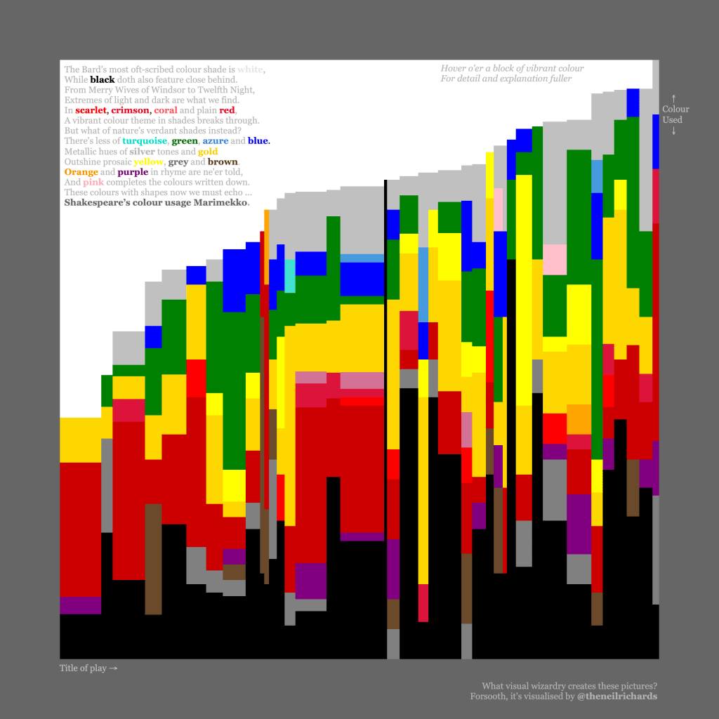
I then had the idea of recording and visualising colour mentions from a book. I’d done something similar with the project below – my Shakespeare colour Marimekko, inspired by Sonja Kuijpers’ course where she encourages you to create and collate your own data before visualising. It’s probably one of my favourite and lesser-known visualisations (not least because I’m quite proud of the sonnet for extra nerdiness!) – on Tableau Public at https://public.tableau.com/app/profile/neil.richards/viz/shakespeare_16408835873650/shakespeare
On deciding I wanted to do something similar, I did a little research on authors who were known for using colour in their text. I found an article suggesting that the Great Gatsby would be a good candidate book. It was a book I had read before, it was not too long, and I was drawn to the idea of the art deco time and setting, having only just recently returned from a week away staying at an Art Deco designed hotel in the UK. Flicking through my photos for inspiration, I remembered the glorious peacock rose window in the hotel bar. It would make for a perfect inspiration for my dataviz. Radial, sectional, geometric and colourful.

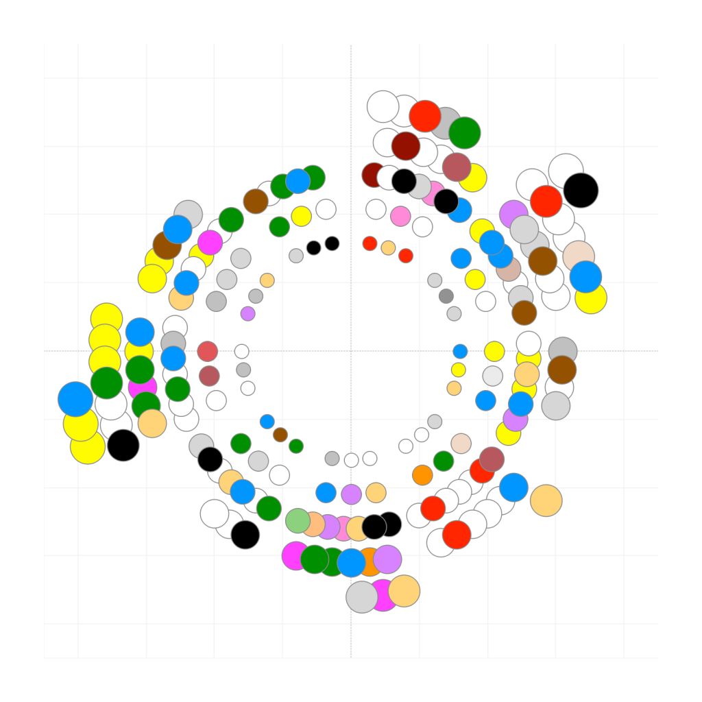
Once I pored through the book and scraped the colour word data, I was pretty clear that I wanted a radial – each segment representing a chapter, with colours mentioned radiating out from the centre. I would attempt to recreate each coloured segment in the same geometrical shape as in the window. I started off by recreating the position of each coloured “glass” segment approximately, as a circle.
There were so many drawbacks to this – the colour selections are bright and unsubtle, the aesthetic fit of clean, crisp bright colours not great in a collection of embroidery visualisations.
But most of all, if I wanted to faithfully recreate something similar to the peacock window itself, every segment needed to be a different feather-like shape and size, intersecting rather than overlapping, and with angles and curves far beyond what I was capable of programming. I like a challenge, particular a mathematical challenge, but that would have been something on the scale of [insert something here that would be a very long, ultimately unnecessary challenge here]. And because my final creation needed to be small (A6 size) in order to fit into a collage of 24 such creations as part of the overall calendar, it was already clear that boundary lines were going to become very blurred and pixellated.
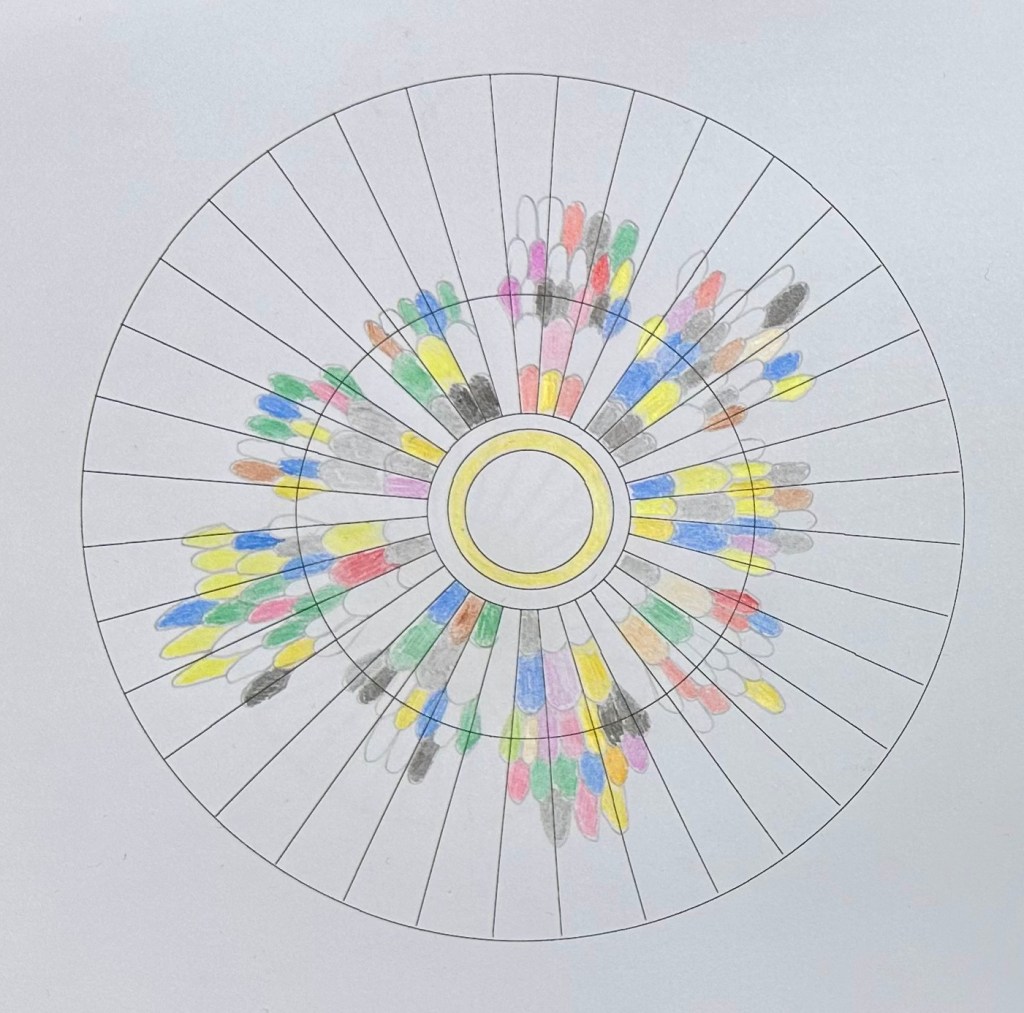
But instead, now that I have the idea of what I want to do, why not draw it?
I’ve mentioned above my trepidation when it comes to drawing. But I was able to generate the correct circles and spokes to use as a guideline by generating and prnting off shapes in PowerPoint, and then to use my photo of the window as a kind of guide stencil to nervously draw outlines of every feather-like segment in what would be a simpler version of the window. Much to the amusement of my far more creative wife and family, this middle-aged man then took great joy in carefully colouring in every segment with a set of coloured pencils, using the above digital array of circles as a guide for colour and position.
Here’s the final version. To read – chapter one starts at the “twelve o’clock” position, with chapters increasing clockwise around the circle, separated by.a clear segment (nine in total). For example, chapter one has 24 mentions of colours, including red, gold, white, rosy-colored, crimson, claret, wine-colored, blue, green, white, yellow, and silver.
It’s also presented online here https://www.instagram.com/p/DDpqbPZqDaL/:
And in fact, it wasn’t until I finished and e-mailed a photo of my creation through to Jordan, that I realised how similar it was in design to one piece of Jordan’s own work in particular. Check out Lockdown Map 2020 below – with “how to read” at https://www.instagram.com/p/DCxEUkAN-VS/?img_index=1. Great minds think alike!
My favourite element to the whole process is that, once again, I’ve questioned the standard way of doing things (sketch using pencil, create using a viz tool) and flipped it entirely on its head. I sketched using Tableau and used that sketch to produce a finalised pencil and paper output.
But it was never my intention to work on something that would make a great “questioning” blog post or potential book chapter. Instead, that questioning has arisen organically. It’s just become part of the way I approach projects now without realising. You could certainly consider this another example of one of my favourite rule-contorting concepts: design-driven data. Either way, by being used to considering unconventional processes, I’ve reached a conclusion to a project that I really enjoyed taking part in, leading to an unusual visualisation that was a new adventure for me. And that’s basically what I strive to do most times I visualise data in personal projects – long may it continue!

fascinating. I love Jordan’s data driven advent calendar. But I am very biased
LikeLiked by 1 person