This post culminates with my latest visualisation, a combination of a coxcomb and beeswarm chart. I’ll tease you, readers, and reveal it at the end of the post. But what got me thinking and posing questions was the nature of a chart with elements of two existing chart types.
My output these days is much reduced – I’m fine with that! As a data visualiser by passion and hobby, particularly where the non-conventional charts are concerned, my time, inspiration and priorities all ebb and flow. But even in quieter times, it’s all too often the case that I will find or curate a great dataset, sketch and formulate an idea or two, and leave the project unfinished.
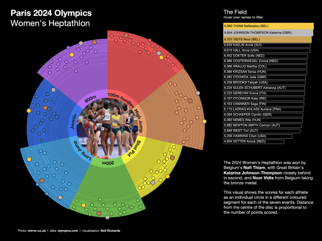
One example of this was from the Olympics this year. I have always loved the Olympics and it goes without saying that the competitors, countries, results and scores make for a great data source. I got hold of the data from one of my favourite sports, the heptathlon. I love it as a spectator sport, and its advantage for visualisers of complex or disaggregated data like me comes from the fact that there are seven separate events. In some ways, that makes for seven times the data to visualise. The geometry-loving me can start investigating heptagons. The colour-loving me can start thinking how to introduce seven colours into a colour palette (and the lazy colour-loving me instantly thinks of the rainbow …)
I had radials, I had coxcombs, I had heptagons all sketched out. One of the key findings in heptathlon data is that the ranges of points across all events vary. Some have larger ranges from best to worst contestant. Some have higher points awarded in general, and some will only have a much smaller number of possible discrete scores awarded (think high jump, where only a handful of heights are attempted across all the spectators).
When I picked this data back up recently, I instantly thought of the possibility of seven comparable beeswarm charts. Perfect ways to show not just individual scores, but their ranges and clusters.

I haven’t taken this to its final complete labelled and published state, but couldn’t resist the obvious visual imagery of an athletics track. And yes, the track at the Paris Olympics was a lilac-purple colour! Here, each number represents an event of the heptathlon, in order. This is almost certainly better than my final visualisation (wait for it!) in terms of being able to compare distributions of scores across each of the seven events and across the full field of athletes.
But my mind wandered, as it often does, to the unconventional. Could I combine my earlier idea of something radial and coxcomb-like with the beeswarm distribution above?
I’m sure many of my previous posts have referenced one of my inspirations as Nadieh Bremer – co-auther of Data Sketches, who recently wrote in a LinkedIn Post:
I can, of course, see the benefits of having structure, of having “standard” charts (for multiple reasons, such as instantly knowing how to interpret a general line or bar chart). However, I also wonder if a downside is that it’s creating this uniformity, this monoculture. That we’re pushing our data to fit into our (simplified) charts instead of shaping our data visualizations to fit around our data
Yes – Nadieh is on the same wavelength as me, I must be onto something! Standard charts have their benefits, but conforming to the standard charts only might be stifling us. Why not increase the range of our data visualisation chart types?
Indeed, another one of my first inspirations was also very much a validation for my early explorations in data visualisation. Maarten Lambrechts, a dataviz expert from Belgium, had set up a website called Xenographics at https://xeno.graphics. Celebrating all things unusual in data visualisation, it was a collection of “weird but (sometimes) useful charts” – the website’s tagline, not mine!
Maarten spoke about Xenographics at Openviz in 2018 – the presentation can be found here: https://www.youtube.com/watch?v=fp-WNqaQG0s. About halfway through, he references crossbreed chart types. One way to create a xenographic is to combine two chart types together. Something I’ve always remembered, and something that validated my idea to combine a coxcomb with a beeswarm. And so, I’ve created my own xenographic!
What do I call it – “coxswarm”? A “beecomb”? That could almost become a “honeycomb”, but that already exists as a recognised lattice shape sometimes seen in charts. Perhaps the chart name needs work, but as I’ve already alluded to, the chart itself is finished and published.
Here, each coxcomb segment has a radius of the event’s maximum points score, and is coloured by event. The three medalists are coloured with gold, silver and bronze slightly larger dots throughout. The rest is basically the same as the beeswarms in lanes above though. But for me, the radial layout adds to its appeal, and emphasises the disparity of points scored across events, as the events themselves sweep through time around the circumference.
(the online version here has some basic interactivity and tooltips)
Every visualisation I have ever produced, certainly on this website and in my book, has been for enjoyment, both mine and my potential audience’s. New creative chart types, even if they are weird and only sometimes useful, are fun to create! It’s my hope that they’re fun to appreciate and consume too. If you’ve got better ideas for a name, I’d love to see them in the comments!
