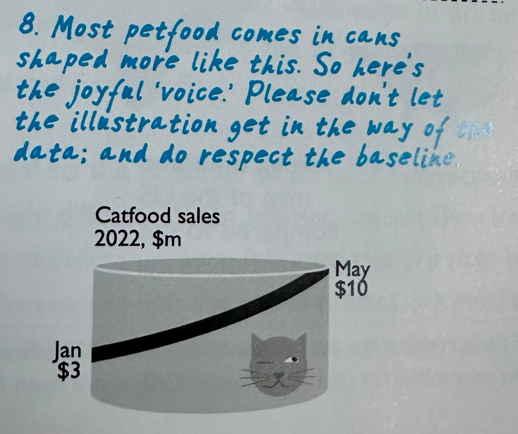
“The designer who wants to be more than a mere decorator must apply his thinking to the proper ‘tone of voice’ for presenting statistics. […] A bar chart is nothing but the skeleton of a story until the designer decides that it’s a message that should be shouted or whispered, or giggled, or just admitted.”
I recently got hold of a delightful book called “Graphis Diagrams”. First published in 1970, it’s a wonderful (trilingual) Swiss publication of data visualisations of the time. The above quote is from Lesley A. Segal, in the book’s introduction.
I first wanted to describe many of the visualisations in the book as “rule-breaking” but quickly reconsidered, since in many ways these visualisations preceded the “rules” as we might think of them now. As someone who likes to question practices, conventions and rules in dataviz, needless to say, I loved the book. However, it’s not my intention to review that book, since it’s no longer widely available and somewhat out of the mainstream. If you are interested, a review, which certainly helped convince me to get hold of a copy, can be found at https://medium.com/paper-posts/graphis-diagrams-1974-data-visualisation-853823fb5e05
But it’s that introductory quote that has stuck with me ever since. And one word from that quote in particular.
“A message that should be shouted or whispered, or giggled, or just admitted.”
I love the idea of a visualisation presenting its findings, analytical or otherwise, in the form of giggling. An inside joke between creator/designer and reader. Whether we take the findings seriously or not, we have fun creating a chart, and our audience has fun consuming it. We as designers are encouraged to think of visualisations or infographics as a joke that our audience is in on, in such a way that they giggle along with us.
So much of data visualisation is about understanding our audience and presenting your material in such a way that our readers understand the visual message and its analytics, and are persuaded to follow its cause of action. But what of the unconventional, the artistic, or the amusing? Like a comedian, a cartoonist, or so many other kinds of creative performers, our audience is primarily those with the same aesthetic. People who appreciate rule-breaking charts. People who have our sense of humour, who giggle at our bad jokes.
All of which giggling is a rambling introduction to the featured book review for this post: Joyful Infographics, by Nigel Holmes.
Like unconventionally designed bar charts that giggle their messages, Nigel focuses on charts and infographics, mostly his own from throughout his long and distinguished career, with a friendly, human, approach to data. And the very first thing to note is that the book itself is every bit as joyful as its title suggests.
Bright yellow, with a cartoon bespectacled face filling in the “O” (how many of you did that particular kind of doodle when bored at school? I bet some of you did!), the book contains many daft cartoons to fill white space, and even has a particular fun feature on the bottom corner of many pages that I will leave as an Easter Egg for those buying the book!

The illustrations and icons throughout showcase examples of Holmes’ work and his influences. I might not see myself as an artist, or an infographic designer, but I do appreciate the design and aesthetic of every image included . For example, it’s not hard to see how a particular favourite visualisation method of mine, the small multiple, has taken its influence from frame-by-frame illustrations, from the instructive Muybridge and his ground-breaking work showing every stage in a horse’s gallop in an effort to prove that at one point all four legs leave the ground, to the slightly less instructive but more joyful John Cleese and the pose-by-pose breakdown of the Ministry of Silly Walks from Monty Python.
And there’s probably no finer example of the joyful silly touches throughout the book, than looking through the index. While looking for Eadweard Muybridge, I found this delightful snippet in the index – where else would you see “Mum, my” as an index entry?. And this was only just below separate entries for Florence Nightingale, Florence Nightingown, Flora MacNightshade and Flora MacNightLight. Such individuality really made me wish I’d created my own index for my own book! But I digress …
The majority of the infographic-themed section of the book can be summed up by the core chapter of “nine ways to make your graphics joyful”. Covering audience, prosody, context, metaphor, simplify, edit, label, draw, and “add humans”, this is the largest section of the book covering the full range of graphics and advice. I can’t really leave this paragraph hanging here without explaining “prosody” – a word I wasn’t aware of before.
“Prosody is the pattern of stress and intonation in language – inflection. I didn’t know what prosody meant, either, but I thought it would be OK to have a word in the book that I had to look up. Prosody is what makes reading and listening to words enjoyable …”
There you go, I feel seen! Another example of the style of writing that had me smiling throughout. And picking up on prosody again – Holmes explains that it is visual prosody which is what the book is all about. The way you express data visually can make a data joyful, (or awful). I very nearly entitled this post “What is visual prosody?”, but that could have deterred the right audience from seeing the post, but I think it perfectly sums up the book and the principles behind it.
The sections of most interest to me were those which referred to data visualisations, referred to in the book as “Chartoons”. Now if you’re thinking about Holmes’ best-known work, you may already have one image in mind. Straight away, I love the fact that Nigel refers to this “elephant in the room” with an illustration!
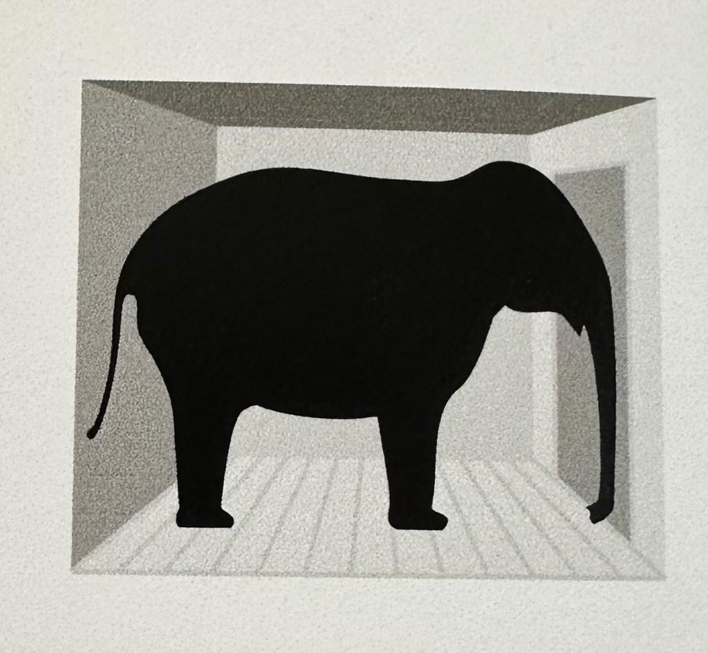
The aforementioned elephant refers to his well-known chart from 1980, featured in Time Magazine, about the rise and fall of the price of diamonds. I won’t include the image here, but it is discussed at length in a book by one of our industry’s most prominent protagonists (Tufte – Envisioning Information, 1990), who hates it, and by another one of our industry’s lesser-known opinionated authors (Richards – Questions in Dataviz, 2022), who loves it! In short, Tufte pulls no punches in describing it as “chartjunk” which goes against all of his principles of minimising the data-ink ratio. As for me, I acknowledge Holme’s image as very much against Tufte’s teaching but don’t share the disdain. I certainly worry less about the pejorative definition and see it far more for its positive elements. If an image is considered witty and eye-catching, it becomes memorable, accessible and enjoyable to its audience.
Holmes does mention that he contacted Tufte both in 1990 after his disparaging words in “Envisioning Information”, and again in 2020 during the writing of the book for a chance to reply and engage in the conversation, but received no reply on each occasion. His own summary, I think, hits the nail on the head. While acknowledging that some of his approximately 1000 images of the time (of Time, in fact), may have been “over-illustrated”, he concluded that “Tufte simply misunderstood my audience.”
Whereas Tufte wrote from an academic standpoint, and saw no reason to divulge from his best principles that he insisted must be followed under all circumstances, Holmes knew that his audience was not scientific, nor an expert in a given chart’s topic. The humour and additional illustration included, whether over-illustration or not, was not chartjunk, but charthelp. I much prefer that definition. Visual additions which aid readers, joyful or otherwise, are help, not junk!
The final chapter, entitled “Don’t do this” covers a few examples of infographics of their time that Nigel would definitely do differently in this day and age. But the final “don’t” is a simple one:
Please don’t forget to have fun. If you enjoy what you are doing, it will shine through in your work, and connect you to your audience.
If that’s a good enough way to end the book, it’s definitely a good enough way to end this post!
