So before you think I’m ending my longish absence on this site by making a grand re-entrance swooping back in with some controversial opinions on maps, this post is my review of Terrible Maps by Michael Howe.
I feel like I should address my recent absence on the site, but on reflection I don’t think I need to at any length. It’s true that I have a draft post that’s been in the making since September, which I do intend to publish eventually, where I began to address this in more detail. But in reality I feel it should be quite clear and obvious. Nobody should feel obliged to continue to create visualisation and blog content. Times change, priorities change, and things happen outside of your control. The right level and quality of output is exactly what is right for you and your circumstances. In my case, my professional role has changed a little, and important personal non-data-visualisation stuff (yes, there are such things), is taking a major part in my life which has meant I’m turning to Tableau and WordPress a lot less than in the past. True, I have articles and output in other places in the meantime, but right now, as we approach the end of December 2023, I’m back here at last, and I want to get at least three posts in by the end of the New Year weekend to try and kickstart my book reviews and creative visualisation content (though I won’t beat myself up if it’s only one post.)
And that’s why I’m going with Terrible Maps, as a reminder of what made me fall in love with data visualisation in the first place, as a way of rekindling the review content on this blog. The book is a glorious throwback, for me, to approximately 2014. I would love to claim that my first dataviz book was a Tufte classic (it wasn’t). Instead, I often tend to think that my first dataviz book that inspired me into the field was one of David McCandless’s seminal Information is Beautiful books. But I’m not sure that’s entirely true either.
My first dataviz book, and it was s a genuine influence, was Pop Charts, by Paul Copperthwaite
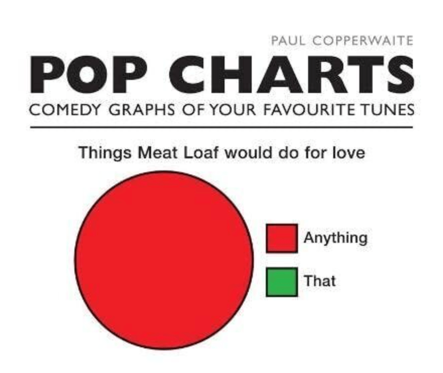
The book cover showed me everything I needed to know – a collection of graphics that sum up well known songs and lyrics. I could use my understanding of simple charts, such as pie charts, bars, and Venn diagrams, to solve the visual gags on every page. It was a great fun coffee-table read that sparked the idea in my mind as to how you can display the simplest of information visually, with creativity and wit. And in my case it pre-dated every other dataviz book to influence my leanings towards data visualisation, art, and information design.
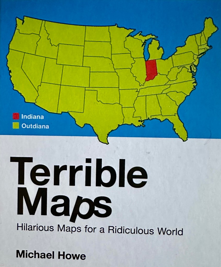
Fast forward nine years or so, and Terrible Maps has had the chance to re-light that spark in me after a lean spell. Terrible Maps is basically the best bits of @terriblemaps on twitter (X), in book format, which describes itself as “the home of terrible maps with a pinch of humour” It’s a fun read full of witty maps that’s a perfect coffee-table filler over the festive holiday period. And it’s got me back here talking and writing about it! The front cover is reminiscent of Pop Charts – a simple map, a bad joke, and a portent of what’s to come!
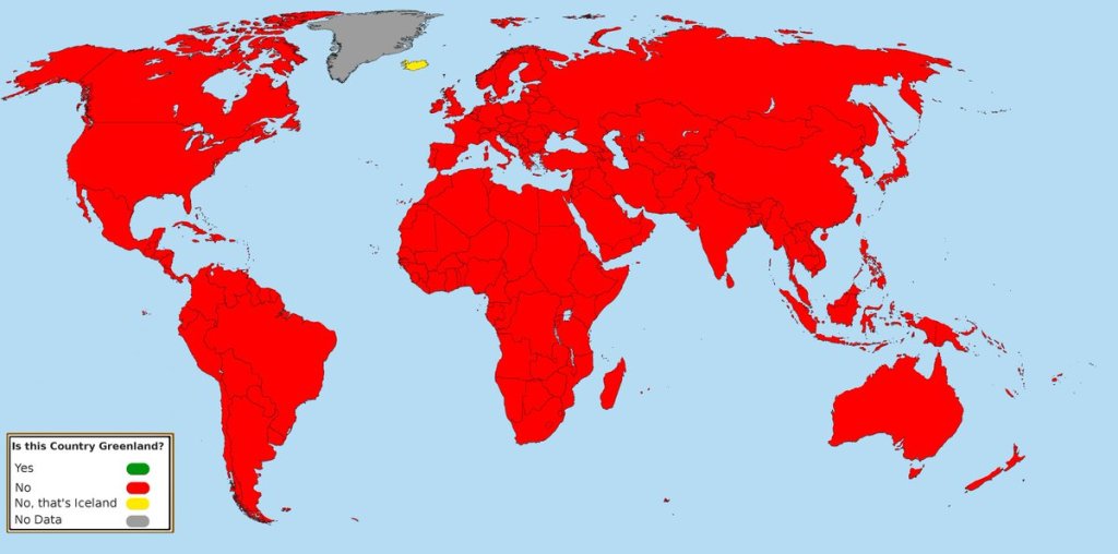
If I had one criticism, it would be the common use of bright red/green as its prevalent colours. But this book is all about ignoring rules (no wonder I’m a fan!) in favour of fun, so it really doesn’t seem like a problem. So much so that one entry even acknowledges this straight on the nose!

Some of the book’s humour comes from the daft topics and subjects, or the blatantly obvious depictions. Other examples come from “in jokes” of the kind you are probably used to seeing in maps. Such as the example of “area A has as much/more population than all of area B combined” – in the Terrible Maps example (not shown here) the entire world except New Zealand becomes area A and just New Zealand on its own is area B. I’m sure this is also a separate nod to the well-reported concept of world maps missing out New Zealand entirely.
And as another example of such an in-joke, you know how there’s almost never any data for Greenland in maps? How about this map by way of demonstration (which ironically avoids the red/green issue) …?
There are many more maps I could’ve chosen – all silly in their own way, and all cleverly depicting information, however obvious, in a graphical way. Unless you’re a map obsessive to start with who doesn’t tolerate frivolity within the field, then however terrible you find each of the examples in the book, the legacy of Terrible Maps is that you’ll probably like maps a little bit more than you did before you started reading it.
