As a mathematician, I’ve always been interested in numbers and patterns between them. So many mathematical formulas, numbers and concepts can be “explained”, or at least shown visually, that I was tempted to create data visualisations (or, if you prefer, data art) based on numbers and their patterns. One of my first fun mathematical facts that I remember from a young age was about the fascinating number 142857 and what happens when you multiply it
142857 x 1 = 142857
142857 x 2 = 285714
142857 x 3 = 428571
142857 x 4 = 571428
142857 x 5 = 714285
142857 x 6 = 857142
142857 x 7 = 999999
Each multiple is a cycle of the previous numbers until you get to 7 – it seemed amazing! Not long after, I learned that 1/7 (one-seventh) was 0.142857 recurring when described as a decimal, there was that number sequence again! And so it was that a few decades later, earlier this year, I wondered whether there might be some interesting opportunities for visualising recurring decimals. If fascinating things (in my eyes, anyway) happen with sevenths, what happens with other recurring decimals? As a lover of small multiples and grids, I set about looking at the first 100 digits of the first 100 fractions (1/1, 1/2 through to 1/100). The result is below – true to my preference, I wanted to design an eye-catching “poster style” visualisation and I was pleased with this result.

Patterns were jumping out nicely here (look at 81!) so I knew I had a really rich dataset. But this was back in May, and I didn’t do anything more with this for a while. OK, actually, that’s a lie, I wondered what it would look like in pie charts, but wasn’t brave enough to publish. Imagine – think of all we’ve been told about how bad pie charts are, and yet I could recreate a poster style viz of 100 pie charts with up to 100 segments each! Here it is … you’ve been warned!

I didn’t come back to this dataset though until much more recently. Tableau had a new animation feature in beta which I was keen to try out, but what kind of thing could I visualise? My idea was to come back to this dataset. With a hundred numbers each “owning” a hundred further digits, this felt like a possibility to “make things move” as I investigated each trail of decimals. What patterns could I see develop across the 100 decimal places of each fraction?
The upshot of this was the following visualisation, seen below in animated form. I looked at what would happen to each fraction if I developed a “walk” from each decimal. If I walked a distance the length of each digit, turned 90 degrees to the left, walked the length of the next digit and then continued for at least 100 different digits, what patterns would emerge, and how far would I go from the original start point?
I was pleased with this – some fun patterns were emerging, and I published this to twitter for people to see. But still many questions remained. Which numbers would eventually return to start, and which seemed to just have “random” trails? What on earth was going on with 82? And why turn 90 degrees each time – that’s quite an arbitrary number, it’s just easy for us to imagine as “up, down, left, right”, what patterns would emerge if we changed direction a different number of times in a circle?
So I had my current version, but what if I changed the number of turns in a circle? I changed the code in my workbook so that instead of turning four times, I could use a parameter to determine the number of times. I changed to six, and hoped that I might see some wonderful hexagonal snowflake or honeycomb patterns.

Far from it! This time we had loads of numbers “doing an 82” and spiralling away from their start point. First of all was 7, as well as 14, and 21, and many more. Now I knew all about 7 and had done for many years. The decimal for 1/7th has six recurring decimals. This is the same for 1/14th, 1/21st, and lots of other multiples of 7 on the denominator. That made sense to me – I’m making six turns in each circle, and if the circle repeats at exactly the same rate as the decimal recurs, then it can never return to the start – it will always go further away from the start in exactly the same pattern with each repeat of the decimal, there was no chance for it to go in any other long term direction.
I was pretty sure that the pattern of each trail would relate to the number of repeated decimals in each recurring pattern. A bit of online research led to the following definition. I don’t think I could’ve envisaged the number of times I would type the word “repetend” over the next few days and weeks …

If we rotate during our walk the same number as the repetend, we were guaranteed a spiral that never returns. So that must mean that of the numbers 1-100, quite a few numbers have a repetend of 6. And, by eye, from the animated original above, only one number has a repetend of 4, which is 82, right? I had lots of replies about 82 and how its trail was so unique – described in fun as “silly 82”, it was the source of amusement, with various repliers identifying with 82 as it spiralled out of control.
But just as I had the thought that 1/82nd must be the only fraction with denominator 1-100 having repetend 4, I got a reply on twitter from Nathan Heilman (@nheilman). The trail for 1/82 didn’t look right. I was ready with my reply – I checked my data and could verify that it repeated every 4 digits. That was why it behaved uniquely to the others. Before clicking “send” I just double-checked the data. I was wrong! 1/82nd actually has a repetend of 5 – my data was incorrect, I had mis-copied the recurring string of numbers!
So a swift correction, apology and re-publish followed, and the wondering spiral had disappeared. But I felt like I was moving on – how could I determine the best number of times to turn within a circle? Chris Love (@chrisluv) had already suggested via twitter that making the same number of turns as number of repeating digits might make more sense. But I already knew that although I thought that was close to the solution, it actually led to the wandering spirals.
I went back to the parameter and changed it to 7 – instead of turning 4 times, or 6, we would now turn 7 times, in other words by 1/7th of a circle each time. The multiples of 7 were all back in fully contained symmetrical paths, looking like seven-petalled flowers. Beautiful! I decided to pull in the repetend value for all of the 1-100 denominator fractions, then filtered my results a few times to look at some individual sets of examples.
Here are all of those with repetend 6, all turning 7 times within a circle. Now we’re getting somewhere!
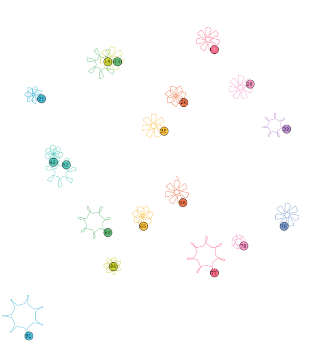
Here’s the grid for all 100 fractions after a maximum of 100 walks. It’s starting to look interesting! There are other nice regular shapes and patterns developing too. Look at 27 for example, with repetend 3, making a shape of rotational symmetry 4. Or 81, which is making a ten-petalled flower (81 is 0.012345679 recurring, repetend 9)

A lot of others look more like a scribble, but you can isolate most of the trails to look like they may end up going round in a circle in due course. On re-watching the animated version, I noticed that 7 and all its multiples returned to the start after 42 walks. 42 is 6 x 7, or (repetend) * (repetend +1). As I was changing direction (repetend+1) times and there are (repetend) numbers in each cycle, that made sense to me. So if I look at a number like 17, which has repetend 16, I might expect it to need 17 * 16 = 273 digits before returning. Now I only had 100 digits in my data, but the trail for 17 looks like it might be about a third of a way round a big circular coil. Perhaps I could test this by bringing in more numbers? 97 would be the worst – with a repetend of 96 it would need 97 * 96 = 9313 numbers in my dataset. But with every fraction being a recurring decimal, at least I knew the exact digits to bring in, even 9000+ decimal places in.

Well, it works, but the sheer sweeping scale of the larger repetend numbers (I told you I typed the word “repetend” rather a lot) means that this viz, though accurate, isn’t the most aesthetically pleasing. At this point I wanted to see the individual shapes of all 100 decimals equally. This meant making the decision to go back to a rigid grid structure and normalising so that all one hundred fractions had equal prominence.
But before I do this, I wanted to convince myself that there was sense to what I’d done. Changing direction (repetend+1) times seemed to work, but was I really sure why? I resorted to a visual explanation which helped the penny drop for me, so I hope does the same for you:

As won’t be a surprise by now, I started by considering the number 7 and why it worked. Going “out of synch” by one allowed all of the six numbers (in this case demonstrated by coloured blobs) to be in all possible positions round the circle 1 to 7, meaning that whatever the magnitude of each digit (each coloured blob), everything would cancel out in both magnitude and position. It also, I was rather pleased to notice, a plausible Ultimate Question to the answer of Life, the Universe and Everything, as the 6×7 total digits involved nicely combined to 42!
And why doesn’t it work using the repetend itself (without adding one?)

In this case, being “in synch” means that it’s not possible to retain any symmetry and the path will continue to spiral – as I’d tried to explain in words further above in this post.
Back to the final visualisation – I owe a lot of thanks to Michelle Gaudette who started the process by offering feedback and in the end talked me out of inappropriate colours, designed the more stable grid structure in Tableau containers, implemented collapsible buttons for instructions, recorded and hosted superior animations for the instruction pane, solved the problem of implementing viz in tooltips, and devised a subtle colour gradient highlight scheme that I had never before considered, let alone attempted, all while having to listen to me ramble on about repetends and formulate ideas. What started out as friendly feedback ended as an invaluable contribution to a true collaboration, thank you!
The result is shown here – first in greyscale, which I couldn’t resist including here because I think it really replicates the idea of pencil and paper sketches …

… and then in colour version (click through to see the full interactive version on Tableau Public with animated gif embedded)

I hope that was of interest to anyone (like me) with a fascination about numbers and their patterns – anyone is welcome to download the final workbook from Tableau Public, as I feel like there is more to this dataset in terms of possible visualisations. I’m certainly open to more suggestions!

Whoa! that is so cool. Very enlightening and to think I just stumble on to your
LikeLike
Intteresting read
LikeLike