I feel a bit of a fraud asking this question. It’s been asked, debated, blogged and further debated many times before. You can get opinions on the subject from people with much more experience in data visualisation than me. For example: Cole Nussbaumer Knaflic, Alberto Cairo, Jon Schwabish, Georgia Lupi, Chad Skelton, Sophie Sparkes, Robert Kosara to name but seven of many. So do please check out what they have to say, but allow me to put my thoughts here too, even if that just involves collating and arranging the thoughts of the aforementioned others.
So why am I even broaching the subject? Two reasons really. One – I daftly decided to start a blog (you’re reading it) about questions in data visualisation, and what better question? And two – in less than a fortnight I am giving a presentation on data storytelling at a conference in Manchester. I’ve volunteered for this, stepping into the breach to help out a presenter who couldn’t attend, and have started off with obvious fear at what would be my biggest speaking engagement so far. The more I’ve researched, read and listened to many talks on the subject, the more excited I’ve got at the prospect at having a great subject to talk about with so much potential material – I should have no problem talking for 45 minutes about a subject that fascinates me within data visualisation. And yet the more I’ve continued the process, the more daunted I’ve got again. There isn’t overall agreement, there’s no real answer. How can I tell a hall full of delegates what data storytelling involves when there isn’t agreement within the industry?
So here’s a frivolous but pertinent example from none other than Kurt Vonnegut. Known for his modern science fiction classics such as Slaughterhouse Five, Vonnegut also showed how stories can be plotted out on a simple pair of axes:
Ill Fortune to Good Fortune, Beginning to End. In the story of “Man in a Hole” (which requires neither a man nor a hole) the protagonist starts off fine, then finds some trouble, and gets out of it in the end.
In Vonnegut’s diagram of the “Boy Gets Girl” story, the boy finds something wonderful, then something bad happens (e.g., the girl and boy fight), but then he gets it back again.
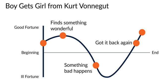
Two examples of how the simplest and most classic of storylines can be visualised graphically – as (almost) a sine curve. I could flip this upside-down and change the words (if I had the inclination and Illustrator skills), then you’ve got a very true to life story:
- Middle aged Man prepares conference talk: by Neil Richards
- Man agrees to talk – is worried and daunted (ill fortune)
- Gets lots of information, gets really interested (good fortune)
- Keeps researching, realises there’s an overload of contrasting material and gets daunted again (ill fortune)
- End
So where to start? Last week, Cole Knaflic, author of Storytelling with Data visited London to talk to the Tableau User Group. I was privileged enough to attend. As you’d expect, Cole explained how visualisations could be improved by treating them as stories with all the elements you’d expect in a work of fiction. Your work of fiction doesn’t have to be Pride and Prejudice, it can be an adventure book written for a small child. But all good fiction stories have characters, a theme, a plot, a point of view, setting, conflict and tone. All these were great pointers to improve our presentations and business dashboards. The result of this approach was to highlight the importance of many data visualisation principles.
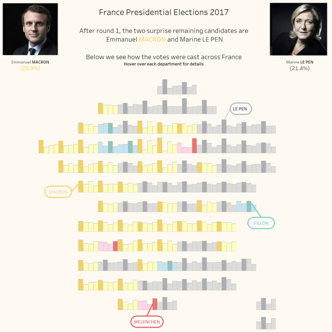
In the two hour train journey to London I finalised this visualisation of the French Election first round results.
Cole mentioned that colour is great – for children’s parties. If you don’t need it, don’t include it. An hour into my journey home, I had the following. It still needed some colour, after all there are four main candidate, but this was far less busy and made every outcome clearer. Much better – an instant improvement, and a story more clearly told.
I asked Cole the same question as the title of this entry – should every visualisation tell a story? Her answer was “no”. There’s certainly a distinction to me made between explanatory and exploratory visualisations (a distinction I’ve attempted in the past myself). But the key thing is that a visualisation should always convey the message that it’s intended to convey. Her blog then makes a distinction between a “Story” (with upper case S) and a story (sic). I’ll leave you to explore the differences, but perhaps the conclusion is that every visualisation should tell a “story” (lower case s!)
Jon Schwabish is keen to point out how the term “story” is overused, that many visualisations in fact do not tell stories. I’m not sure whether or not he concludes they *should* but don’t, or just don’t! But I do like Chad Skelton’s interpretation a lot. He takes us away from the idea of a story in terms of a work of fiction.
Fundamentally, the purpose of literary stories is to entertain and the teller of a fictional story has the luxury of making things up to ensure their story is as entertaining as possible.
In contrast, the purpose of data analysis is usually to inform an audience and those visualizing data are limited to plain old facts.
What if those facts don’t stir emotions, or fit into a satisfying story? Trying to make facts “tell a story” could distract from communicating correct analysis. Chad suggests that a “news story” is a far better alternative. Inform rather than entertain – you can’t make something more entertaining than it is!
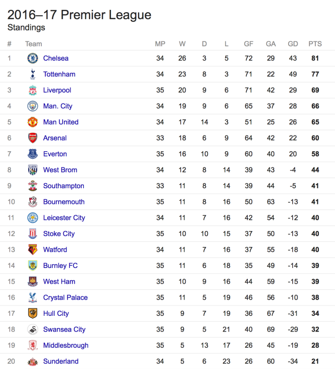
However, I do think it’s possible to tell an intriguing story (OK, a news story) by careful selection of data. The next examples are league tables – they are not sophisticated or artistic, but they are every bit as valid as an example of data visualisation as a bar, pie, bubble or any other chart you might want to mention. If I asked who was the best football team in England, would you remember the most recent complete season and give the answer as the runaway league winners, Leicester City?
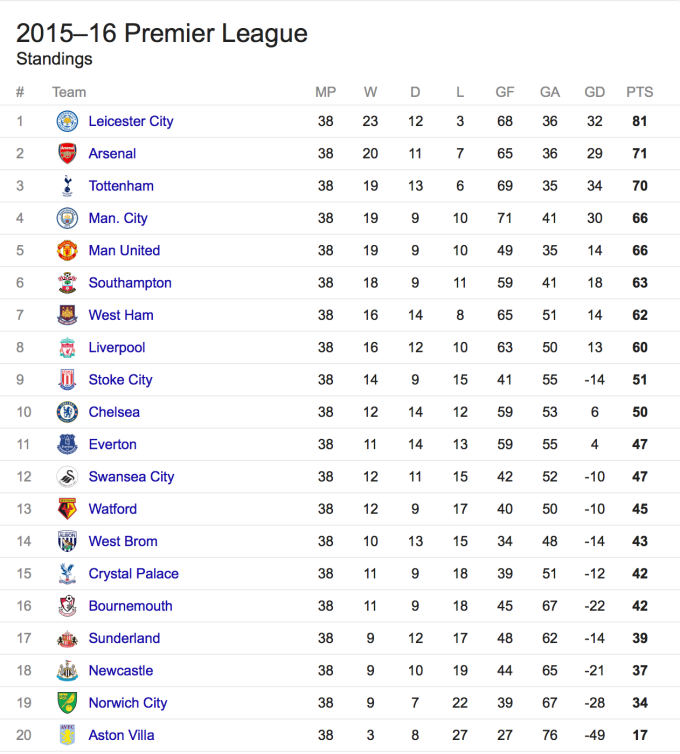
Or would you say this year’s league leaders and favourites for the title, Chelsea, who have as many points as Leicester did last year, with four games still to go?
Both are credible suggestions, but if you were to consider the overall results over the last two seasons, a new team emerges – despite not topping an individual year’s league table since the 1960s, Tottenham are a clear 15 points ahead (graphic courtesy of the Sun).
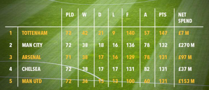
This isn’t so much a data visualisation technique, but it is a data storytelling technique. And hard to argue, when facing the less conventional third option above, that Tottenham are not the best and most consistent team in England at the moment.
Whatever your definition of a story, it’s possible to make your data tell the wrong story. If you’ve seen this chart before, featured and debunked in Business Insider, you’ll know exactly what’s wrong with it. If you haven’t – I’ll make it easier and put two at first seemingly different charts next to each other …


There are lots of powerful (and, unlike the above, ethical) ways to tell a good story with your data. Whether that’s with a small or large S, these ways give extra impact to your data. And that’s what I’l focus on when I talk about storytelling, not so much about the semantics of the word, which will continue to fascinate. I’ll probably include the above charts and will definitely include very many more, and my aim is twofold: to promote interest in great data visualisation, and to stimulate debate rather than answer questions.
Still terrified though!

You quote Vonnegut, so I love you for that anyway. As always, I love how you bring these questions to the table, regardless of how basic they may seem on the surface. They rarely turn out to be as obvious as they seem, as you’ve keenly pointed out.
To me, using linguistics as a model, the point of a data visualization is to communicate something. As humans, we communicate to interact, entertain, share ideas and emotions, and transmit culture across generations (not my definition – smarter people than me). When we look at this within data visualization, we get to your question – is this communication ALWAYS a “story”.
To derail a minute, do we have anecdotes in data viz? I think so. These are often these 1 chart dashboards. FT, D3, and a number of Tableau dashboards have done this quite effectively. To me, these are separate from a “story,” but a small piece of information.
When building exploratory dashboards, these may or may not have “story” within them. For me, I call this grammar, as it can be a grammatically made dashboard, but that would be a sentence, not a story.
Some of this is all likely semantic. Our work, as a profession dedicated in this fashion, rather than as part of another profession, is still novel. So, I think how we talk about our work (“Story” vs “story”, grammar vs story, etc) is still evolving, so we’ll likely have this question for a long time.
Yes, today is the tomorrow you worried about yesterday…
LikeLiked by 1 person
Thanks Bridget! I probably put about 10% of what I wanted to in this blog post, and when I give my presentation that will probably go up to about 30%. Just so much to think about, talk about and show. I don’t mind that it’s largely a semantics thing, because every opinion and definition gets us thinking about how we can make data visualisation more accessible and do it better.
Sasha Paluska from Tableau gave a great talk just a couple of days ago on making your data make an impact, and understandably many of the thoughts and subjects overlap with this. Her take was that the techniques and tools we use were the language to tell a story – a take which instantly made me relate to your talk on the linguistics of data visualisation. So I’d already think to include this as a corollary to the question.
But what a great further interpretation – data visualisation as an anecdote. I love that! We’re not creating War and Peace here (or Slaughterhouse Five, or even Larry Gets Lost in Seattle). But, meet me and I tell you some stats/numbers, and you forget the numbers. Chances are you forget me too. Meet me and I tell you a good anecdote, you’re far more likely to remember both me and what I told you. That’s surely a key aim of good data visualisation.
I’ve got two things to do now in the next week. Finish (re-)writing this talk, and read some Vonnegut.
LikeLike