I wanted to write a post about my inspirations in data visualisation. First of all, I feel a little bit uncomfortable citing inspirations, not because I feel uncomfortable expressing praise to others, but because I feel that as someone so inexperienced in the field, you might think that I am eliciting comparison. Please don’t think I’m like the guy who can sing and play the piano a bit and goes on TV wanting to be the next Elton John. In the same way, I can’t claim to be in the same league as most of my inspirations. If I’m honest, I didn’t know I was inspired by quite a few of the people on this list until I stopped and thought about it. But if you can get past that, then here’s my list.
1. Hans Rosling
Last week saw the sad passing of Hans Rosling. It feels a bit like jumping on a bandwagon to pay tribute to him at this point, since many words have been written in tribute. Hans Rosling is known to many in the data visualisation field for his work on gapminder.com, his TED talk videos, and his BBC FOUR appearances presenting The Joy of Stats. I’ll almost take it for granted that anyone who has found this page has done so because they have an interest in data visualisation, so will be aware of some or all of these things. If not, go and seek them out!
I can think of at least three things that point to the influence of Hans Rosling on my work. First of all – this animated viz, on the Global Peach Index.

Above is the start of the visualisation, but you can click through to a hosted version which shows the animation of peach production in each year from 1062 to 2012. Bizarrely, this started as a bit of fun on Andy Kriebel and Andy Cotgreave’s Makeover Monday project which started as a result of a typo on the Global Peace Index. But that notwithstanding, I produced this animated visualisation. It’s crude and quite simple, but I got feedback that it was “very Hans Rosling”. I felt enormous pride at this comparison.
The second example was from last week’s project (below), the last viz I created before his death. Like Rosling, I love the scatterplot. It allows granular display, with x, y, colour and size available to compare four different dimensions. Five, if you include time as Rosling often did. I used this, I hope, to good effect in my Brexit visualisation here:

The dataset available last week contained data on many millions of Chicago taxi trips. I can’t tell you how many more stunning and successful visualisations were made – see Exasol’s blog “Let them have ALL the data” for just some of the best. But I didn’t want to use Exasol’s big data capabilities, choosing to stick with what was regularly available to me. I also stuck with my favourite visualisation form. A scatterplot of destinations, using two measures, colour and size to cluster destinations. It didn’t attempt the sophistication of many of the big data dashboards, but it could only have been more Rosling if it was animated. And it was produced the day before his death was announced.

My third example of his influence is perhaps the most powerful, but not a visualisation per se. Rosling had a real passion for his work, and wanted to get up and tell people about it. Not about anything technical in relation to his visualisations, but he wanted to tell the story the data was telling, to enhance the message. He told good news – focusing on social measures and the improvement in standards of developing countries, and used his charisma to enhance what his visualisations reported. This was perhaps the most inspirational thing that set him aside and placed him as such an influential master of his craft.
Just two weeks ago I was part of an exercise at the Tableau User Group in Nottingham. We split into groups of 4 or 5 of varying skill and experience levels to look at some data provided around road traffic accidents. Between us, we came up with a story and a couple of visualisations to present to the group. Nothing earth-shattering, I think we found things like the existence of more cycle accidents in London, more accidents during weekday rush hours, and each year’s quietest days being on Christmas day, that sort of thing. I felt I should get up and present – something that, like many introverted data people, is not something that comes naturally, but my role as a Tableau Ambassador would have made it a good chance to introduce myself and say a bit about what the team had done. But another attendee from our team wanted to get up and talk. I tried to be quite persuasive to say that I should be the person to present – I really didn’t mind – but my new friend was having nothing of it. Of course I was delighted that he was keen enough to take the presenting on, but in part I was actually quite disappointed. Having helped create the visualisation I wanted to tell people about it – explain the findings and tell the story. That to me was the biggest Rosling influence. Pride, ownership and conviction in our visualisation findings, with enthusiasm and charisma to pass them on.
2. David McCandless
There’s a spectrum in data visualisation that has Stephen Few or Edward Tufte on one side (strict adherence to best practice – “go to” experts for rules, standards and expertise), and David McCandless (fun, visually engaging, disregard for best practice at the expense of beauty). The first books on visualisation I bought were by David McCandless. As a novice stumbling on the concept for the first time, only about 18 months or so ago, his were the books I wanted to flick through, read and enjoy. Most exponents of data visualisation know the Few/Tufte principles and some decide never to stray from them. I feel all should know them and use them when appropriate. But I gain more pleasure from the visually striking and engaging, undoubtedly coming from the fact that I have created more projects for pleasure than I have professionally. McCandless’s brand, and website, is centred around the words “Information is Beautiful”. I bought the books because I agree!
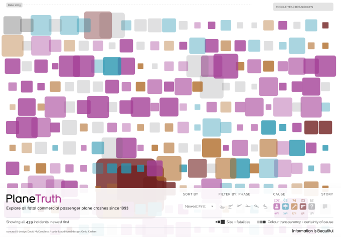
Here’s a simple McCandless from his website – “Plane Truth” visualising commercial passenger plane crashes. The data is all there and accessible, but behind tooltips. Outwardly, all that can be seen is different sizes and colours of rounded squares. They tell a story and are instantly visually striking, but aren’t the best medium to exactly compare and contrast incidents without digging further; but to my mind you have to ask yourself if that matters. Are you using exact size of shape for insight (and, with that, the quickest, most accurate insight possible?) Or is an initial visual estimate OK if it’s visually engaging – if not an approximation, then an accurate depiction in not the most intuitive way. If the latter, then you probably, like me, lean towards the McCandless side of the spectrum. I firmly believe that it’s important to understand and adhere to all best practice principles where appropriate. But, once you understand them, you develop an appreciation of when it’s OK to bend, break or turn a blind eye to them!
3. Chris Love / Rob Radburn
As I was starting out – one morning I was working from home with my twitter feed on in the background while listening to an England cricket match on the radio. At one point during the day, I suddenly realised that one person was visualising the game almost as quickly as I could listen to it and sharing his work with his followers:

http://www.theinformationlab.co.uk/2016/03/30/7-tips-for-creating-a-topical-data-visualisation/
Instantly from this I realised several things
- Though I was a complete tableau novice, the software can be used to make visualisations which are great, topical, quick (though I don’t think many people are as skilled and quick as Chris), and on almost anything
- There are people doing this who are local to me. Within a few miles, accessible via the online community, and part of the local Tableau User groups.
I had no idea what a Zen master was but it turned out that this guy was one. As I’m sure you know, and I do now, that’s a pretty good thing. I’ve since seen many more great pieces by Chris – and though we often don’t agree (Chris is both technically adept at producing a great range of chart types while advocating the need to keep things simple), I can’t help be inspired by his work.
I also noticed plenty of correspondence at the time between Chris and Rob Radburn – another Zen master who worked in the same city as me. Rob was producing some lovely stuff too, and worked in local government, so often his concerns were to do with social data, the same field I was about to move into. This viz by Rob really resonated with me, and gave me ideas of more striking things I could do professionally. I didn’t yet realise that it was actually technically pretty easy to do, but it was a great example of “thinking outside the box” and telling individual stories through visualisation

It was a great encouragement to have two experts local to me, living as I do a long way from big city London, and they continue to be leaders in their field. And I’ve yet to see a bad piece of work from either of them!
4. Adam McCann / Chris DeMartini / Rody Zakovich
So many talented data visualisation creators, but these are just three more of those high on my personal list, who do things that I like to create, and do them in my software package of choice: Tableau. There are people who create jaw-dropping graphic creations but I don’t include them because they are not the kind of visualisations I create. I like curves, mathematical visualisations, and unorthodox chart types. I know that some of what I create will make the purists cringe. I like to create exploratory vizzes, not necessarily insightful ones. So why these guys in particular? Here’s one example from each of a technique I’ve leaned heavily on …
Adam McCann loves to demonstrate new ideas and techniques, the very latest of which was just two days ago – the spark bar chart:

It’s come in for equal measures of appreciation and criticism (probably the Few/McCandless spectrum again!). Why aren’t the sparklines aligned? How can one measure on the x-axis represent time but the bar chart doesn’t? I see past all that – I don’t need to directly compare the sparks, just see a visual snapshot of each against the bar it represents. And I borrowed heavily from this to create my own, using Valentine’s Day data.

It’s not as good as Adam’s, not least because the bars are more uneven, leading to sparklines off the chart to the left. But Adam remains a huge influence (as I may have alluded to in my signature radial bump chart viz here)
Chris DeMartini has also created and documented some great chart types – including the jump plot which remains one of my favourites. Mine is adapted for Premier League goalscorers. Unorthodox, and there are many simpler ways of showing goalscoring trends. But this is crisp, different, and fun! I included the jump plot in my previous post right here
Rody Zakovich loves to create vizzes with curves – check out his public profile to see great work on Queen songs, golf shots, US football quarterbacks to name just a few. When he created a sunburst chart based on the Boston RedSox, I knew it wouldn’t be to everyone’s taste. But I loved it and used it twice, with Rody’s backing and help!


Rody’s Redsox viz (top right) became anglicised to a Birmingham City football viz (bottom right), and eventually resurfaced as a viz for songs of my favourite prolific band. Great examples of exploratory vizzes, versus explanatory ones …
One thing each of the three have in common is that their work is unorthodox but accessible, and all use Tableau (to Zen Master status) so I know that they might all have greater skills and experience, but start with the same toolkit, and the same blank canvas, as I do. This gives me the inspiration to know what is possible.
5. Nicholas Rougeux / Valentina D’Efilippo
My other inspirations here signify what to me has been one of the most exciting ways of using data visualisation; that is to create pieces of art. I could have included other examples of great data artists here, such as Stefanie Posavec or Giorgia Lupi, the two responsible for Dear Data. The insight comes from the way you want to explore the visualisations and the time you want to take enjoying it. For me, I’m so completely uncreative and unartistic, that creating data visualisations has been the first opportunity I’ve ever really had to do something a bit more “arty” (or so it seems to me, anyway). And, unlike some of the inspirations I’ve quoted above, these artists don’t use Tableau. So in this case, inspiration is less about stealing (like an artist, of course) and more about being inspired to create something similar from scratch.
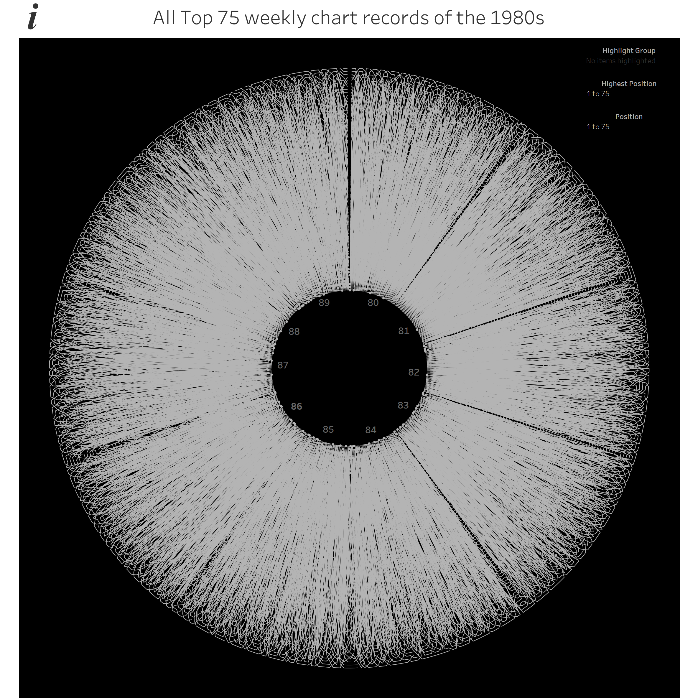
Nicholas has created some great work on www.c82.net. Often his visualisations are completely word-free, with simple lines and swirls depicting multiple examples of a certain genre. Below are visualisations of sonnets and literary first sentences respectively


Nicholas’ work is good enough to sell as a poster, which is something I would love to aspire to. When I recently wanted to do something a little “different” in visualising classic chess games, I came up with the following, based on average piece position and number of pieces present throughout the game. As soon as they took shape, they reminded me of Rougeux’ work on sonnets, road intersections, or classic novel first paragraphs. I saw that only as a good thing!
I haven’t finalised/published these yet as I’d like to include some more games, but here are my classic chess game visualisations covering three centuries:


(Inspired by Anderssen vs Dufresne, Carlsen vs Karjakin and Spassky vs Fischer). These are snapshots of a work in progress, but I think they could become similar art style visualisations. Would anyone buy them, even a fellow chess nerd? I don’t know about that.
Valentina D’Efllippo is another data artist I admire, and I have included her here specifically in relation to the Oddityviz project. Oddityviz is a serious of visualisations inspired by David Bowie’s classic Space Oddity album. How good must it be to use data to create physical works of art in an art gallery? The full gallery consists of seven record-themed visualisations: here is one of them, based on rhythm.
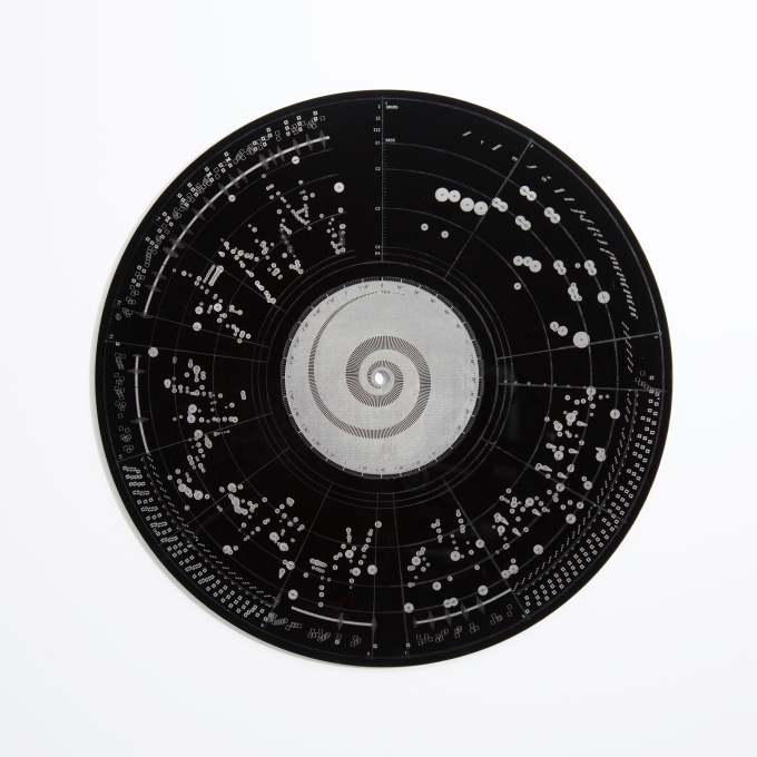
I had this very much in mind when I tried all sorts of ways to visualise my 1980s pop data which I first blogged about here. The influence of Rody & co (see above) meant that I was always planning to do something circular or spiral, but I was never particularly happy until I muted the colours, my viz became more record-like, and I realised I had an OddityViz inspired creation here:
It won’t sell out any galleries, and it has been pointed out to me that it looks very much like an eye – I think I’ve perhaps missed out on a whole different metaphor opportunity there. But I’m still learning and experimenting, and this is one visualisation which I wanted to frame (no pun intended) as an attempt at data art, with Valentina’s work as an inspiration
6. Donald J. Tr*mp
So who saw that coming?! The first five are current and past influences. This one, tangentially at least, is one for the future.
People are human, and although my social media bubble, in particular twitter, is almost entirely data visualisation related, a lot of people have been very affected by this guy (I refuse to write his name in full). They write, rant, protest and share about this man. What can we do, other than vote differently in 4 years time, and encourage others to do the same? (In my case, as a Brit, only the latter!). We’re not politicians or major influencers.
The fact is, dissatisfaction is a great source for visualisation material, and that is something that we can do. Tr*mp has appalling attendance figures at his inauguration? Visualise it! Tr*mp has worst approval ratings of a new president in recent memory? Visualise it! So far I’ve only created my tweet spiral viz but the very fact that the “topic” of the viz is something that polarises opinion has created more interest than usual.

Ben Jones and Flippo Mistriani have created great visualisations too about his recent golfing following his many tweets about Obama doing the same. Here’s Filippo’s:

People such as the fabulous Brit Cava and Ken Fierlage have visualised the strength of feeling about Tr*mp’s Muslim travel ban and reaction following Women’s marches in the USA and round the world here, they are just two of many doing great work.
Here’s Brit’s visualisation

And here’s Ken’s

As a final example, author Alberto Cairo (who I mention a lot, a highly respected data visualisation practitioner and lecturer) has had a lot to say about the election of Tr*mp. For a while, his (very frequent) twitter output changed almost exclusively from data visualisation and journalism related posts, to political comments and opinions. But, crucially, he has now decided to do something about it.

Alberto is channeling the political anger and disappointment in the wake of the ubiquitous “fake news” articles into his area of expertise – data visualisation. He will be touring with “Visual Trumpery” lectures later this year. Personally I will do all I can to persuade him to visit the UK (more specifically somewhere Midlands or North!). More of this to come later in the year if and when it happens. But this is a fine example of using social or political issues to inspire data visualisation. Something I need to do much more of. And I’m sure that Tr*mp will inspire me and people round the world to get visualising, telling stories that need to be told.

What about visualizing how absurd Tr*mp’s lies are? Examples: https://twitter.com/MinitrueJulia
https://public.tableau.com/profile/minitruejulia#!/
LikeLike
Thanks Julia – in fact, I’ve decided to put my money where my mouth is and I’ve done just that
https://public.tableau.com/views/election_fakenews/Dashboard1?:embed=y&:display_count=yes
LikeLike
Thanks for sharing this Neil. Valentina is one of the most inspiring data visualization designers for me. her Poppy Field work that won the Kantar award has opened a whole other dimension of data visualization to me (http://www.valentinadefilippo.co.uk/projects/poppy-field/). It is a dynamic data visualization. You have to experience it to fully appreciate: http://www.poppyfield.org/ (Click EXPLORE at the bottom of the page) I just love it.
LikeLike