I’ll be honest – I don’t for a minute believe I have the standing, expertise, or width of knowledge and experience to comment on data visualisation generally in 2016 (or, similarly, to make predictions on future developments for 2017). But 2016 was an eventful year in my progression into the field of data visualisation. So I want to share that with you in this post. Looking back, it feels like I made great progress in 2016, from rank beginner who had just started in a new job which would require a small amount of data visualisation, to a potentially much more exciting position within the field (read on) with a lot of progress, recognition and learning along the way. I hope my 2016 can influence or inspire new people in the field for 2017. So, here goes:
1. The Truthful Art (January)
At the very end of January 2016, Alberto Cairo published his latest book: the Truthful Art. It’s a great book which gives any newcomer a great grounding in the field, and I’d recommend it for anyone’s bookshelf. In short, buy it. Read it. But that’s not where its relevance for me ends. At the end of 2015 I took part in an online course through the Knight Center for Journalism in the Americas – run by Alberto and Scott Murray, it was a great introduction to Data Visualisation theory and practice (Alberto) and introductory d3.js (Scott). But it was this tenuous link with Alberto which made me reply to one of his tweets right at the start of the year, asking for proof-readers for the book. So for me, I got a chance to read through the book in full ahead of time and offer my thoughts on pedantic English to poor Alberto.

My contribution is rightly minimal to say the least – a very small mention in the acknowledgements and the knowledge that without me you might have had a quote by Ronald Dumbsfeld rather than Donald Rumsfeld. But it made me feel part of the data visualisation community and made me realise how open and inclusive it was. A particular thank you to Alberto for that (and his efforts to get me a copy of the book in thanks). If I wasn’t hooked on data visualisation right at the start of the year, I was by now.
2. Makeover Monday (February)
Makeover Monday gets a lot of mentions on this blog, and I explain it more fully here. But although the project started at the first week of January, I made my first contribution in week 7 (during February). From this point on, I had at least one project to work on, publish and put online every week, and a growing group of fellow contributors doing exactly the same thing. Follow the link from the banner below and you might find some of my work but you’ll need to find it form among well over 500 other authors!

And now, as I write at the end of December, I’ve completed week 52. All done, with no gaps, and I’ve even been keen enough to go back to do those first six datasets in an effort to reach the end of the year in the elite 100% club! The project has been instrumental in improving my Tableau skills and getting my work out into the public domain, and looks sure to continue through 2017 with the addition of Eva Murray to the team.
3. Climate visualisation (May)
This is where things started to take off for me – my visualisation on the spiralling temperatures of 2016 (below) was made Tableau’s Viz of the Day (and, a week later, Viz of the Week). Now there were a number of brilliant visualisations this week, many of which I think were better than mine which was still simple and within my capabilities. I don’t even like it very much (the lower and upper CL bands add nothing, and why did I not fix the white axis in the median chart?). But I admit it’s got a nice unintentional heat-haze look about it. Somebody else somewhere liked my contribution, and hence I got my first noticeable recognition for any of my work.

4. Questions in dataviz (May)
So once my work was starting to be noticed, people suggested I start a blog. There’s no tricky Tableau in my visualisations above, so I didn’t feel I could add much technical advice to the large community of experts out there. But I can write and waffle on a good day, and I love a discussion or point of view on general issues, and so this blog was born. Some posts get a great readership count, others less so (does nobody like German psychology?!), but generally I’ve had some encouraging comments about this blog.
So, it’s here to stay! I’ll continue to post updates/topics and questions that are not too technical or Tableau-specific, but would love any suggestions or comments from you, my readers.
5. Brexit (June)
Ah, Brexit. The Brexit result itself wasn’t exactly a highlight of 2016. But, along with the US elections later in the year, (ah, the US Elections – the US election result itself wasn’t exactly a highlight of 2016 …), it was a ripe source of visualisations which understandably held the data visualisation community’s interest. I brought out my Brexit visualisation, not just because I wanted to create something that looked good, or that learnt a new skill, or to demonstrate anything else, but genuinely because I wanted to use the visualisation as an end user. To see, play with and try and understand the results (let’s face it, they weren’t easy to understand!). My visualisation, below, is the one many people have said was their favourite of mine in 2016. It was also another viz of the day!

Tableau have also featured this in their review of visualisations of the year: https://www.tableau.com/about/blog/2016/12/vizinreview-share-your-favorite-vizzes-2016-63852
6. Tableau Torch (August)
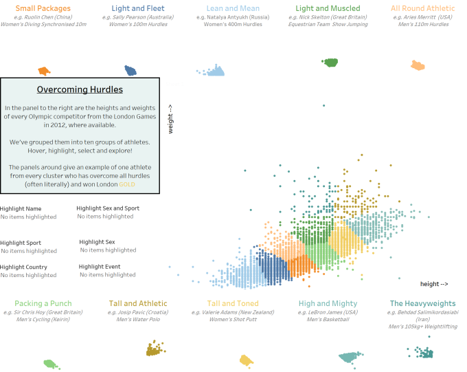
By the time August came along I was using the brand new beta version of Tableau v10. Not a big deal, as Tableau are great at encouraging active users to take part and feed back on beta versions. Tableau Torch was a chance for anyone to enter a competition with a theme – demonstrate one of the new features and win a ticket to the annual conference in Austin 2016. I know I’m not up to the standard of their annual Iron Viz feeder competitions, but this seemed like it was worth a try, with my love of scatter plots (see above) and interest in what Tableau could do with the new clustering features. Sticking with the Olympics theme, I came up with the visualisation below. To my amazement, a winning entry. I was going to Austin, Texas!
7. Malaria in Africa (September)
In September, our Makeover Monday dataset looked at malaria over recent years in Africa. I decided on an approach with its own pros and cons, but one I had never seen before, namely an Africa tile map (which I blogged about in much more detail here). The beauty of publishing online via twitter means that anyone can see your work, and before I knew it a French magazine was interested, they contacted me, we re-worked it a little (just by using more publication-friendly fonts and colour schemes, and obviously translating into French), and voila – I was in print!
Over the course of a couple of months, I’d won an a award, won a competition and been published. It was starting to feel like I couldn’t convincingly pass all three off as a bit of luck (though I must admit I still hold that view!), and that data visualisation, using Tableau, was starting to take off for me.

8. Culture and Politics of Data Visualisation (October)
I’d been implementing my growing interest for, and confidence in, data visualisation in my work job as much as possible. A few new dashboards had been produced, a few new chart types had crept into presentations, and I felt that as things were progressing nicely on both fronts (in and outside of “work”) that I’d be happy to present at a conference. The opportunity came up to talk about some of our formative evaluation work at a one-day data visualisation conference in Sheffield (“The Culture and Politics of Data Visualisation”). Now I’m no keynote speaker, but my talk combining and showcasing our professional uses of data visualisation in formative evaluations, and explaining how any visualisations, however simple, acted as a call to action for our clients and stakeholders seemed to go down well. My audience was about 40 or 50 people, and consisted of artists, PhD students, visualisers and analysts. But it was another landmark for me – I was confident enough in my role to present my thoughts and findings.
Later in the year I was able to present research and simple visualisations from one of our work projects to a much bigger audience of about 150-200 people. Through involvement in data visualisation my opportunities to talk and present are growing, and I’m happy for that to continue into 2017.
9. Tableau Public featured author
Just before travelling to the conference in November, I got a great surprise. The Tableau Public team made me a featured author. Now this is something that gets awarded to ten or so people at once, and is rotated every few months (I’m not sure exactly for how long I will stay featured). But this has resulted in a few more views and followers on my public projects, and is a great way to showcase what i have been doing this year. It’s also further great recognition for my work for which I am incredibly grateful. If people really want to, they can get straight to my public work with one click … and if you really want to you can click below.

10. Tableau Conference (November)
Of course this was a highlight of the year – a full week immersed in Tableau, learning about data visualisation and meeting community members and experts from all around the world.

I’ve blogged extensively about this in these two posts:
What did I learn from Tableau Conference 2016? (part 1)
What did I learn from Tableau Conference 2016? (part 2)
11. Interview (December)
In December I went for a job interview. I’ve loved my job over the course of this year but really wanted to take advantage of my growing exposure to (and improvement with Tableau). So, though not actively looking for new opportunities, I saw an option which looked too good to ignore. It felt like the culmination of my great year in Tableau – a chance to sell myself, my abilities and my visibility within the community. After a technical test (which, to be honest, I think could certainly have gone better) was the standard interview panel, during which I was asked to demonstrate one of my visualisations. Ahead of me was a laptop projecting in full onto an empty wall.
Going into Tableau Public, via my featured author page (see above), it was great to be able to wow the panel with the sheer variety and volume of my work. A few times recently I’ve heard people recommend the use of their Tableau Public profile as a portfolio to show of their work. I can’t agree with this strongly enough. Building a portfolio with a combination of Makeover Monday projects and my own experimental projects

In short – I got the job and start in late February. Much more data visualisation focussed than my current role (in particular, using Tableau), it’s an exciting role (for me) where I can be a user, trainer, mentor, evangelist and possibly more. I won’t go into too much detail about my new job since I still have two months to work at my current position, which will get my full attention through January and most of February 2017. But I’m excited about the new prospect and it’s sure to be an important step in my continuing journey for 2017 (cringeworthy cliche alert)
12. Sports Viz of the Year (Dec)
This feels like a nice way to round off my review. My favourite viz (of mine) of the year hasn’t featured anywhere above, but it was featured near the top in this review of the top ten sports visualisations of the year:
http://www.minto.net/2016/12/the-10-best-sports-graphics-and-data-visualisations-of-2016/
And the viz itself, of course, is this one:

I wanted to include this because so much of what I’ve done has been reviewed, liked and publicised within a relatively small closed circle. But this has been picked up and included from outside, in a different sports visualising community – with the exception of the malaria visualisation above, that’s still quite unusual for me. A great way to end the year!
Next Year
So what’s in store for next year? Who knows?! However these are just some of the plans/ambitions I have the following for next year:
- Take part in January in this MOOC course
- Speak at another conference
- Attend the Tableau Conference in the US again (somehow!)
- Continue to meet and network with all those who have helped me in my progress so far (and meet those I have yet to meet!)
- Continue growing my output through Makeover Monday
- Work hard on my technical skill in tandem with the skills needed for my new job (perhaps become Tableau Certified)
- Keep blogging!
There are just too many people to thank and mention for their help and encouragement this year, but I hope to keep working with all of you next year. See you all in 2017!

Such an amazing year for you Neil! Thanks for sharing your story and I hope this can inspire others.
LikeLiked by 2 people