So, is it OK to steal? Of course not. In the data visualisation context, that would be passing someone else’s work off as your own. Anyone would agree that would be the wrong thing to do.
But that would make a very short and uninteresting post. At the very least, I’m shooting for quite long and uninteresting (anything better is a bonus). So, is it OK to base your visualisation heavily on someone else’s work, to the point where it’s quite obvious that’s what you’ve done?
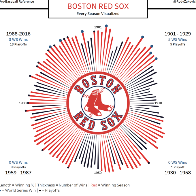
Here’s a case in point – a recent visualisation by Rody Zakovich. Normally I’d make a link to the interactive version but in this case I’ll give a link to Rody’s public Tableau page, mainly because he is prolifically good and there’s a lot more great visualisations than just this one.
 And here’s a recent visualisation from me (click through for interactive version):
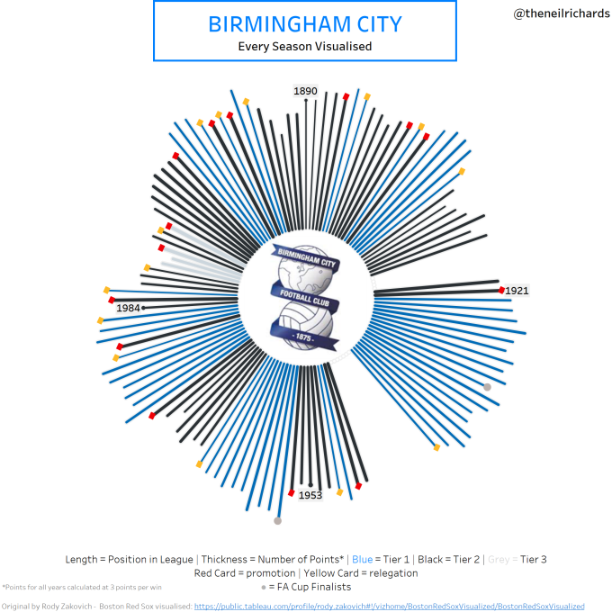
I make no bones about it – it’s pretty much the same viz. Names, colours, logos and timescales have changed, and the rest is either the same, or an equivalent to take account for the fact that UK football does have “winning seasons” or World Series, but does have a 96-team four-tier structure, promotion/relegation and the FA Cup (not that Birmingham City have ever won it). Oh, and I changed a z to an s!
If I was critiquing Rody’s original, I’d say that a sunburst chart isn’t the most effective way of being able to ascertain exact information, or to easily compare season versus season numerically. As any visualisation nerd will know (and I count myself as one), the radial arrangement of years doesn’t really mean anything.
But I’m not critiquing it, because that isn’t the point of his visualisation. There’s no getting away from the fact that at a glance it looks appealing. You can tell good years from bad years, see periods/etas where the team was strong and where the team was not so strong. It’s a bold, striking visualisation and if I was a Boston Red Sox fan I’d love that in poster form on my wall. Now, I’m not a Boston Red Sox fan (surprisingly for a Brit, not because of baseball ignorance, but because I’ve been lucky enough to go and see their divisional rivals the Tampa Bay Rays play a couple of times, but that’s another story). But, I am a Birmingham City fan. Hence, my remake.
It has the same pros and cons of the original. If you want easily readable, accessible and comparable stats, you can just go to Wikipedia or the club website, where the figures were sourced from in the first place. But as an “artistic” visualisation in one place, I like it (though I say so myself). My hope is that Birmingham City fans and visualisation fans would like it too, though I admit these are both pretty small pools of people.
But because this was so similar to an originally published piece of work, the first thing I did was to contact Rody. He was delighted to talk through the project, the code, and the tricky bits, and really keen to see the final product. Though I wanted to do as much as I could from scratch, I certainly knew after discussing it what it made sense to change and what it made sense to leave exactly as it is. After I published and publicised my visualisation, he was the first to like, retweet and promote it. My version (as you can see) acknowledges him for the original Boston visualisation – he didn’t even think it needed acknowledgment but I wanted to do so.
And then, also that day, I witnessed a similar example – Andy Cotgreave from Tableau published a small post entitled “It’s the small dataviz things” on his blog. A small comment on a really nice small touch on some recent data visualisation. Hang on a minute, isn’t this exactly the same as The Little of Visualisation Design on the Visualising Data website? This has been done 27 times already – this looks blatant to me!
But before I could worry too much or formulate an overwhelming opinion on the subject, I noticed that Andy posted online along with a playful acknowledgement that he was blatantly stealing the other Andy (Kirk)’s idea (I can’t remember the exact wording). Was Andy K annoyed? Worried? Angry? Of course not – his reply was that it was great to see his idea leading to more spin-offs. A great positive way to look at things and further evidence to me that if you like someone else’s idea, if you use it with very little change, but you acknowledge and interact with the original creator, then there’s plenty of room for all versions.
With the discussion and content of this page now firmly in my mind, I sat down a few days ago to write this entry. I wrote the title, fired up a podcast, where Matt Francis and Emily are interviewing Alberto Cairo, with the idea of writing this up, multitasking a little round the house, and listening to the podcast. An hour and half later, I had still only written the title. Testament to Matt, Emily and particularly Alberto, the podcast was enthralling, and you should listen to it here:
As a result of this – I didn’t get this post written (or anything else done), but wrote down several ideas for future blog posts, some of which you may see soon. However one thing stood out – the phrase: “Steal Like an Artist” which was discussed towards the end of the podcast. This was a phrase that Alberto recommended and encouraged to data visualisers looking for great examples and influences/influencers in the field.
So what does this mean? The main thing is that everyone should almost be encouraged to “steal”. If there’s someone whose work you admire, copy it! Copy it well, understand it, acknowledge it, and in due course adapt it, so that you find your own style. Some people think Dali influenced Picasso, others think the reverse, but it seems there was a certain amount of “stealing like artists” going on, helping both become arguably the two biggest names in early 20th Century art. But going back further in time, most of the true master artists did this. A lazy google of “Steal like an artist” almost exclusively reveals the title of just one well-acclaimed book. I won’t publicise or recommend it, because I haven’t read it. But I’ll steal(!) one line from its amazon page which says:
Nothing is original, so embrace influence, collect ideas, and remix and re-imagine to discover your own path
So that’s why I highlighted the word “artistic” several paragraphs previously. I’m not an artist and never have been (as is pretty obvious here), so need to be reminded to think in those terms. Now, I will remember to steal like an artist. In particular, in data visualisation (and even more in particular, in the use of Tableau, where public projects are downloadable to all), the key thing to do is understand what you are stealing or adapting for your own benefit so that you can work towards including your own influences. And, if anyone ever wants to steal from me, then I know, unlikely as it seems, that I will have made it!

I love how you to bring your points to the table and ask these questions. For me, I like Kelly Martin’s approach (steal and nod: http://vizcandy.blogspot.com/2014/04/steal-and-nod.html) and find it’s essential for learning. You can only learn so much on an island, as this year for me has well proved.
For me, I think it’s important to highlight the source for a few reasons. One is the one you cited, but the other is giving the viewer/reader/user a link to another person they too can learn from. There are limits to what new things can come and some people may make the same discoveries around the same time, but giving credit also feeds back into the community. So, stealing is important, but so is nodding, and by doing both, we push farther together.
Thank you as always for bringing such great discussion to the table! Cheers!
LikeLike