This question and therefore this post has come about as a result of a conference talk I am giving tomorrow. The overall conference theme is the Culture and Politics of Data Visualisation and I’m excited to have been asked to talk at an event for the first time. Specifically, my talk focusses around my professional work, and aims to demonstrate the use of data visualisation in formative evaluation projects within social research. And while this post isn’t a plug for my talk – if you’d like to come and it’s not too late then please sign up, come along and it would be great to meet you!
Anyway, my talk spans the various uses of data visualisation: as a reporting tool, as a means of creating specialist outputs, as a data quality tool, as a means of disseminating key facts, a way of monitoring project progress, an enhancement to standard reporting actions, an incentive to stakeholders, and as a call to action.
When we think about data visualisation, and particularly when we promote data visualisation, we usually think of the key advantage as providing insight to our data. Whether or not this is tied in with (or even the same as) telling a story, is a moot point (as I touched on here) but traditionally (and I’m safe to use the word “traditionally”, because data visualisation isn’t as new a technology as you might think!) we look to provide and show insight.
But, to cut a long story short, in preparing my slides, I was over-running. I had to cut a long presentation short(er). In using examples of my work, I try and show that we cover all the different aspects. Should I just leave out the couple of slides covering the “call to action” example that I had, and go with the rest of the talk’s content? I decided to do that, to get rid of the slides, for two reasons:
Firstly – everything I’d spoken about so far was already a call to action. Visualisation showing number of participants lower than target in a certain area? Call to action: get more participants. Used as incentive to projects with more than 50 surveys completed to show individual rather than national findings? Call to action: complete more surveys. Visualisation highlighting poor data quality among certain difficult subject areas? Call to action: hold workshops to discuss how to make the process simpler. Project running swimmingly and showing great results the client wants to see? Call to action: Great – don’t do anything! Anything the visualisations showed, whether or not it qualified as genuine insight, would lead to its own call to action.
Secondly – the “call to action” example was only ever going to be an extra if time allowed, for the simple reason that it was a bit of an aside to my professional work. And, in hindsight, I think I was taking it a bit literally. However, I can of course show it here. Following from the culture and politics of visualisation theme, it started with a visualisation tweeted by the only politician that I follow on twitter. I try and stay neutral with my feed almost exclusively devoted to data visualisation, but the politician I do follow, as a result of knowing her personally for many years, is Green Party London Mayoral candidate Sian Berry. So when I saw a data visualisation emanating from her twitter feed I was interested to take a look. The visualisation (below) was a retweet from a campaigner who is against expensive road-building projects at the expense of greener alternatives, and the visualisation aimed to highlight the particularly large cost per mile of London’s proposed Garden Bridge versus alternative proposed transport schemes.

It was simple and to the point, but in truncating the x-axis at various points it made it look like the garden bridge was 41 times more expensive than the proposed green transport scheme of a CS2 super-highway, an extension of a cycle route through East London because the bar representing the former’s cost per mile was 41 times the length. In fact, the cost was 292 times more expensive.
With my dataviz hat on, I went to recreate the original, focussing on correct proportions of bars, removing the colour and keeping it simple. Squeezing horizontally onto a page would have become somewhat tricky so I went with vertical bars and optimized the chart for mobiles. It would need a lot of scrolling, but that would just emphasise the discrepancy in costs. The resulting visualisation was as below:

The result – lots of positive feedback. The original poster, and Sian, both loved it and the image began to get circulated. It was adapted and used on campaigning websites, and I got several replies/messages saying how even more ridiculous it made the costs look.
Good! Mission accomplished – this visualisation became a “call to action” in the real political campaigning sense. I don’t want to overstate its effect – we’re only talking a handful of activists who have seen this and I doubt it’ll have any effect on whether the proposed garden bridge gets built. But this particular data visualisation can play a small part, demonstrating that if done well, and correct principles are followed, a visualisation can have more of a visual impact, hence a greater call to action.
Until now, many of my visualisations, in particular my “personal” non work-related projects, are not calls to action in the same sense. An interactive visualisation of the Premier League standings might have its own call to action in inviting the viewer to interact by hovering, clicking and dragging, but only in the sense of finding more insight using interactive features. Many static visualisations would not even really do that. Take one of my more recent visualisations of the Ryder Cup singles matches.
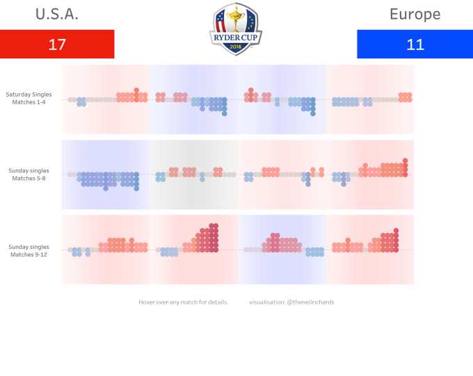
OK – it’s a shameless way of slotting a recent visualisation into this blog, but it’s an example where the viewer is shown (I think) some interesting insight: for example, the fact that on the singles day in the Ryder Cup, the eventual winner in 9 of the 11 decisive ties was not the first player to win a hole. That’s the visualisation’s job done – it’s told a story and provided insight, but it doesn’t require anything further. It’s an example of when a visualisation is not a call to action.
But examples like this are the exception that proves the rule. Our personal projects might show interesting data with or without extra insight in as creative or skilful way that we can manage, but in my case all of my more prosaic work done within the social research environment generally leads in at least some way to a call to action, with the aim of improving the outputs of the project, both for the client concerned and the members of the public involved. Many of us feel there is a real divide between personal and professional in visualisations we produce, and it’s often why we take such pride in personal projects. But this made me realise the importance of the simpler visualisation projects I’m involved with at work – they are almost always a call to action, and that makes the work feel worthwhile.
Now, all I need to do is get this message across tomorrow to a conference of attendees. Yikes!

Hi Neil, thanks for sharing this article.
Congrats on the adoption of the data visualization for the Green Party. I love the idea of optimizing for mobile scroll. Great work!
It is hard to get people to act based on the data visualization. I wrote about it here: http://www.olgatsubiks.com/single-post/2016/10/24/Visualize-to-persuade-and-inspire-action. I think that the only way to get people to act is to design a data visualization that works as a decision aid. What do you think?
LikeLike