Because the gimmick of this blog seems to be to pose and answer a question in every post, I wasn’t sure whether to ask “How important is creativity …?” or “What is creativity …?” but either way creativity in data visualisations is what I want to talk about in this post.
A little while ago I heard from Jonni Walker whose blog here is full of beautiful data visualisations. Now even if I had no reference point as to what creativity in data visualisation was, I would know that his work meets the criteria every time. Beautifully artistic works, all of which have his very identifiable style and none of which would look out of place as a glossy magazine article. Here’s one of many below:

This visualisation had two effects on me. First, I wanted to explore – the subject matter and visual quality made me want to interact. Second, I wanted to close down my laptop, go outside, and look for kingfishers in Derbyshire, it was that good. I know that I don’t have the skill to do these kind of visualisations. Yet he was quick to call my work creative – citing my visualisations on Africa, football and the Olympics as examples. He also said he didn’t want to start a debate on creativity – I agreed, yet that’s what I’m doing now, sorry about that!
Few would disagree that Jonni’s work is artistic.* I am not artistic. My work at school was so bad that stuff I handed in didn’t get marked, it just got a tick. An acknowledgement that I’d done something, but off the bottom of the scale for marks. That’s not false modesty, that’s just true! My small-talk summary is that I can barely draw a stick-man. But it makes it clear to me that there is an important difference between being artistic and being creative (though it is, of course, possible to be both!).

So, here (above) is an example of my artistic skill. This is actually really good for me, but I rest my case. But I include this because this masterpiece was created as part of Francois Ajenstat’s keynote speech at the Tableau roadshow last week. There were two purposes to the exercise. One, I’m pretty sure, was as an ice-breaker. We all had sixty seconds to draw our neighbour. But the other purpose was to open the discussion about creativity.
The most important insights that come from visualisations are often as a result of the most creative visualisations. Those which follow the iterative process I’ve mentioned before, where the stories told by the data are not immediately obvious. The example was of one creative employee who is able to find the money-saving solution with the creative visualisation tools at his/her disposal. Now of course, the reason for emphasising creativity was the assertion, which I certainly don’t disagree with, that the latest Tableau release enables the creator to be more creative than ever before. But the assertion that the best visualisations, whether the most eye-catching or the analytically insightful, was a non-software specific one. Creativity in visualisation spans several separate elements: the thought process, the insight, and its presentation.
Also last week, designer and data visualisation expert Valentina D’Efilippo teased her followers on twitter by announcing she was creating a pie chart in a drop of water. Most data visualisation practitioners shy away from pie charts these days, and if there’s anything worse than a pie chart, it’s a 3D pie chart. Would not messing with a pie chart make it even worse, or would adding a gimmick around it make it harder to read?
Well, no, not necessarily. This page is from Andy Kirk’s excellent Visualising Data book, and it’s in this blog because I remembered it instantly when the above pie chart conversation began.

There, in full glory, is a pie chart in the shape of a pizza. It’s not in the book section under “don’t use pie charts” but it’s in the book section under “visual appeal”. And the fact I remembered it is testament to the fact that the creative approach works.
Another example of creativity in data visualisation is Dear Data. I won’t go into great detail here, because if you have found my blog as a result of at least a passing interest in data visualisation, then it would be a travesty if you didn’t already know about it. If you don’t, you can link through via my link or via the postcard images below. The postcards below are some examples from the project, and the entire project was the overall winner in 2015’s Kantar Information is Beautiful awards.
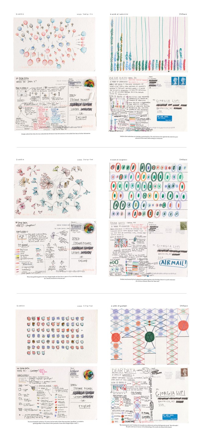
Because the project is purely pen/paper based, every one of the 104 submissions was created purely through imagination and because there was no computer software to aid the process, all had to represent their data clearly and uniquely. Each postcard successfully did this, and the creativity that came through from the personal touch every time is what led to the widespread acclaim of the project. P.S. Buy the book, it’s great (there’ll be book reviews on this site soon, but that’s as good as it gets for now).
But it doesn’t stop there. In 2016, Andy Kriebel (of #MakeOverMonday fame) and Jeffrey Shaffer have recreated the project as Dear Data Two. Here they use the original project as inspiration for their own postcard series, also recreated manually and posted overseas. But they went one step further by generating their visualisations electronically, in Tableau. This emphasises the fact that, with sufficient creativity and skill (the latter of which, Jeffrey and Andy have in abundance), it is possible to recreate anything that can be hand-drawn. Here’s one from Andy, visualised around about Christmas!

There’s a flipside to every argument, and whichever definition of creativity you take, there are times and circumstances where people don’t want “creative”. The standard dashboard, the templated report, the simple informative bar chart, and many more. And creative productions shouldn’t be favoured over the sake of clear and correct visualisations. We’ve all seen Sankeys that don’t make sense, radial charts when there is no visual need for a circular layout, colour schemes that look great but are visually unnecessary or confusing.
But, as someone starting out and learning, the more creative I can be despite my lack of artistic talent, within the constraints of best data visualisation practice (or outside of them if it’s justifiable!) the more satisfaction I can take out from my visualisations.
So in summary:
- Creative visualisations get noticed, remembered, talked about, commented upon
- Creative visualisations can break rules, even be diametrically opposed to them, but only where appropriate
- Creative visualisations don’t necessarily have to be artistically beautiful (this is a a good thing)
- If you can come up with an idea, and it can be drawn, chances are you can use your software to visualise it.
Before thinking about it and putting these thoughts down in blog form, I wasn’t sure I had creativity. But actually, I admit I do, albeit occasionally, and it’s community feedback in many form which has helped convince me of this. We pretty much all do. My advice is to have fun trying, and if and when you see some creative work that you like, join in the discussion and use the author’s influences in your own projects.
* When I say “Few would disagree” I mean “Not many right-minded people would disagree”. I don’t mean Mr. Few would disagree. He probably would, he disagrees with most people. But that’s a whole different blog post

Nice post Neil! There is definitely a balance to be wary of here. I strive to achieve beauty and function with my work. My take is if you make someone’s day/life easier, they will like you. If you make it an enjoyable experience while making their day/life easier, they will LOVE you. Adam
LikeLike
Neil, thank you for sharing this. I think creativity is important in the data visualization domain. Creativity can take many forms: color design, choice of chart types, storytelling, building an interesting dataset, innovative data representations, like with the case of pizza that you mentioned, or other things. There is a niche for every type of creativity. I think feedback is very important for every data creative, as I share in my blog post here:
http://www.olgatsubiks.com/single-post/2016/07/13/The-power-of-feedback-for-data-creatives. That is why things that Andy Kriebel and other do is so inspiring. Thank you for sharing the link to KANTAR. I haven’t heard about it before. A lot of people create beautiful things, and I believe that these stories should go further than back of a napkin!
LikeLike